Today (September 30, 2015) is the last day to submit an entry in the Power BI Best Visual contest. I and Daniele Perilli (who has the skills to design and implement UI) spent hours thinking about something that would have been challenging and useful at the same time. Daniele published a couple of components (Bullet Chart and Card with States) that have been useful understanding the interfaces required to implement a Power BI visual component. But the “big thing” that required a huge amount of time was another.
We wanted a component to color areas of a diagram, of a planimetry, of a flow chart, and of course of a map. From this idea, Daniele developed (and published today – what a rush!) the Synoptic Panel component for Power BI.
The easiest way to see it is watching the video. However, an additional description can help. Let’s consider a couple of scenario. For a brick and mortar shop, you can color the areas corresponding to categories (and subcategories) of products, using either saturation of colors or three-state logic (red-yellow-green, but you can customize these colors, too).
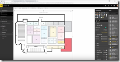
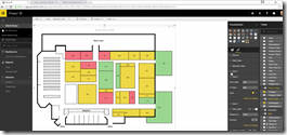
But what if you are in the airline industry? No problem, it’s just another bitmap.
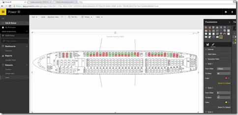
Wait a minute, how do you map your data to the graphics? How can you start from a bitmap, and define the areas that you want to relate to airplane seats or product categories and subcategories? We don’t have coordinates like latitude and longitude, right?
Well, you can simply go in https://synoptic.design, import a bitmap and design your area, straight in the browser, no download, no setup, no fees required. Each area has a name, that you will use to connect data to your data model. Yes you read it right. You will not change your data model to use the Synoptic Panel. For example, here you draw seats area in an airplane:
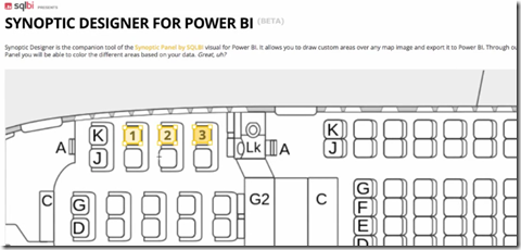
And with some patience you locate all the areas of a shop, too:
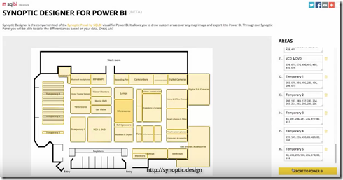
In the right panel you have the coordinates you can modify manually, and the editor also has grid to help you in alignment (snap to grid feature is also available).
Once you finished, you export the area definition in a JSON file that you have to save in a public accessible URL so that it will be read by the component (we will add the capability to store this information in the database, too – yes, dynamic areas will be available, too).
At this point, in Power BI you insert the component, specify the URL of the bitmap, the URL of the JSON file with the areas, the category, the measure to display, the measure to use for the color (as saturation or color state), you customize the colors, and your data are now live in a beautiful custom visualization.
Thanks Daniele for you wonderful job!