-
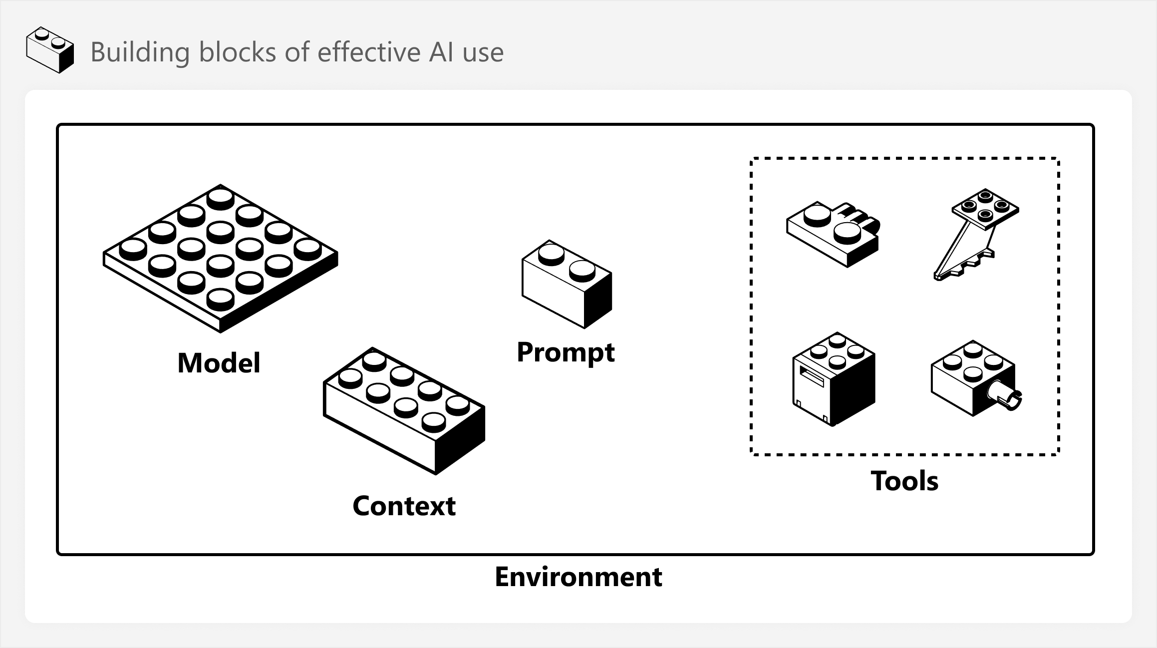
This article is about useful concepts and scenarios for integrating AI and AI agents in BI development, with specific examples for Power BI. Read more
-
Overview of the various capabilities of AI workflows and agentic development for Power BI. The focus is on AI for BI professionals, not conversational BI for data consumers. Read more
-
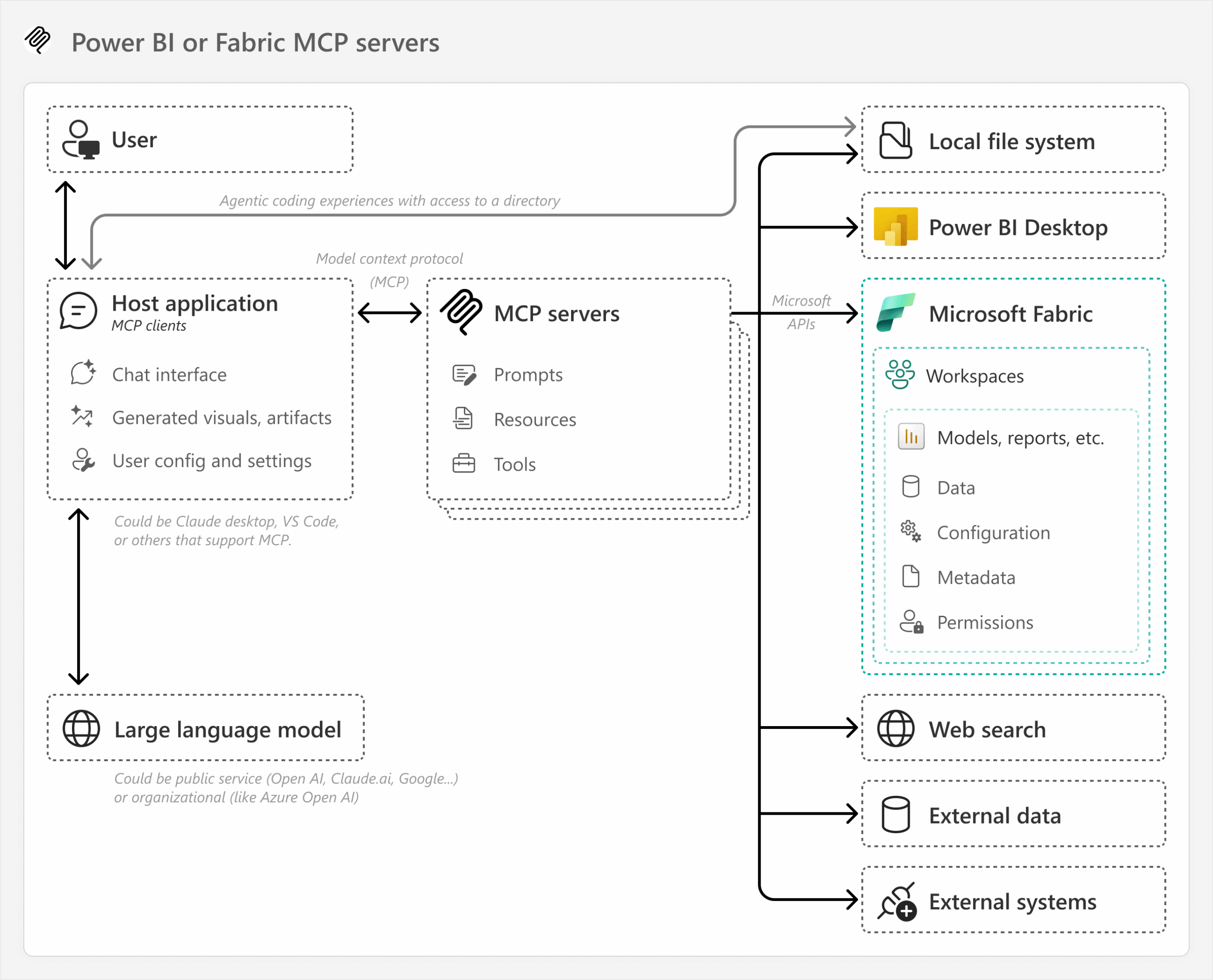
This article is about the state of AI tools with Power BI, and how to use the model context protocol (or MCP) to interact with and control Power BI or Fabric with a large language model (or LLM). Read more
-
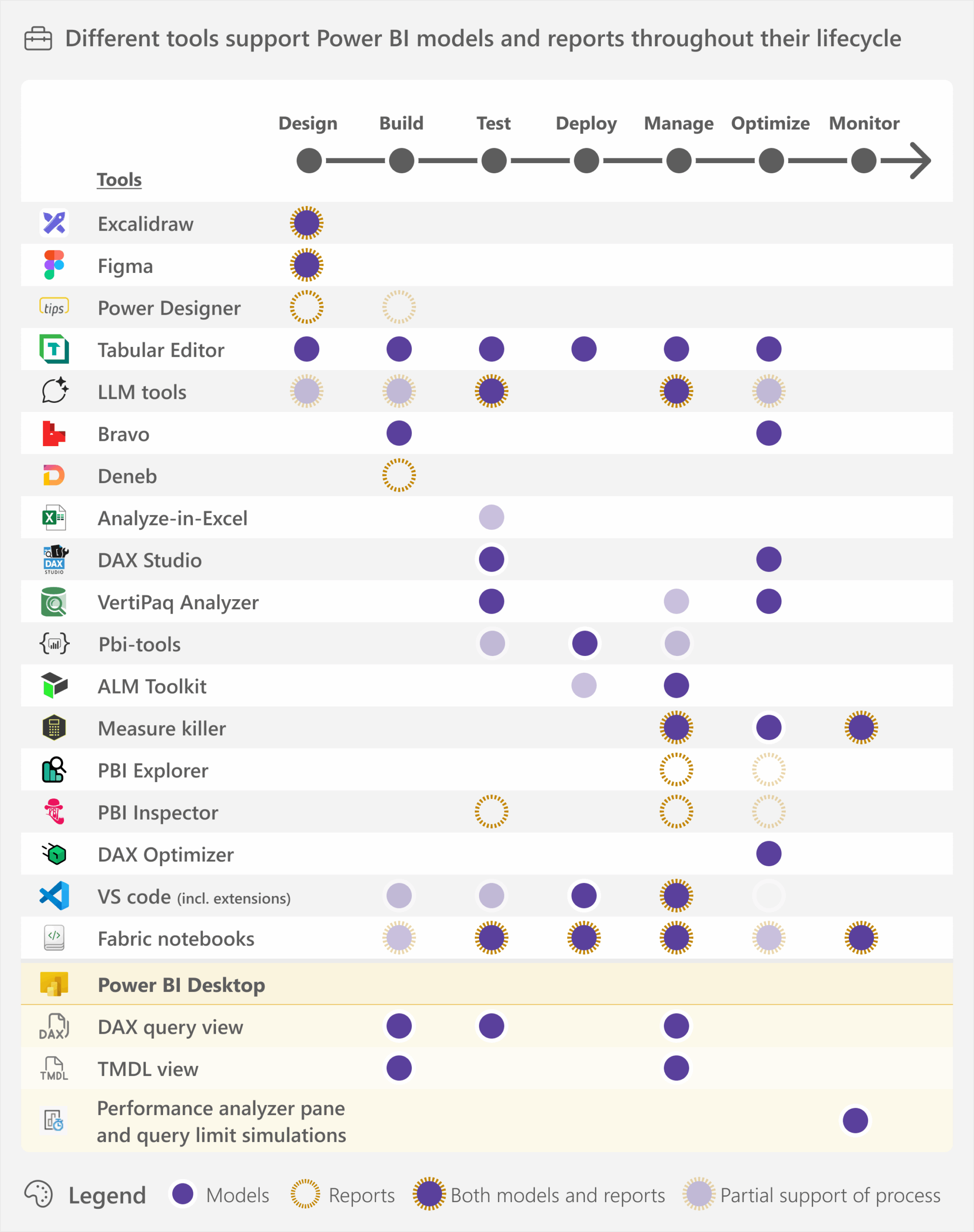
This article gives an overview of some of the available tools that can help you create semantic models and reports. Read more
-
This article is about a process to use AI tools like LLMs to create custom visuals in Power BI, and how this still requires deliberate thought, planning, and learning. Read more
-
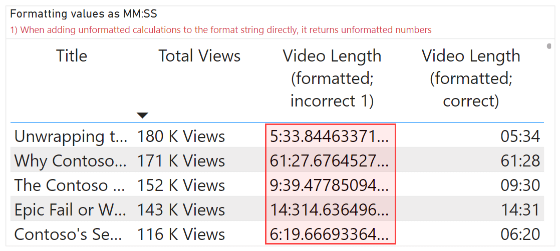
This article describes the different approaches to format your DAX measures in Power BI semantic models using custom and dynamic format strings. Read more
-
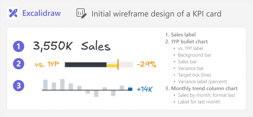
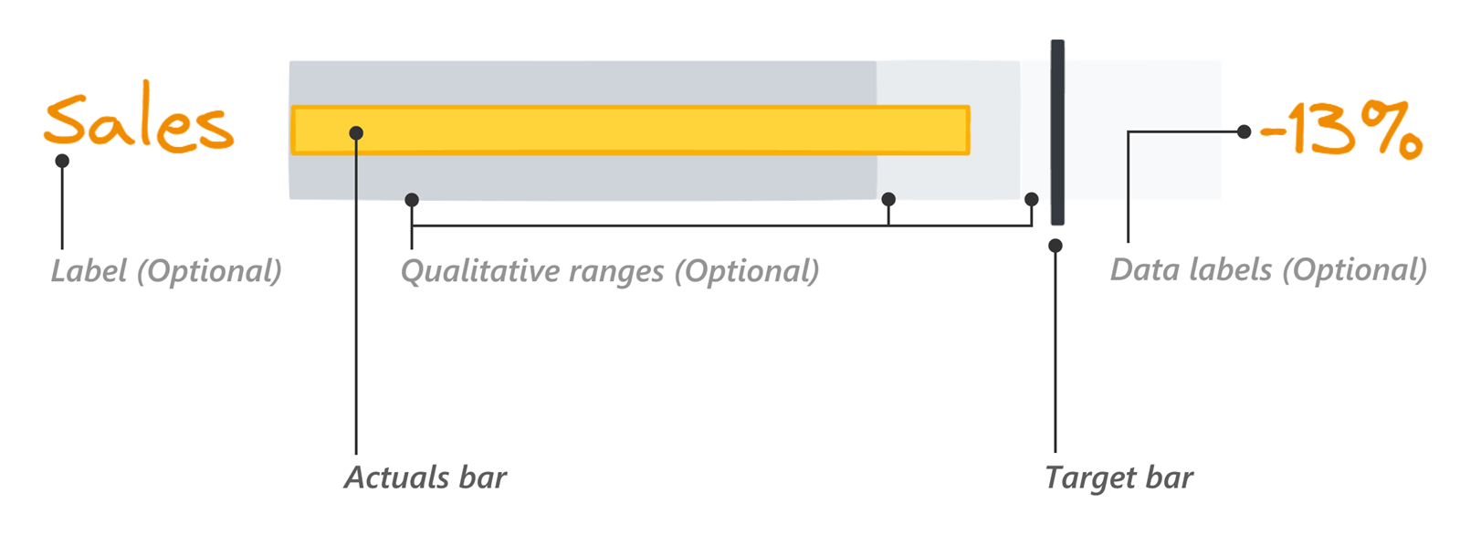
This article is about how to read and use bullet charts when comparing actuals to a target in Power BI, and the different options you have available to make these charts in Power BI reports. Read more
-
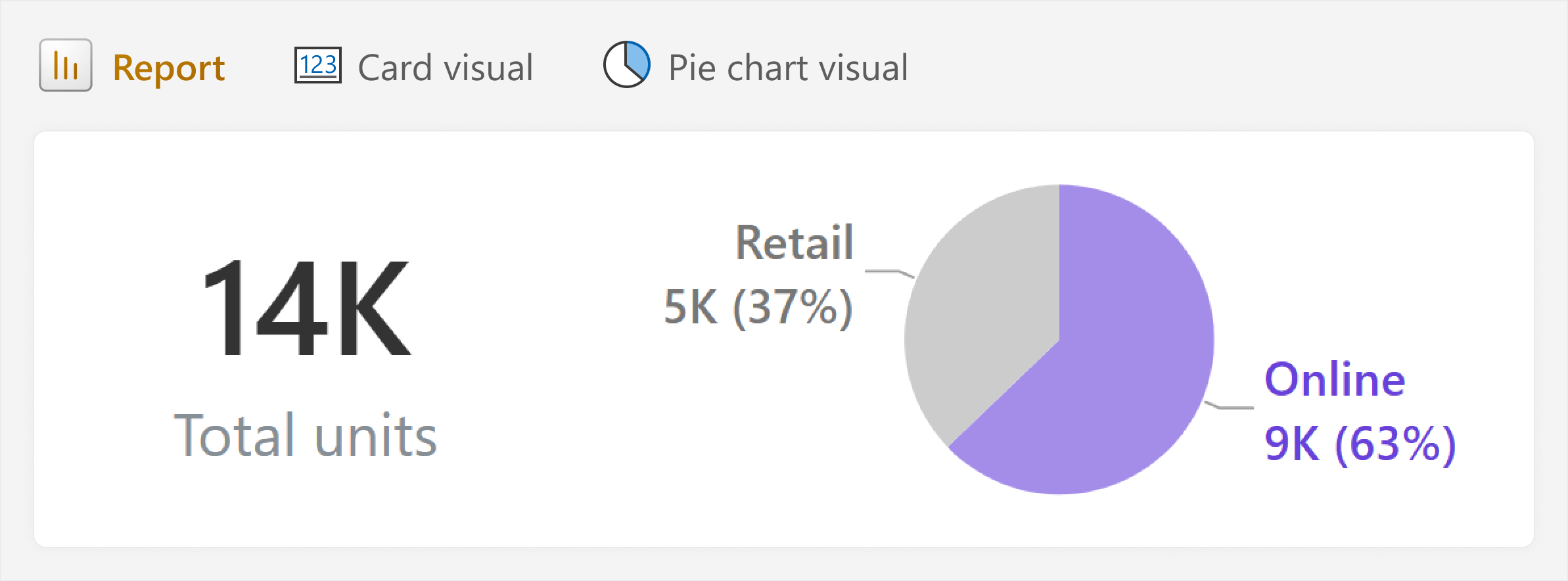
This article is about how rules like “avoid pie charts” can be useful for beginners, but also unhelpful in real-world scenarios with more nuance. Instead of learning rules about “how”, try to understand the “why”. Read more
-
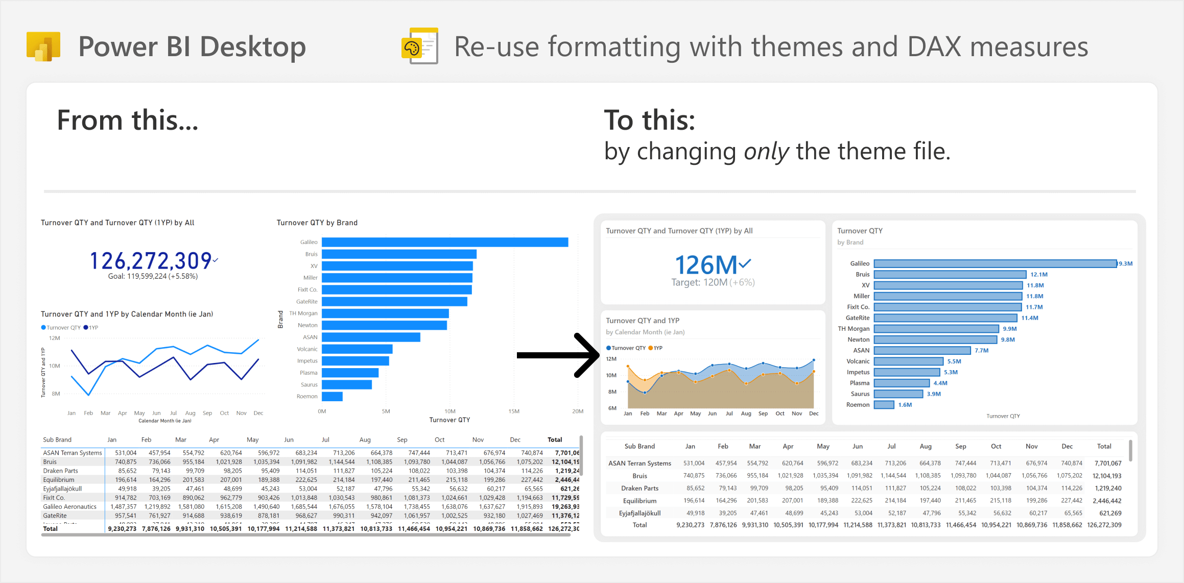
This article is about how you can save time when building and maintaining Power BI reports by using strategies to re-use visual formatting. Read more
-
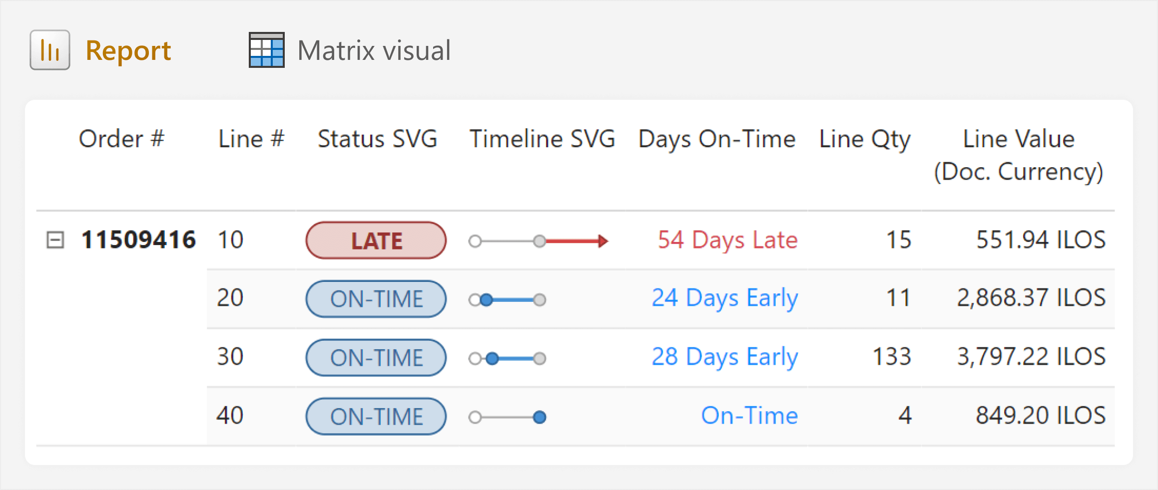
This article is about creating dynamic images in DAX measures to visualize data in tables or cards, including an easy way to do this in Figma, and a caution for using these DAX measures in real-life scenarios. Read more
