A little background: in these days I’m preparing sessions for some upcoming conferences in Italy (despite the English titles, most of the sessions will be in Italian: Microsoft SharePoint & Office Conference 2010 next week and Microsoft SQL Server & Business Intelligence Conference 2010 on April 20-22) and of course PowerPivot will be an hot topic. However, an important part of the puzzle is Excel Services, which makes the rendering on the web for this new self-service reporting environment. You know, a good picture worth a thousand words and for this reason I tried to push the rendering engine. And from here we start the discussion of this post…
Well, what is the state-of-the art of a dashboard? Is it a page full of gauges? Is it a thermometer? Is it a mix of pie charts, 3-d histograms and colored arts? Absolutely not. They don’t have value. They are good just for a demo, but in everyday work you want to examine correlations between data and having control of a large number of parameters and indicators.
Thus, a good collection of dashboards is available on the Excel Competition Dashboards page on BonaVista website (now acquired by XlCubed). Yes, they use a little component called Microcharts to do that, and in fact Excel 2010 has its own Sparklines but even with older versions of Excel you can get Sparklines for Excel for free using a free library written by Fabrice Rimlinger.
Well, it seems easy, the sexiest dashboard today strictly follows Stephen Few’s rules, which includes many important ideas of Edward Tufte. Now your dashboard is cool, life is good but… wait, you still have to publish it. Well, devil is in detail.
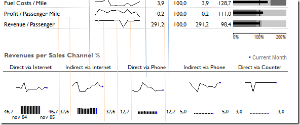
The most important feature I learnt of Excel when I started composing dashboard is the Paste Picture Link, which is illustrated in a short video you can find in this page. This feature is fundamental to get the desired layout without the alignment constraints of rows and columns typical of Excel. Just consider the dashboard published in this XlCubed demo and look at the following detail: how do you manage the different column alignment of the two bands in this picture?

Blue lines highlight the required alignment for some objects in the upper zone and orange lines highlight the alignment for the bottom part. Of course, you might spend hours of your life trying to merge columns in a way that match the requirements, but every time you want to move some object or insert something new in the middle, the nightmare begins! However, using Paste Picture Link feature, you simply design single components (having he same column/rows organization) of the dashboard in different (hidden) places of your Excel sheet and “paste” these components on your dashboard sheet, without worrying about alignment compatibility! And, as you can imagine, using the XlCubed Web Edition you can publish it on the web. But I don’t want to promote XlCubed, it’s just a good product that I want to use as a reference before someone says that doing this rendering is too complex. Someone else, smaller than Microsoft, already did it.
Well, you probably already know my point now. Excel Services 2010 has been improved, it has much more features than the previous edition, in the long term I understand that 90% of the reports will be Excel sheets published on SharePoint. It’s only a matter of time. But, today, the Paste Picture Link feature is not supported by Excel Services. That’s it.
Uh, before someone with a good sense of humor tries to suggest that PerformancePoint Dashboard Designer should be used to create dashboards, I want to underline that my initial reference to the dashboard gallery is not casual. But I will completely change my opinion about a dashboard product the day I will be able to create and publish the kind of dashboard that I can create since 2007 using Excel and XlCubed.Just to make an example of how you can do more (dashboards) with less (components).
PS: I like Excel and SharePoint 2010 – it’s a big improvement over previous version, but still far from competition if you consider more vertical products.