 Kurt Buhler
In many reports, it is common to find large tables or matrixes with a lot of information. Business users come to these reports to get the details they need to answer questions, make decisions, and take actions. However, these detailed tables can be inefficient, requiring users sort, drilldown, and filter them to find actionable data.
Consider the following example of a matrix to analyze gaps in year-over-year growth by product, and dissect those by region. In this scenario, the intended purpose of the report is for a sales team to analyze why we did not hit our revenue growth target.
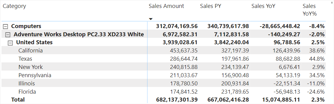
Despite being a simple example, the matrix is overwhelming. It is difficult and time-consuming for users to do the analysis, unless they already know what they are looking for. We can try to improve it by adding some formatting, but that will not solve our root problems:
- The user can only see a few rows at a time. They have a limited view of the full context of the data.
- The details do not rise to the surface. It is time-consuming and inefficient for a user to find the outliers and patterns, requiring that they sort and filter the table or use drilldowns.
- The view is inflexible. It shows regions by product, but what if we wanted to do the inverse—for instance—if we wanted to understand product sales within a single region. This often results in redundant, multi-page reports, with slightly different breakdowns of the same information.
One way to address these problems and improve the report is by using a scatterplot. Scatterplots are useful charts to help users quickly find actionable details, and use crossfiltering in Power BI, to drill for more information. Outliers and interesting groups of data points are easy to spot. For instance, consider the red circles on the top-left of the scatterplot below. A user can easily single out and focus on these products, as the visual makes those details rise to the surface, rather than forcing the user to find the details themselves in the adjacent matrix.
Reading and using a scatterplot
A scatterplot is a type of chart that shows the distribution (or scatter) of data points for two measures. In the chart, each data point represents a single member of a dimension; for instance, product or customer name. You read the values based upon where the data points are positioned in the plot.
A scatterplot is useful in scenarios such as the following:
- You have many data points, and want to view their spread or distribution.
- You want to identify outliers, or data points with exceptionally high or low values.
- You want to identify whether certain data points cluster or group together.
- You want to see how one or more data points are positioned compared to the rest.
- You want to explore a potential relationship between two variables.
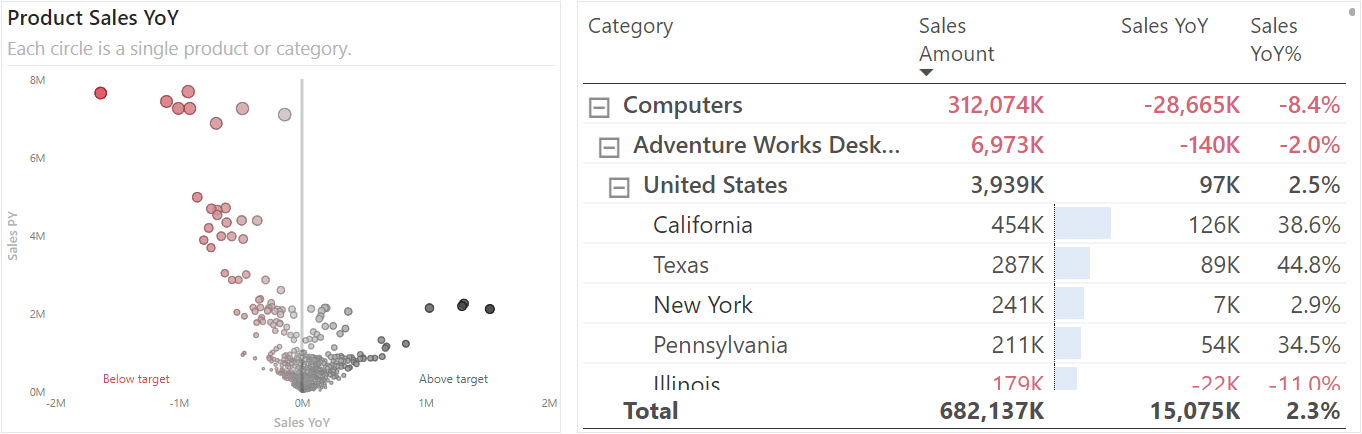
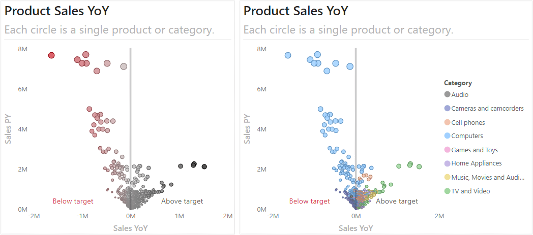
The following image shows two examples of scatterplots that illustrate these scenarios for products.
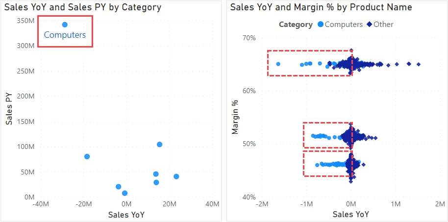
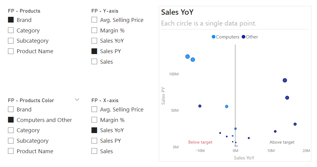
In the first example, we can clearly see that the Computers category is an outlier; it clusters away from the other product types, having both the highest previous year sales (Sales PY) and the lowest year-over-year sales (Sales YoY). For a user, this clearly shows that they should focus on the Computers category to understand why we did not make our growth targets.
Continuing the analysis, the second example shows many more interesting things. In this example, we are looking at the Margin % versus Sales YoY for individual products. We can clearly see that our products seem to cluster into a higher, medium, and lower margin segments. Additionally, products in the Computers category generally seem to have lower Sales YoY compared to products in all other categories (denoted by the dashed red boxes). Note however that this segment is only a subset of the products in the Computers category; the density of the other points hides many of the data points for other computers products. This scatterplot is good for an exploratory analysis to discover or highlight the possible segmentation, but a deeper analysis would be needed to obtain the final conclusions.
These two examples show how you can see a lot of valuable information clearly and efficiently by using a scatterplot.
Types of Scatterplots
There are different types of scatterplots, which are used in different scenarios. The first five (1-5) are all possible with the scatterplot core visual, while the rest (6-8) require the use of custom visuals in reports, or use in a Fabric notebook (for instance, by using Python packages to visualize data, such as seaborn).

- Scatterplot: The standard scatterplot.
- Animated scatterplot: A scatterplot that shows evolution by using the play axis animations.
- Bubble plot: When you want to view the data by three measures, where the third changes the size of the data points (or bubbles).
- Quadrant plot: When you want to classify the data points into four distinct segments, or quadrants.
- Volcano plot: When you want to see how data has changed between two conditions or time periods.
- Connected scatterplot: When you want to show the evolution of one or more data points for two measures.
- Joint plot or rug plot: When you want charts in the margin to show the distribution along the axis. A rug plot is typically more condensed than a standard joint plot that uses histograms.
- Swarm plot or strip plot: When you want to show distribution along a single axis (as opposed to two). While not explicitly a type of scatterplot, these charts are similar in appearance and worthwhile to mention. These plots can add random spacing (or “jitter”) to allow you to see the distribution. A swarm plot (also called a jitter plot) ensures data points do not overlap, whereas they can overlap in a strip plot.
There are also different alternatives to scatterplots, such as bivariate KDE plots (or density plots), bivariate histograms, and hexbin plots, which are more useful when you want to bin data because the number of data points is very high. However, like some of the last examples, you can only reasonably create these chart types with custom visuals in Power BI reports.
Another potential limitation for Power BI scatterplots is high-density sampling. This limits the number of data points shown at once for performance reasons. By default, this limit is set to 3,500, but you can increase it yourself to a maximum of 10,000. This means that if you want to see the distribution for 100,000 products, only a maximum of 10,000 will be shown, based upon the algorithm. You also cannot overcome this with custom visuals, which use a data reduction algorithm to limit data to the top N rows. However, this limit can be higher for most custom visuals (up to 30,000) and is highest for R visuals (150,000). The consequence is that it is possible your unfiltered chart misses data points when the total number is very high.
Depending upon your scenario and needs, you can use different kinds of scatterplots. In the following example, we show you step-by-step how to create a volcano plot (number 5 in the description above) to support a year-over-year analysis. In future articles, we will show other types of scatterplots and related visuals.
Creating a Volcano Plot
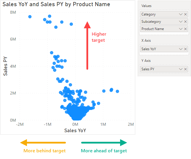
Returning to our original scenario, users want to examine year-over-year growth by product, to understand why we did not hit our targets last year. In this scenario, users want to identify which products require deeper analysis and follow-up actions. This is a good use-case for a scatterplot by product, specifically, a volcano plot to compare year-over-year. Volcano plots are commonly used for statistical analysis of biomedical data, like -omics analyses, but as we will see, it can be applied to many other scenarios outside of this use-case.
To make this plot, we should first add measures to the axes. Specifically, we add the target to the Y-axis, and the comparison to the X-axis. In this case, Sales PY is on the Y-axis, and Sales YoY on the X-axis. We then add the product hierarchy to the “Values” part of the visual. By adding the full hierarchy (and not just product name) we allow the user to perform a drilldown.
The result is a visual where data points further left are more behind target, and data points further right are more above target. The higher up the data point is, the higher the target.
Next, we should add formatting to make this chart more useful.
- Add a line to clearly denote zero. You can do this by using an X-axis constant line set to zero. This visually shows the clear point at which Sales YoY becomes negative or positive.
- Add labels by using transparent Min and Max constant lines, labelling the line names as “Below target” and “Above target”, respectively.
- Add descriptive titles and subtitles. This will help users understand and interpret the visual.
- Clean up lines and fonts. This will make the visual easier to read.
- Use size to help emphasize important points, by adding Sales to the “Size” property. This way, products that sold more will be larger, and receive more visual emphasis.
- Use conditional formatting to emphasize important points, like outliers, by coloring by Sales YoY. Alternatively, we can color by product category to visually identify segments.
- (Optional) Use zoom sliders to allow users to control the axes range and investigate more densely-clustered data points.
With these formatting changes, we have our volcano plot. The below image shows the two possible plots, depending on whether you chose to color dots by Sales YoY or Product Category.
While the scatterplot is already valuable on its own, we can get additional value from it in several different ways. The following sections outline three more advanced ways to further improve the use of scatterplots in your reports.
Example 1: Crossfiltering a detail table
One of the most powerful features in a Power BI report is the ability to crossfilter visuals with interactions. When you click on a data point in one visual, it filters or highlights other visuals to show you more information for that data point. With scatterplots, this is extremely powerful.
When users see a scatterplot, they usually want more details for the interesting data points. You can give them these details by using techniques such as tooltips and crossfiltering. For instance, you can include a detail table next to or below your scatterplot to provide supplemental information. This way, users can use the scatterplot to drive the table and get details only for the relevant datapoints. While you can select multiple points by using CTRL + left-click, this would be even better with a lasso selection, although that is not available in Power BI yet, unfortunately.
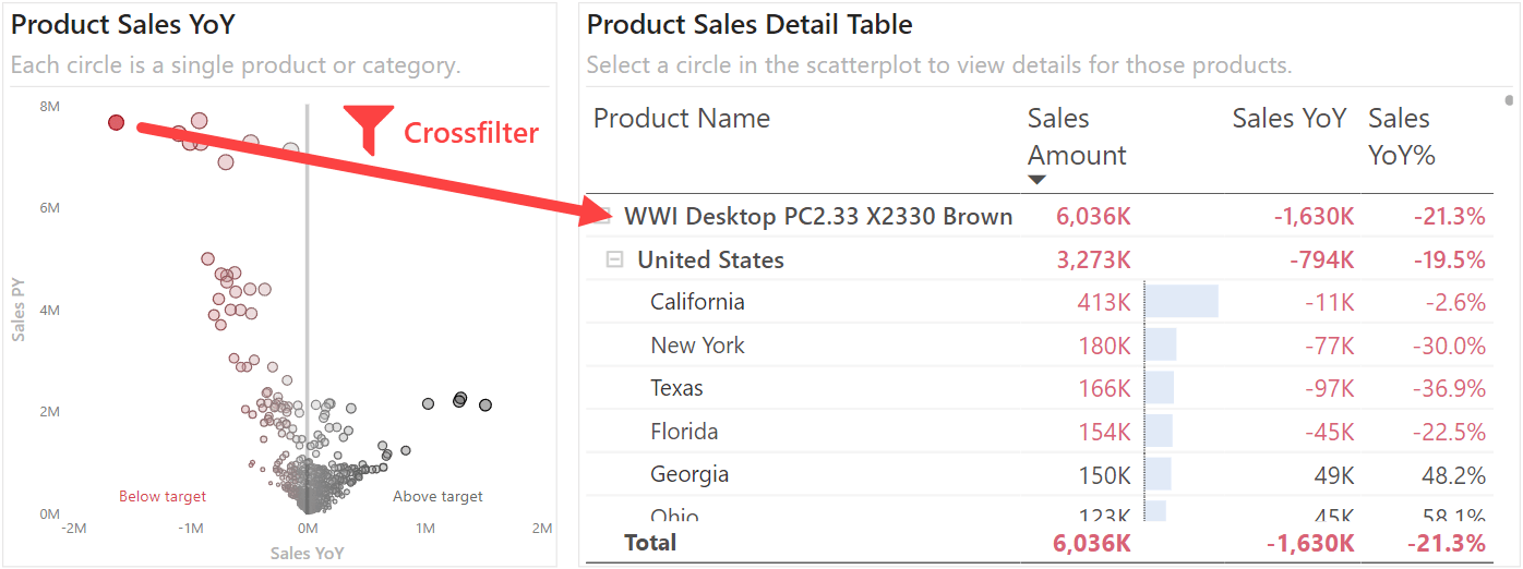
For more exploratory reports, you can even consider using two scatterplots that filter each other. This is particularly useful when examining patterns between two closely related attributes, like region and product. The following example shows what this can look like when you crossfilter from product to state, and vice-versa.
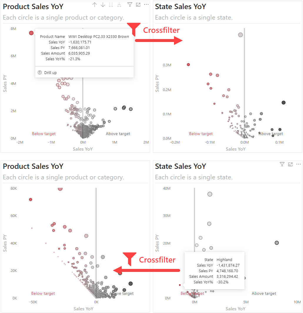
In the top example, we can see the distribution of Sales YoY by State for the “WWI Desktop PC”, which easily shows the regions most behind. Conversely, we can see the distribution of Sales YoY by Product Name for the “Highland” state, which shows the products most behind.
Crossfiltering is a powerful feature that can really improve how scatterplots are used in your reports.
Example 2: Pareto formatting
Another way to improve your scatterplots is to visually label or identify points that require particular attention. One example is by performing a pareto analysis. In a pareto, you identify which categories can explain a substantial increase in a variable. For instance, we can perform a pareto analysis on the products which have negative Sales YoY. In this analysis we refer to the negative Sales YoY as the gap. Specifically, it is a gap between current year sales (Sales Amount) and previous year sales (Sales PY).
To do this, we first create a measure to identify the gap in Sales YoY:
Pareto (Gap) =
-- Retrieve only the values for which Sales PY < Sales Amount (the gap)
    VAR _Actuals = [Sales Amount]
    VAR _Target = [Sales PY]
    VAR _Delta = _Actuals - _Target
    VAR _Gap =
        -- Intend to only compute the cumulative percentage for the negative values
        IF( _Delta > 0, BLANK( ), ABS( _Delta ) )

    RETURN
        _Gap
Afterwards, we create a second measure to compute the cumulative percentage for the gap by Product Name. This allows us to identify products that contribute the most to this gap in Sales YoY:
Pareto =
-- Cumulative percentage of the gap to find which products have the most significant contribution to negative Sales YoY
VAR _Gap = [Pareto (Gap)]

VAR _ByProductName =
    ADDCOLUMNS (
        ALLSELECTED ( 'Product'[Product Name] ),
        "@Gap", [Pareto (Gap)]
    )

VAR _Cumulation =
    FILTER (
        _ByProductName,
        [@Gap] >= _Gap
    )

VAR _CumulativeAmount =
    SUMX ( _Cumulation, [@Gap] )

VAR _Total =
    SUMX ( _ByProductName, [@Gap] )

VAR _CumulativePercentage =
    DIVIDE (
        _CumulativeAmount,
        _Total,
        BLANK ( )
    )

RETURN
    _CumulativePercentage
By using the previous measure with conditional formatting, we label red the products that contribute most to the gap in Sales YoY. This red label identifies the products that warrant more attention, so users can focus upon them, first. You can adjust this percentage threshold to make it stricter or broader, by adjusting the conditional formatting for the markers.
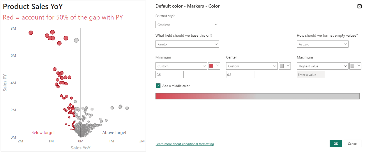
In this example, the red products have the biggest impact, so they are visually singled out for users. This is just one example. You can also use more sophisticated statistical methods to label points-of-interest, such as clustering by using dimensionality reduction techniques (like PCA or t-SNE).
Formatting can make it easier for users to find the important data points and spend less time looking at the chart.
Example 3: Field parameters
To further enhance your scatterplots, you can make use of field parameters. Field parameters let you dynamically select either dimensions or measures, and enable more flexible visuals. For instance, we can have a field parameter for users to select how they want to view the scatterplot, and also to select the measures along the X and Y axes. The following scatterplot shows an example of how this looks.
For more advanced users of reports, this can be an effective way to explore the data from different perspectives within a single report page. However, you should be mindful to only include combinations which make sense, so as to not confuse users. Additionally, field parameters are reporting objects, and it is important to be mindful that you do not add too many to your semantic models, as it can cause clutter and confusion for both developers and model consumers.
Conclusion
In reports, it is important that users can go from a high-level overview to details on demand. Scatterplots are one possible way to help you do this. When used effectively, scatterplots can help users identify actionable or interesting data points, particularly when used in combination with other advanced techniques in interactive reports, such as crossfiltering, formatting, and field parameters.