 Marco Russo & Alberto Ferrari
The Pareto analysis is an analytical technique used to identify the most impactful elements within a dataset, based on the principle that a small proportion of causes often leads to a large proportion of effects. For example, the ABC Classification in DAX Patterns is also based on the Pareto principle. However, typical implementations often face limitations. The analysis based on the Pareto principle commonly uses categorical axes, such as customer names or identifiers, making it impossible to leverage a continuous axis on a Power BI line chart. A categorical axis creates a scrollbar on the line chart when there are too many data points, limiting the ability to compare the distribution of data points in different categories within the same line chart.
This article shows how to overcome this limitation by introducing a numeric axis reflecting each item’s position based on the selected measure. This requires a complete dynamic calculation that also provides the following features:
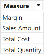
- Allows dynamic metric selection (e.g., Sales Amount, Margin) via slicers.
- Supports interactive filtering through other slicers (e.g., product brands).
- Enables comparative visualization of Pareto distributions across multiple countries within the same chart.
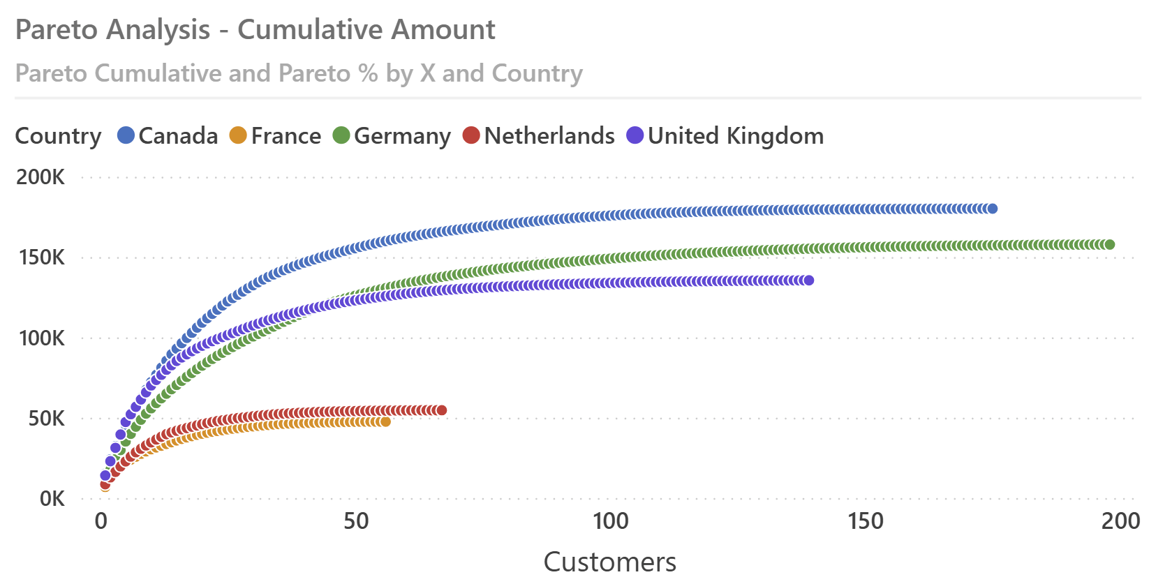
This results in the ability to create line charts like the following ones, which compare the cumulated distribution of customers in different countries based on a measure selected by the user.
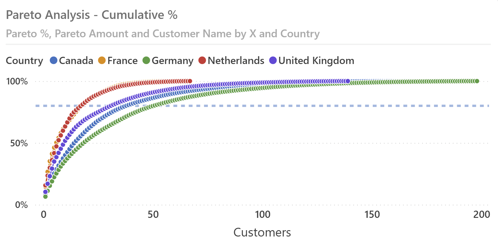
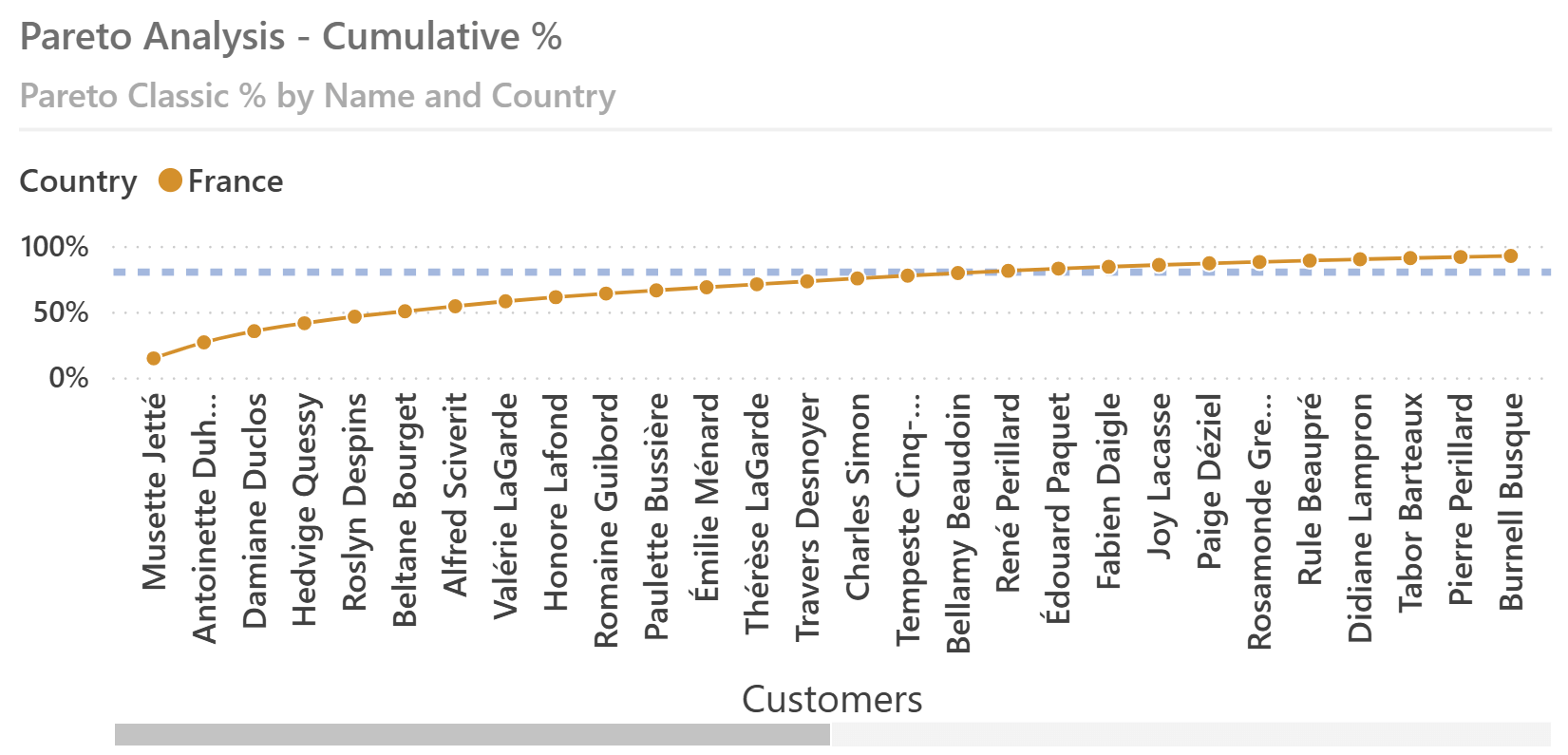
To show the importance of the continuous numeric X axis, here is the result of a classic Pareto analysis using a categorical axis with the customer name: with a single country selected, it is possible to see the customers needed to reach 80% of the total amount only when their number is small. Otherwise, you should use the scroll bar.
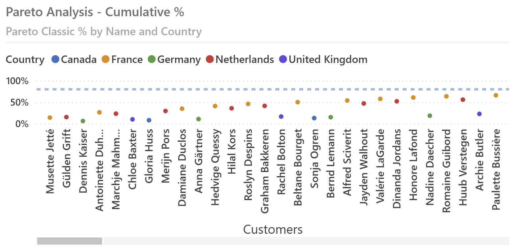
When multiple countries are selected, the line chart is useless because it does not connect customers of different countries—and only a small number of customers is visible without using the scroll bar.
Therefore, we will create a disconnected table to serve as a numeric continuous axis for the line chart and then implement measures that display the correct values using the current position on that axis.
Creating the dynamic numeric axis
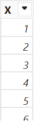
We create a calculated table to serve as a continuous numeric axis, numbering from 1 to the maximum number of customers:
X_axis =
SELECTCOLUMNS (
    GENERATESERIES ( 1, COUNTROWS ( Customer ) ),
    "X", [Value]
)
This table can be used as a continuous axis in a line chart. The X_axis calculated table must be included as a visible table in the semantic model; however, it should not have relationships with other tables.
Implementing dynamic metrics
We create a Metric table with a list of measures the user can select for the Pareto Analysis:
Metric =
SELECTCOLUMNS (
    { "Margin", "Sales Amount", "Total Cost", "Total Quantity" },
    "Measure", [Value]
)
We also create the Metric Value measure to return the value of the measure the user selects:
Metric Value =
SWITCH (
    SELECTEDVALUE ( Metric[Measure] ),
    "Margin", [Margin],
    "Sales Amount", [Sales Amount],
    "Total Cost", [Total Cost],
    "Total Quantity", [Total Quantity],
    ERROR ( "Measure not selected in Metric[Measure]" )
)
The ERROR function in the SWITCH call ensures that the model explicitly stops the execution when no valid selection is made. This prevents potential confusion due to missing or incorrect slicer selections.
Calculating the dynamic Pareto distribution
The core element of this scenario is the Pareto Cumulative measure, which dynamically calculates cumulative Pareto values based on slicer selections. This measure retrieves and sums the top customers for the metric selected:
Pareto Cumulative =
VAR x_pos = SELECTEDVALUE ( X_axis[X] )
VAR points =
    ADDCOLUMNS (
        VALUES ( Customer[CustomerKey] ),
        "@Value", [Metric Value]
    )
VAR cumulated_points =
    WINDOW (
        1, ABS,
        x_pos, ABS,
        points,
        ORDERBY ( [@Value], DESC, Customer[CustomerKey], ASC )
    )
VAR Result =
    SUMX (
        cumulated_points,
        [@Value]
    )
RETURN
    Result
The Pareto Cumulative measure involves three main steps:
- The points variable computes a table containing all visible customers and their respective metric values (@Value). Importantly, the visual should not include customer attributes on the X-axis. Hence, the calculation occurs only once for the entire visualization, even though the measure is invoked for each data point.
- The cumulated_points variable filters the top N points from the previously calculated points table, sorted by the selected metric in descending order. This selection represents the cumulative subset of customers up to the current position (x_pos) on the numeric axis. The WINDOW function implements this filter in a very effective way.
- Finally, the Result variable sums the metric values (@Value) from cumulated_points, providing the cumulative total at each position.
The result of the Pareto Cumulative measure allows the visualization of a line chart for each country for the selected brands. However, varying customer counts between countries complicate direct comparisons because each line reaches 80% of the total for the related country in a different position.
To make the comparison simpler, we need to use a percentage-based measure:
Pareto % =
DIVIDE ( [Pareto Cumulative], [Metric Value] )
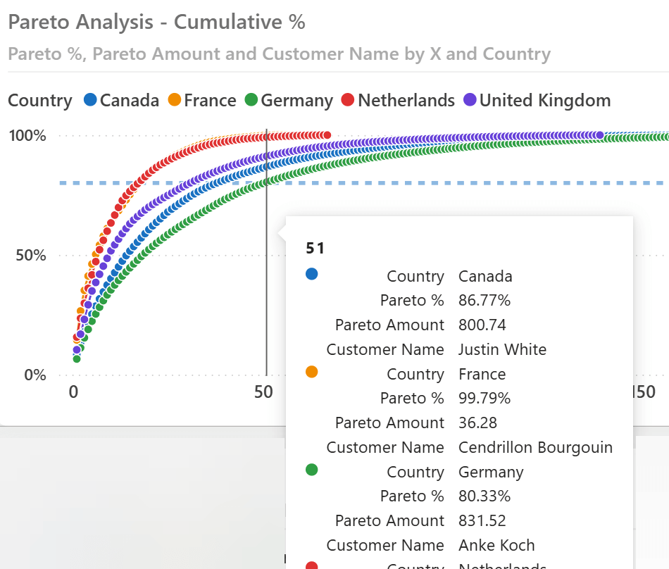
Plotting Pareto % on the Y-axis against the numeric axis allows more intuitive comparisons between different groups, like the customer countries used in this example. This is the same chart we have shown at the beginning of the article; the chart includes an 80% dashed reference line.
Displaying insights and tooltips
The previous visualization makes it easy to compare different trends, but it cannot provide insights about each data point – each customer, in this example. To provide this analytical capability, we can include a table with visual calculations, which works well for customers within a single country selected.
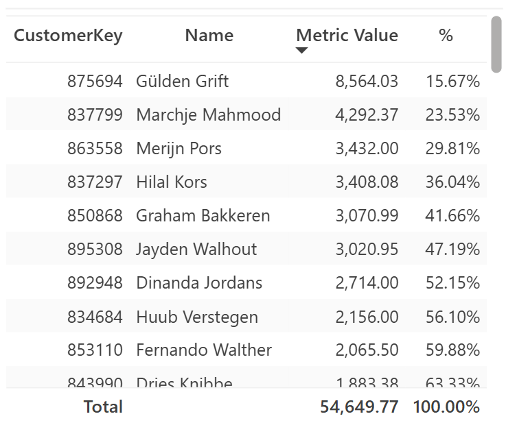
Because the visual displays all the selected customers, we can implement the hidden Running sum cumulative amount with a visual calculation:
Running sum =
SUMX (
    WINDOW (
        1, ABS,
        0, REL,
        ROWS,
        ORDERBY ( [Metric Value], DESC )
    ),
    [Metric Value]
)
By using the table visual, we implement the % visual calculation with a division that compares Running Sum with its total using COLLAPSE:
% =
DIVIDE (
    [Running sum],
    COLLAPSE ( [Running sum], ROWS )
)
The visual calculations described work well when a single country is selected. If you want to display the same insights for multiple countries, you should partition the calculation by Country and use a matrix to simplify the navigation.
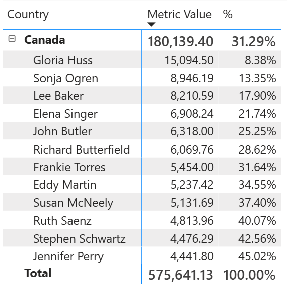
The % for a customer is the percentage within the corresponding country. In this case, the Running sum visual calculation uses the PARTITIONBY directive in the WINDOW function:
Running sum =
SUMX (
    WINDOW (
        1, ABS,
        0, REL,
        ROWS,
        ORDERBY ( [Metric Value], DESC ),
        PARTITIONBY ( [Country] )
    ),
    [Metric Value]
)
If you want to provide insights directly within the previous line chart, which displays multiple countries, you could add measures designed for the sole purpose of being displayed in the tooltips. For example, we can display the amount of each data point by using the Pareto Amount measure:
Pareto Amount =
VAR x_pos = SELECTEDVALUE ( X_axis[X] )
VAR points =
    ADDCOLUMNS (
        ALLSELECTED ( Customer[CustomerKey] ),
        "@Value", [Metric Value]
    )
VAR selected_point =
    WINDOW (
        x_pos, ABS,
        x_pos, ABS,
        points,
        ORDERBY ( [@Value], DESC, Customer[CustomerKey], ASC )
    )
VAR Result =
    SELECTCOLUMNS (
        selected_point,
        [@Value]
    )
RETURN
    Result
The tooltip shows the values of a customer in the selected position for each country in the visual.
The Customer Name displayed in the tooltip can be obtained with a measure similar to Pareto Amount. However, we suggest limiting the number of measures like this one because they are evaluated for each data point if they are used in the Tooltips section of the visual. To avoid this performance issue with a large number of data points, consider moving the tooltip to a separate report page so that it is executed for each data point. Here is the definition of the Customer Name measure, which includes the Customer[Name] column in the points variable because it is the value that Result needs. We use ALLSELECTED instead of VALUES or SUMMARIZE to populate the points variable because the Customer[Name] column is also used on the X-axis, and we must compute Metric Value for all the customers in the visual:
Customer Name =
VAR x_pos = SELECTEDVALUE ( X_axis[X] )
VAR points =
    ADDCOLUMNS (
        ALLSELECTED ( Customer[CustomerKey], Customer[Name] ),
        "@Value", [Metric Value]
    )
VAR selected_point =
    WINDOW (
        x_pos, ABS,
        x_pos, ABS,
        points,
        ORDERBY ( [@Value], DESC, Customer[CustomerKey], ASC )
    )
VAR Result =
    SELECTCOLUMNS (
        selected_point,
        Customer[Name]
    )
RETURN
    Result
Conclusion
The dynamic Pareto analysis technique demonstrated in this article enables dynamic metric selection, interactive filtering, and comparative visualizations. While visual calculations can be useful and more efficient for visuals providing detailed insights for individual customers, multiple groups in the same line chart require an implementation based on measures, and on a disconnected table used as a slicer to dynamically compute the values for each position in the Pareto distribution.
Raises a user specified error.
ERROR ( <ErrorText> )
Returns different results depending on the value of an expression.
SWITCH ( <Expression>, <Value>, <Result> [, <Value>, <Result> [, … ] ] [, <Else>] )
Retrieves a range of rows within the specified partition, sorted by the specified order or on the axis specified.
WINDOW ( <From> [, <FromType>], <To> [, <ToType>] [, <Relation>] [, <OrderBy>] [, <Blanks>] [, <PartitionBy>] [, <MatchBy>] [, <Reset>] )
Retrieves a context with removed detail levels compared to the current context. With an expression, returns its value in the new context, allowing navigation up hierarchies and calculation at a coarser level of detail.
COLLAPSE ( [<Expression>] [, <Axis>] [, <Column> [, <Column> [, … ] ] ] [, <N>] )
The columns used to determine how to partition the data. Can only be used within a Window function.
PARTITIONBY ( [<PartitionBy_ColumnName> [, <PartitionBy_ColumnName> [, … ] ] ] )
Returns all the rows in a table, or all the values in a column, ignoring any filters that might have been applied inside the query, but keeping filters that come from outside.
ALLSELECTED ( [<TableNameOrColumnName>] [, <ColumnName> [, <ColumnName> [, … ] ] ] )
When a column name is given, returns a single-column table of unique values. When a table name is given, returns a table with the same columns and all the rows of the table (including duplicates) with the additional blank row caused by an invalid relationship if present.
VALUES ( <TableNameOrColumnName> )
Creates a summary of the input table grouped by the specified columns.
SUMMARIZE ( <Table> [, <GroupBy_ColumnName> [, [<Name>] [, [<Expression>] [, <GroupBy_ColumnName> [, [<Name>] [, [<Expression>] [, … ] ] ] ] ] ] ] )