 Marco Russo
Update 2022-01-19: Added section “Auto date/time behavior”.
Implementing a classic Date table
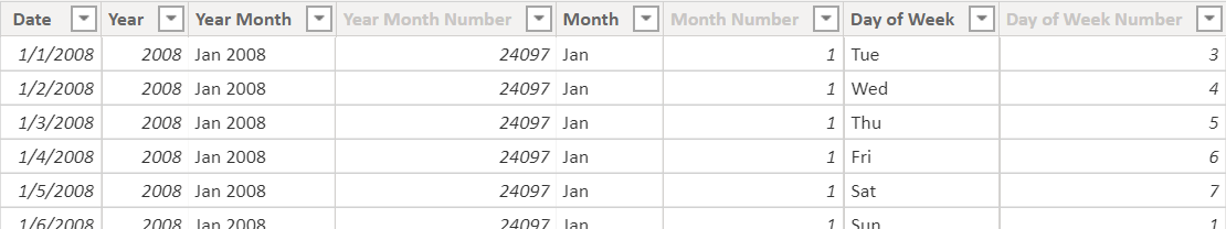
A Date table usually has columns such as Month and Day of Week that should be sorted by the underlying ordinal number – rather than by using an alphabetical order on the names of the months and days. In order to do that, we create two columns for these attributes: one column with the visible name, which is sorted by another column containing a number. For example, Month is sorted by Month Number in the following DAX calculated table:
Classic Date =
VAR FirstYear =           -- Customizes the first year to use
    YEAR ( MIN ( Sales[Order Date]  ) )
RETURN
ADDCOLUMNS (
    FILTER (
        CALENDARAUTO (),
        YEAR ( [Date] ) >= FirstYear
    ),
    "Year", YEAR ( [Date] ),
    "Year Month", FORMAT ( [Date], "mmm yyyy" ),
    "Year Month Number", YEAR ( [Date] ) * 12 + MONTH ( [Date] ),
    "Month", FORMAT ( [Date], "mmm" ),
    "Month Number", MONTH ( [Date] ),
    "Day of Week", FORMAT ( [Date], "ddd" ),
    "Day of Week Number", WEEKDAY ( [Date], 1 )
)
In the previous code, there are 12 names in Month (Jan, Feb, …), and 12 names in Year Month for each year (Jan 2008, Feb 2008, …, Dec 2008, Jan 2009, Feb 2009, …).
Year Month is useful to create charts like the following one.
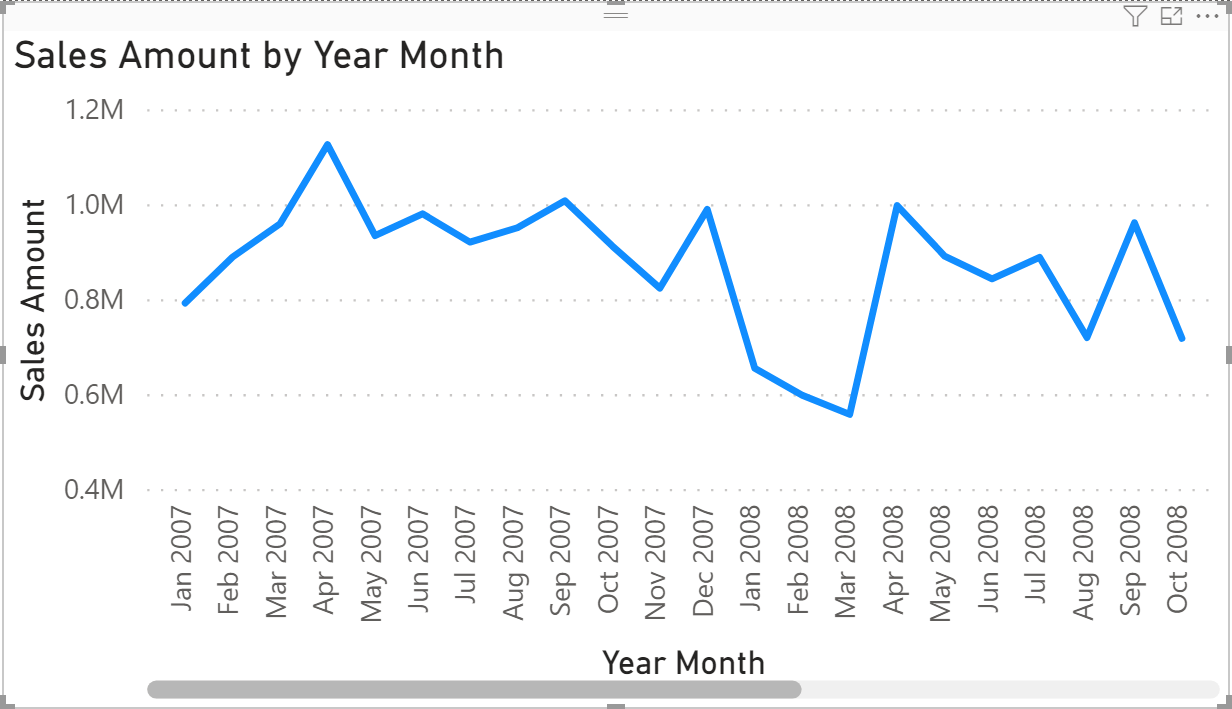
However, if a line chart has many data points in a small area, a scrollbar is displayed at the bottom. Indeed, because the X-Axis contains text and not numbers, it is of Categorical Type. In the article Improving timeline charts in Power BI with DAX, we showed how to create additional columns in the Date table to set the Continuous Type in the X-Axis. That additional column contains the first or last day of each time period to represent in the line chart. The only drawback of that approach is the additional number of attributes required in the Date table, but the result is what we expect: All the data points are visible in the line chart without the scrollbar, and the X-Axis adapts the density of the descriptions based on the space available.
Implementing a simpler Date table
With the recent introduction of custom format strings in Power BI, we can use a different approach that no longer requires additional columns, and that can also remove the need to use the Sort by Column feature. The basic idea is that we always store a date for a period like Year, Month, or Week. The custom format string displays the text we want to see in the user interface; however, because the underlying data is a number we automatically get the right sort order and the ability to use the Continuous Type in the X-Axis of a line chart.
This is our new definition of the Date table:
Date =
VAR FirstYear =           -- Customizes the first year to use
    YEAR ( MIN ( Sales[Order Date]  ) )
RETURN
ADDCOLUMNS (
    FILTER (
        CALENDARAUTO (),
        YEAR ( [Date] ) >= FirstYear
    ),
    "Year", DATE ( YEAR ( [Date] ), 12, 31 ),
    "Year Month", EOMONTH ( [Date], 0 ),
    "Month", FORMAT ( [Date], "mmm" ),
    "Month Number", MONTH ( [Date] ),
    "Day of Week", FORMAT ( [Date], "ddd" ),
    "Day of Week Number", WEEKDAY ( [Date], 1 )
)
UPDATE 2021-05-23: Based on comments we received to improve the visualization in the line chart, you might want to use the first day of year and month in the Year and Year Month columns – in that case, you could consider using these expressions in the previous formula:
    "Year", DATE ( YEAR ( [Date] ), 1, 1 ),
    "Year Month", EOMONTH ( [Date], -1 ) + 1,
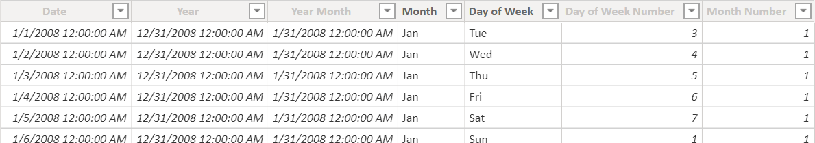
Without a proper format of the columns, the result of the Year and Year Month columns is not easy to read: it is the last day of the year and of the month, respectively.
The custom format string property of the columns can be modified in the diagram view. For example, this is the custom format applied to the Year Month column.
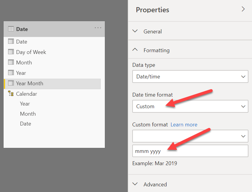
We apply the following format to the datetime data type columns of the Date table:
- Date: m/dd/yyyy (1/14/2008), used as a column to mark as date table
- Year: yyyy (2008)
- Year Month: mmm yyyy (Jan 2008)
We still use the classic approach with a text column and a numeric column for the sort order for the Month and Day of Week attributes. This is because we are unlikely to use a continuous line chart for these two attributes. The table with the formatted columns is the following.
Even though the format syntax is similar to the one supported by the FORMAT function, you have to be aware of a few differences and limitations. For example, there is no syntax available to display the quarter number from a date. You can find all the details about Supported custom format syntax in the Microsoft documentation.
NOTE: if you want to apply a prefix in the formatted string, use the backslash character (\) before every constant character that does not have to be interpreted as a custom format string. For example, for a column with the fiscal year you should use the expression \F\Y yyyy in order to obtain FY 2008 as a result.
The Date table has a hierarchy, even though this does not cause side effects on the format:
- Calendar: Year (Year), Month (Year Month), Date (Date)
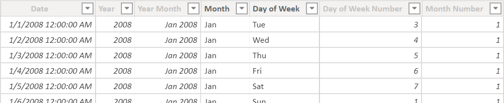
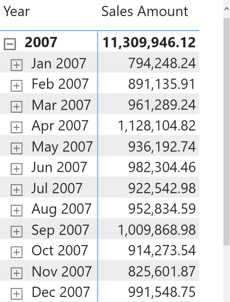
By using the new Date table, we obtain the following matrixes where the Year Month and Month columns display the desired text instead of the underlying dates.
One additional advantage of this approach is that you do not have to worry about the additional column used in Sort By Column in case you manipulate the filter context for a DAX calculation. You can read more about that in the article, Side effects of the Sort By Column setting in DAX.
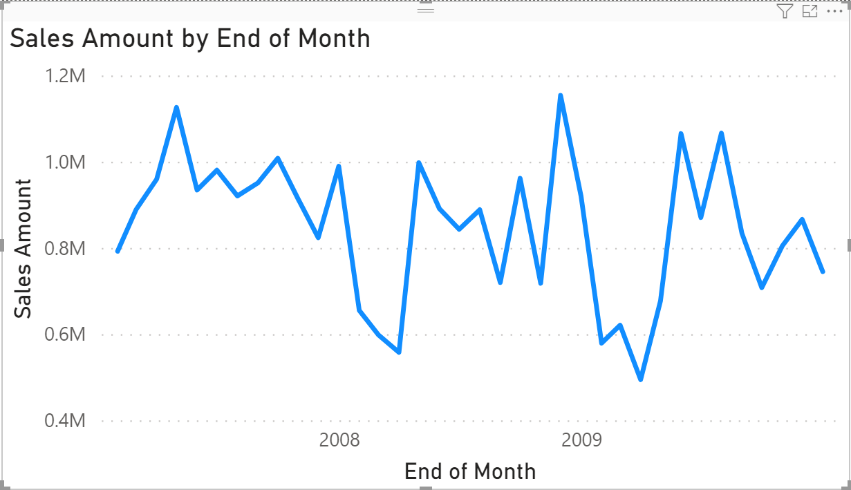
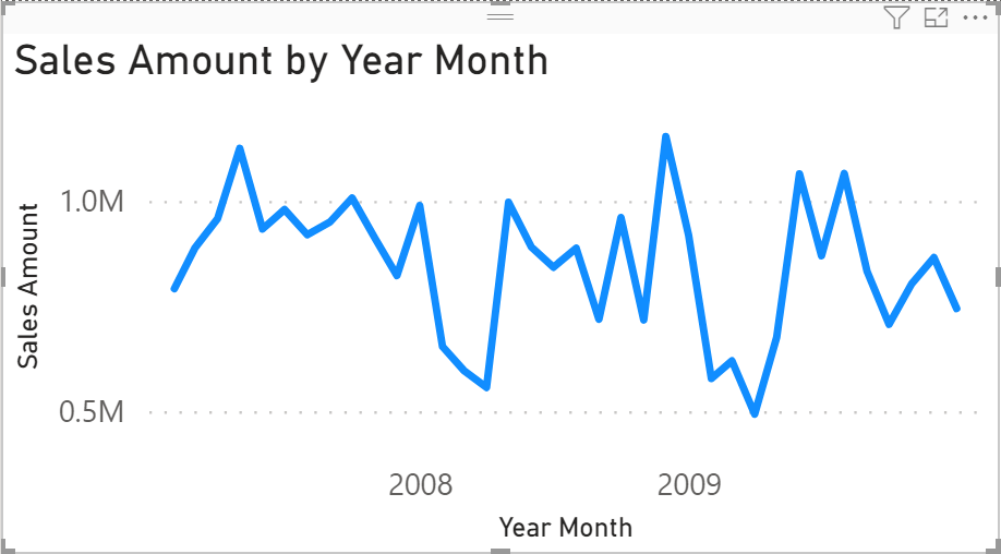
When we navigate the Year Month column using a line chart, we get the result we wanted.
Limitations and additional insights
Using a date data type for columns representing the year and the month (including the year) is a convenient way to control the display format and to continue to use the Categorical Type in the X-Axis of a line chart. Unfortunately, we cannot use this technique for the quarter because the custom format syntax does not support quarters. Thus, we should use the classic approach with two columns for the quarter level of a calendar hierarchy: one column contains the string (like Q1-2008) and one column contains the sort order. You can avoid the additional sort column only if you use a naming convention that automatically provides the right sort order, like 2008-Q1 instead of Q1-2008.
When you use a slicer with the “between” condition on a column like Year and Year Month defined with a datetime data type, the slicer always shows all the possible dates, even though the underlying granularity is by year or month. The selection will only include the entire month or year if the corresponding date is within the range, but the visualization may be misleading to the report user.
In the previous example, we continued to use a two-columns approach for the Month and Day of Week attributes. These columns hold only 12 and 7 values respectively, regardless of the number of years in the Date table. Therefore, it is not possible to define a corresponding date because January aggregates the dates in January of all the years included in the Date table.
However, it is possible to assign an arbitrary date for all the January dates, and another one for all the Monday dates. By properly setting the custom format string the user cannot see the difference, and the model only requires one column instead of two columns for each of these attributes. While this might simplify the manipulation of the filter context and may be considered a more “elegant” solution, in reality it does not provide a real advantage to the end users. They would see an arbitrary date by default when one of the Month or Day of Week attributes is applied to a line chart. In that case, the X-Axis Type should be changed from Continuous to Categorical to restore the right visualization. Because the goal of the article was to simplify the interaction with the report user, we did not use this approach in the proposed solution. In case you want to try this approach, you can try the Extreme Date table in the sample file, which assigns Month and Day of Week to arbitrary dates in 1900.
Auto date/time behavior
Another workaround to use the continuous axis is by using the same metadata used by the Auto date/time feature in Power BI. Automatic date table show a single hierarchy that uses a continuous axis even though the columns quarter and month are categorical. This can be obtained by using particular attributes of the date table:
- Date Table – property DataCategory: Time (this is automatically set by Mark as Date Table)
- Date Column – property DataCategory: PaddedDateTableDates (must be set with Tabular Editor)
- Year Column – property DataCategory: Years (must be set with Tabular Editor)
Moreover, the navigation must be done using a hierarchy: just placing individual attributes in the axis does not enable the Continuous axis type for the charts in Power BI.
Conclusions
A simpler date table can have a lower number of columns by you leveraging the custom format string. Removing the Sort By Column requirement also simplifies the DAX code if you manipulate the filter context. There is only one warning related to the small differences between the format syntax used by Power BI and by the FORMAT function in DAX. Use the Supported custom format syntax in the Microsoft documentation as a reference for Power BI.
Converts a value to text in the specified number format.
FORMAT ( <Value>, <Format> [, <LocaleName>] )