 Marco Russo
The line charts in Power BI are a useful visualization tool to display events happening over time. However, line charts return optimal results when used at the day granularity. To obtain the best visualization at other levels of granularity, it is necessary to apply changes to the data model and to write a DAX expression. In the following sections you will see how to:
- Control the properties of categorical line charts
- Use a continuous line chart for month and quarter granularities
- Implement the week granularity
- Hide incomplete weeks in case of a month/quarter/year selection
Managing categorical line charts with temporal data
Before analyzing the solution, we need to clearly state the problem. In the model used for the demo, the Date table contains a hierarchy with Year/Quarter/Month. If you build a line chart with Sales Amount and put the hierarchy on the axis, you obtain the following result.
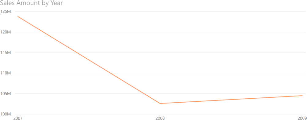
In the sample model, we use a custom Date table. However, if we had used the Auto Date/Time option in Power BI, the result would have been almost the same. Indeed, the presence of a hierarchy in the Axis property of the line chart makes Power BI show the first hierarchical level, which is the Year. As a result, the chart only contains three points, whereas users likely need more points to be able to draw any insights.
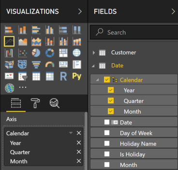
This is how the properties would look, when you use a custom Date table.
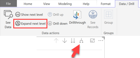
By pressing the Expand Next Level button highlighted in the next screenshot, you can navigate to the next level in the hierarchy applied to the Axis property.
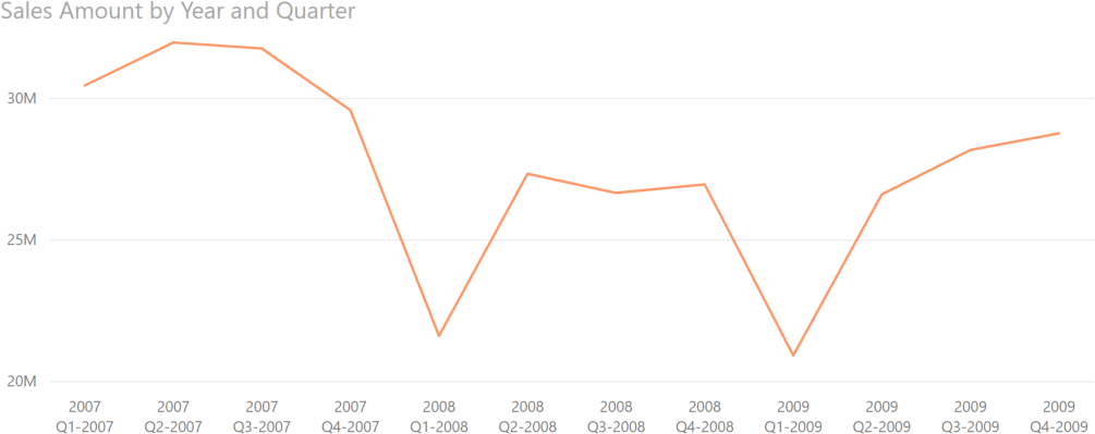
This action shows data at the Quarter level, which in this model is defined by using a string that includes both quarter and year, in turn making the quarter column unique for different years. The result seems redundant on the X-Axis, because the year is repeated twice for each data point.
By repeating the Expand Next Level operation, we navigate to the month level of the Calendar hierarchy.
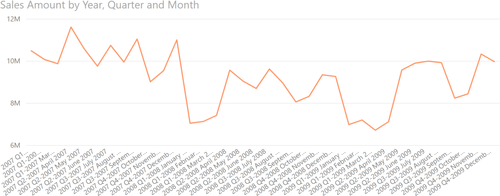
This visualization is confusing, because the year is repeated three times per data point label on the X-Axis. However, using quarter and month columns that only display the name of the quarter or month without the year would not entirely solve the problem. The year would still be duplicated for every point of the chart.
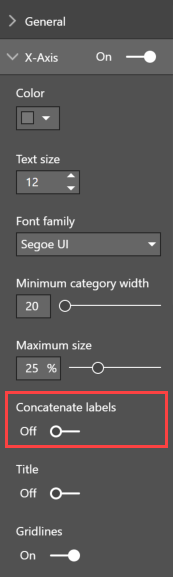
A partial workaround is to disable the Concatenate Labels property in the X-Axis section of the Line Chart visual, as highlighted in the following screenshot.
The result shown in the next screenshot is only marginally improved. Removing the year from the Quarter and Month level may improve the reading experience, but it is hard to think how to display more than 3 years in the same chart. Indeed, Power BI shows a label for each point creating a scrollbar that only displays part of the report when there are too many labels. (The next chart still has the year number in Quarter and Month level, though).

The last visualization displays 36 points. Increasing the number of years would make it unreadable in a single visualization. Moreover, expanding the chart to the week level would require the display of 52 points for each year, generating the same issue again: too many points, too many labels.
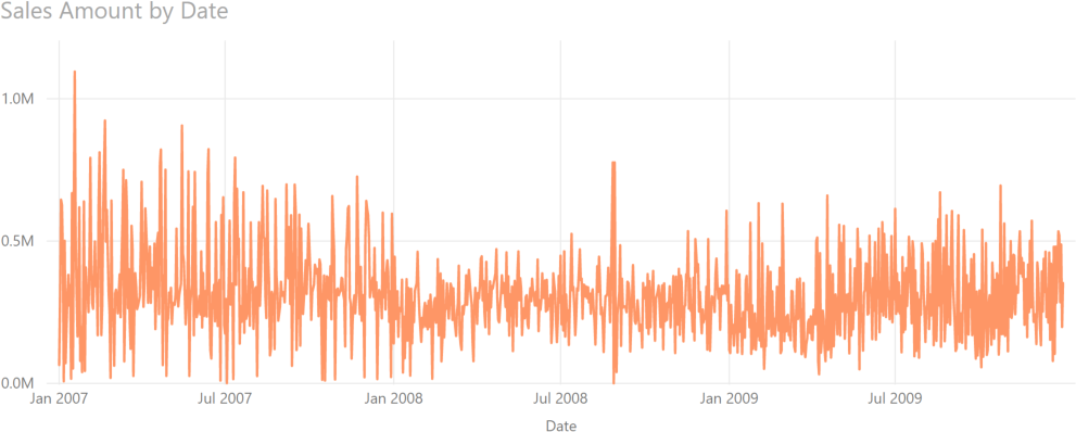
All the line charts used so far use the Categorical type, because the data is displayed using strings. The line chart offers an alternative visualization type called Continuous, which requires a number or date column for the Axis property. The Continuous visualization type displays a smaller number of labels for the Axis, because missing labels can be inferred by the distance from the existing labels. The Continuous visualization also features a special management of date columns, displaying a simplified Year-Month label. For example, the following screenshot displays the same measure as before, this time using the Continuous visualization type. The distance between labels can be inferred by the gridlines, which are applied to each visible axis label.
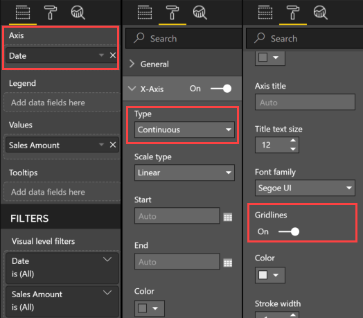
The Type property in the X-Axis area of the Line Chart properties can be set to Continuous because the Axis now has the Date column from the Date table, which is a Date data type. Only dates and numbers can be used with the Continuous visualization type. The Gridlines property is also enabled, and it is part of the same X-Axis area.
Continuous line charts improve the handling of labels, but we have been forced to use a daily granularity. This results in 1,000 points included in the line chart, but most importantly this might not be the granularity that the user wants to display. Better insights might be obtained by using a monthly or weekly grain. In the next sections, we show how to overcome this limitation by modifying the data model using DAX code.
Using continuous line charts at month and quarter granularity
The Continuous type of a line chart is only available for numerical columns. A date column is internally managed as a number and the Line Chart visualization also displays the dates in a smart way, as you have seen in the previous section. The Continuous visualization removes the need for a horizontal scrollbar in case there are too many points in the X-Axis, compressing all the data points within the same visualization. This behavior can also be useful when displaying data at a different granularity, such as months and quarters.
In other words, you need a Date column on the axis to use the Continuous visualization. Yet, with a lower granularity such as month or quarter, the column used to slice is typically a string, representing that month or quarter. In this scenario, it seems like you cannot use the Continuous type and you are forced to use the Categorical type (with all its constraints), but this is not true.
The way to unlock the Continuous type for different time periods is by displaying the desired granularity using a Date column that aggregates the entire period into a single date. The more intuitive approach is aggregating the entire period on the last date of the period itself. For example, we can create the following two calculated columns in the Date table.
Year-Month =
EOMONTH ( 'Date'[Date], 0 )
Year-Quarter =
CALCULATE (
    MAX ( 'Date'[Date] ),
    ALLEXCEPT ( 'Date', 'Date'[Year Quarter Number] )
)
We intentionally used two different techniques. The Year-Month calculated column computes the end of the month using the EOMONTH DAX function. This can work for any standard calendar. However, for custom calendars or for a granularity other than month, the technique used here to compute the Year-Quarter calculated columns is always valid: just use ALLEXCEPT, keeping in the filter context one or more columns identifying the period required. It is always a good idea to use a single column representing the required granularity. However, if the quarter were not unique for every year we would not have had the Year Quarter Number column; ALLEXCEPT ( ‘Date’, ‘Date'[Year], ‘Date'[Quarter Number] ) would have been required.
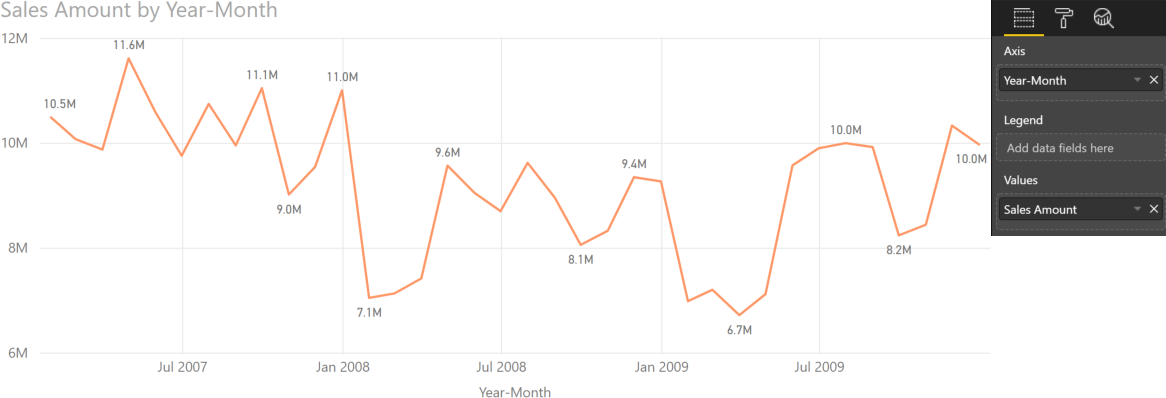
The following screenshot shows the Continuous visualization using the Year-Month column in the Axis property. We also enabled the Data Labels and X-Axis / Title properties for this chart.
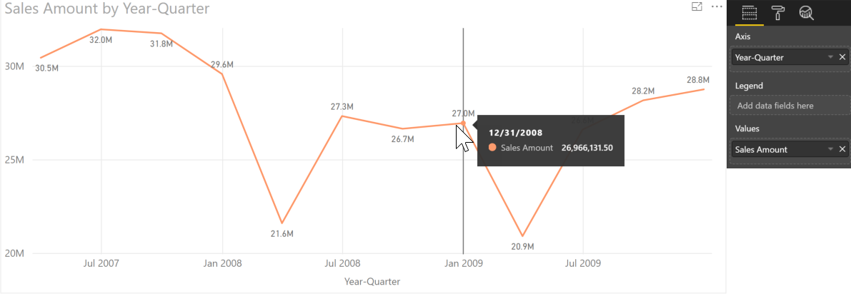
By replacing the Axis property with the Year-Quarter column, the granularity of the chart is quarterly. The only caveat is that by default in this case the tooltip will display the date used (end of quarter) as a label in the tooltip itself. A workaround is using the display format MMMM yyyy for the end of quarter and end of month columns. However, the end of the period would not clarify whether the granularity is by month or by quarter, therefore it is important to display the granularity in the Axis enabling the Title visualization, which we also enabled in the previous Line Chart computed using the month granularity (the following screenshot does not apply the MMMM yyyy format, which is used in the sample file you can download).
As you have seen, using a date to represent months and quarters proves to be a useful trick to unlock the Continuous visualization type. The next step is displaying data at the week granularity, as described in the next section.
Using continuous line charts at week granularity
Because weeks do not align with months, quarters or years, we need a week granularity column grouping all the days within the same week. We create two calculated columns in the Date table:
- YearWeekNumber computes a sequential number representing the number of weeks since a reference date. The FirstDayOfWeek variable in this DAX expression defines the first day of the week. The YearWeekNumber calculated column can be hidden.
- Week contains the last day of the week, computed using the technique previously shown to calculate the last day of the quarter – grouping dates by the YearWeekNumber column computed in the previous step.
YearWeekNumber =
VAR FirstDayOfWeek = 0 -- Use: 0 for Sunday, 1 for Monday, ... , 6 for Saturday
VAR FirstSundayReference =
    DATE ( 1900, 12, 30 ) -- Do not change this
VAR CalDate = 'Date'[Date] -- This is the date to compute
VAR FirstWeekReference = FirstSundayReference + FirstDayOfWeek
VAR YearWeekNumber =
    INT ( DIVIDE ( CalDate - FirstWeekReference, 7 ) )
RETURN
    YearWeekNumber
Week =
CALCULATE (
    MAX ( 'Date'[Date] ),
    ALLEXCEPT ( 'Date', 'Date'[YearWeekNumber] )
)
The result shown in the following screenshot uses the Week column in the Axis property.
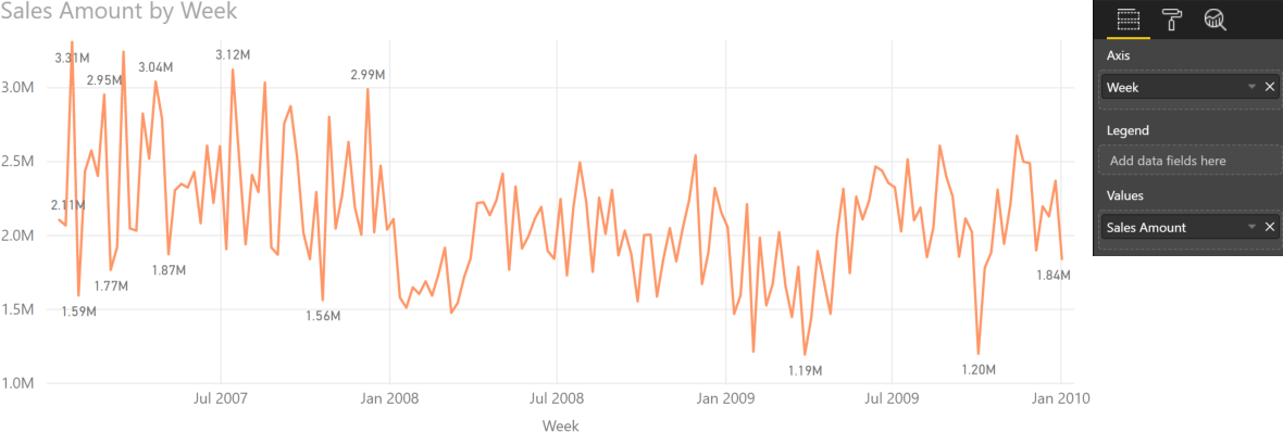
When displaying data at the week level, there are 52 data points for every year. The previous chart has 156 data points, so it could be useful to restrict the date range of the chart. However, if the calendar is not a week calendar such as a standard ISO, then the data of the first and last week of the selected time period might be incomplete. The next section describes how to manage this condition in a standard calendar.
Hiding incomplete weeks in visualization
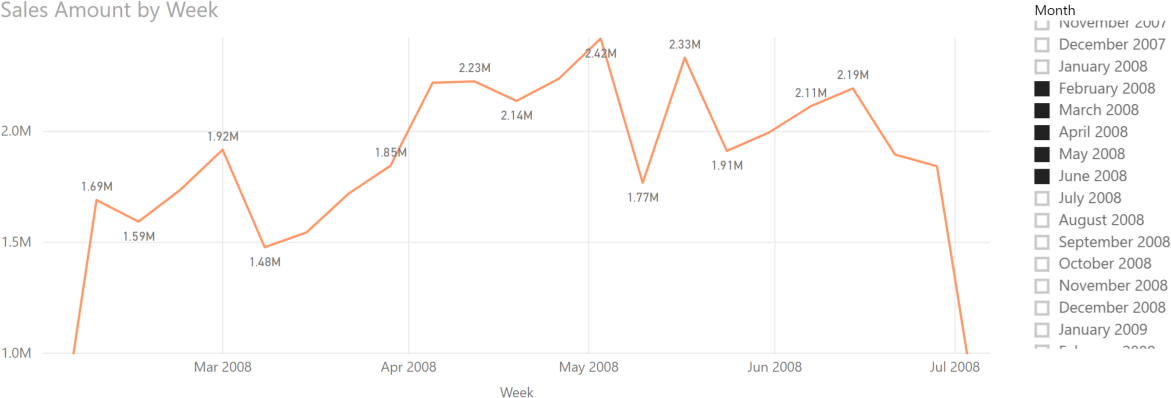
A date selection might include incomplete periods of time in the line chart, resulting in a poor visualization. For example, in the following screenshot we selected sales between February and June 2008. The first and last weeks in this range are incomplete, showing a small number relative to the rest of the line chart – the value seems to be below the minimum value set on the Y-Axis (1,000,000).
Showing the data in a matrix visualization provides more details about what is going on.
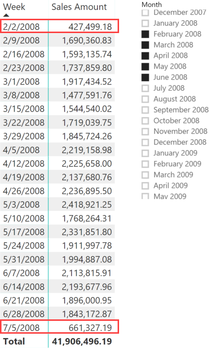
The first line pertains to the week ending on February 2, so Sales Amount only includes two days’ worth of sales (February 1 and 2) disregarding any sales occurring on any of the other five days that week (January 27 to 31). Same with the last week, which includes sales data from June 29 and 30 but does not include sales for the remaining five days that week (July 1 to 5). This also explains why the report includes a week ending in July 2008 although the Month slicer only includes dates up to June 2008.
We can create a measure that removes incomplete weeks from the calculation, as shown in the following code. A similar technique could be used for incomplete months and quarters.
Sales Amount complete weeks =
VAR FirstSelectedDate = CALCULATE ( MIN ( 'Date'[Date] ), ALLSELECTED() )
VAR LastSelectedDate = CALCULATE ( MAX ( 'Date'[Date] ), ALLSELECTED() )
VAR FirstWeekDate = CALCULATE ( MIN ( 'Date'[Week] ), ALLSELECTED() ) - 6
VAR LastWeekDate = CALCULATE ( MAX ( 'Date'[Week] ), ALLSELECTED() )
VAR BeginFilterDate =
    IF (
        FirstSelectedDate > FirstWeekDate,
        FirstWeekDate + 7,
        FirstSelectedDate
    )
VAR EndFilterDate =
    IF (
        LastSelectedDate < LastWeekDate,
        LastWeekDate - 7,
        LastSelectedDate
    )
VAR FilterDates = DATESBETWEEN ( 'Date'[Date], BeginFilterDate, EndFilterDate )
VAR Result =
    CALCULATE (
        [Sales Amount],
        KEEPFILTERS ( FilterDates )
    )
RETURN Result
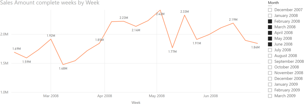
By using the new measure, the Line Chart visualization now removes the first and the last data points, showing more reassuring figures.
The behavior of the “Sales Amount complete weeks” measure is clearer when comparing it side-by-side with the Sales Amount measure in a matrix visualization.
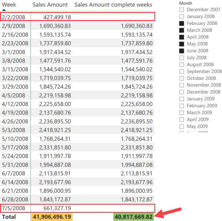
The new measure returns a blank value for the two incomplete weeks. Moreover, the filter technique used in the “Sales Amount complete weeks” measure also works at the Total level; it only includes the complete weeks without requiring an expensive iteration over weeks to obtain the correct result. This result is useful to compute an average by week, which would otherwise be polluted by the presence of incomplete weeks if one were using the regular Sales Amount measure.
Conclusion
This article described several techniques to improve the visualization of measures in a Line Chart using the Date table at different granularities in the X-Axis. These techniques can be adapted to any non-standard calendar. The important takeaway is that by using DAX and by applying small changes to the data model, it is possible to overcome certain limitations of the existing visualizations.
Returns the date in datetime format of the last day of the month before or after a specified number of months.
EOMONTH ( <StartDate>, <Months> )
Returns all the rows in a table except for those rows that are affected by the specified column filters.
ALLEXCEPT ( <TableName>, <ColumnName> [, <ColumnName> [, … ] ] )