 Marco Russo & Alberto Ferrari
DAX is a powerful tool in the hands of a Power BI developer. Using simple DAX formulas, you can not only compute interesting metrics but also customize the behavior of Power BI visuals. In this article, we use DAX to control the range of charts to obtain more coherent visualizations.
Set data range regardless of slicer selection
We start with a couple of simple examples: the first shows how to define the range of a chart independently from the user selection in slicers. We then synchronize the ranges of two charts that slice data by different columns. Finally, a third example shows how to use a similar method to compare two brands chosen with two different slicers. This last scenario is derived from a student question: for that case, we will first quickly describe the incomplete solution that does not involve using DAX, then we will do some thinking, and finally produce the solution that requires minor model changes along with some DAX code.
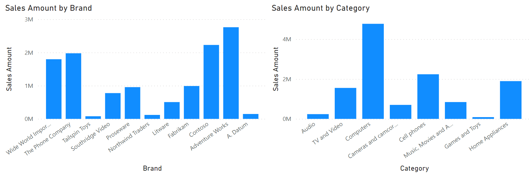
The first report example contains one slicer and one column chart.
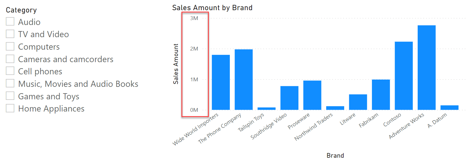
There is nothing special here: the slicer selects one or more categories; the chart shows Sales Amount sliced by brand. However, focus on the red box that highlights the Y-axis range. The range goes from zero to 3M, and it has been automatically computed by Power BI because we used Auto for the minimum and maximum values of the Y-axis.
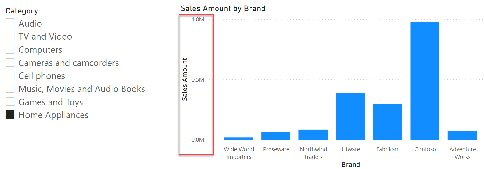
Whenever the visual is updated, Power BI computes the values, finds a suitable range, and then uses the dynamically-computed range to generate the chart. The feature works smoothly, but its inconvenient is that the range changes depending on the selection. If we select Home Appliances in the Category slicer, the range changes from zero to 1M.
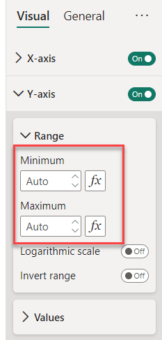
What if we want the range to remain the same as it was with no selection, from zero to 3M? We have two options: we either manually enter the range and obtain a partial solution that requires being updated when the data changes; or, we rely on DAX to compute the range automatically.
We can author a measure that computes the maximum Sales Amount by Brand regardless of any selection on the category. We can then use that measure to define the maximum value of the Y-axis:
Y-Axis range all categories =
    CALCULATE (
        ROUNDUP (
            MAXX (
                VALUES ( Product[Brand] ),
                [Sales Amount]
            ),
            -6
        ),
        REMOVEFILTERS ( Product[Category] )
    )
There are a couple of interesting things to note here. First, we used ROUNDUP to obtain a range in the order of millions by using six digits on the left of the decimal point. If we had not, the range would have used some weird number like 2.87M, which is not very user friendly. Second, we used CALCULATE to remove the filter only on Product[Category]. Depending on the requirements, you can use a different filter context to obtain the range required.
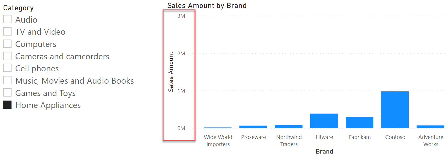
By us using this measure as the expression of the maximum Y-range, the report does not change the scale, even in the presence of a filter from the slicer.
Synchronize data range on two charts
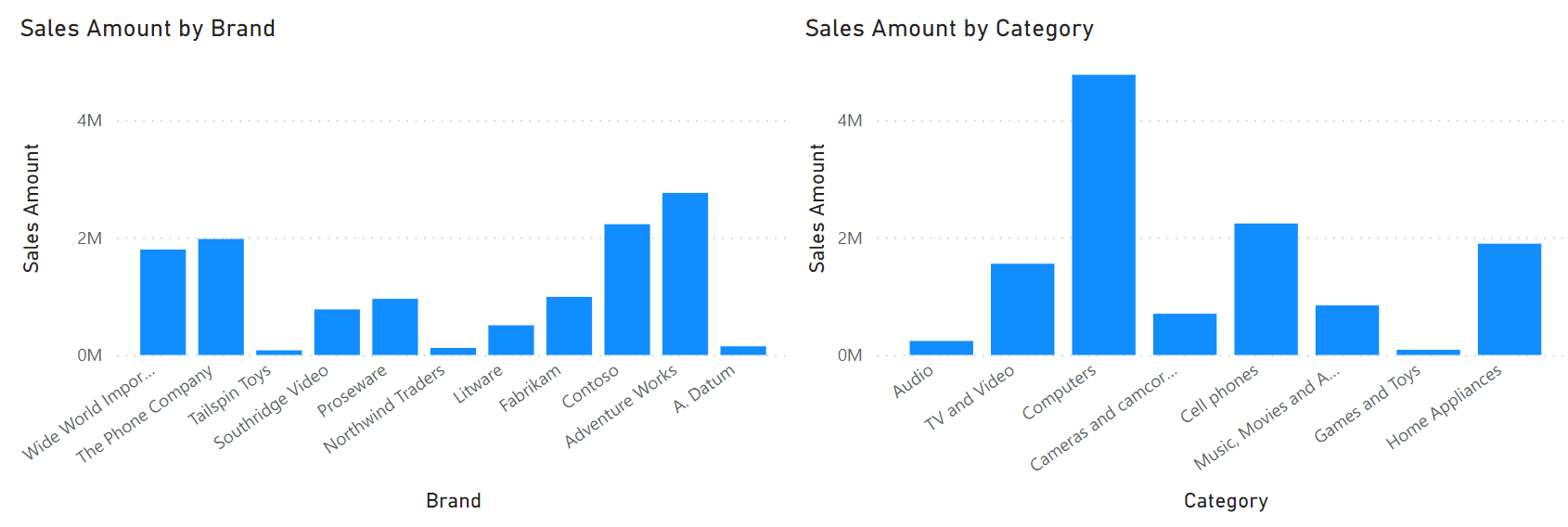
The first scenario was intentionally simple; an easy warm-up. The second scenario involves two charts: one by Brand and one by Category.
The two charts are positioned so that it becomes natural for the reader to compare the heights of the bars. Unfortunately, because the range of the two visuals is computed independently, they do not share the same Y-axis range. One goes up to 3M, the other to 5M.
We can use the technique used in the previous example. However, this time we need to find the maximum of two sets: one is the set of brands, and the other is the set of categories:
Y axis range Brand and Category =
    VAR MaxRangeByBrand =
        ROUNDUP (
            MAXX (
                VALUES ( Product[Brand] ),
                [Sales Amount]
            ),
            -6
        )
    VAR MaxRangeByCategory =
        ROUNDUP (
            MAXX (
                VALUES ( Product[Category] ),
                [Sales Amount]
            ),
            -6
        )
    VAR Result = MAX ( MaxRangeByBrand, MaxRangeByCategory )
    RETURN Result
The code is straightforward. It basically duplicates the same logic as before, and then computes the maximum of the two variables. Once that maximum is used as the maximum Y-axis value in both charts, the columns can be compared visually.
Synchronize data range for two different selections
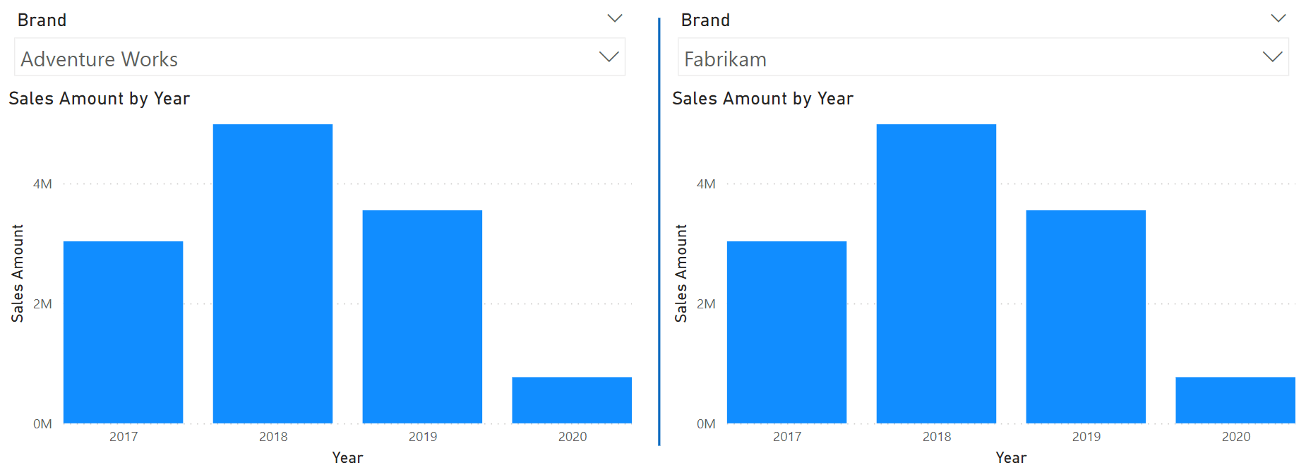
The last scenario we want to solve was brought up by a student who inspired this article. The purpose is to compare the yearly sales of two arbitrary brands, side-by-side, using two column charts. We can obtain the following report by creating two slicers, two charts, and then carefully set the visual interactions so that each slicer operates on its own chart.
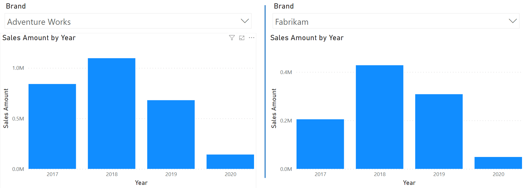
Despite this working, the two charts cannot be visually compared because their Y-axes do not show the same range. We would like to obtain the maximum yearly sales of both Fabrikam and AdventureWorks, then use that value as the top range of both visuals.
Unfortunately, this time the scenario is harder to solve. The visual on the left filters Adventure Works and has no clue about Fabrikam being selected in the visual on the right. This is due to how we set visual interactions. We must enable visual interaction between the slicer on the right and the column chart on the left, to propagate the filter from the right onto the visual on the left. However, by doing this, we would prevent the report from working because the two slicers would filter different brands, resulting in an empty selection.
The solution requires two additional tables. We do want the filter from both slicers to reach both visuals; however, we want to control how the filter operates on both the value displayed and the calculation of the Y-axis range.
We first create two additional tables, disconnected from the model, that contain the values of the brands:
Brands 01 = ALLNOBLANKROW ( Product[Brand] )
Brands 02 = ALLNOBLANKROW ( Product[Brand] )
The two tables have no relationship with the other tables in the model.
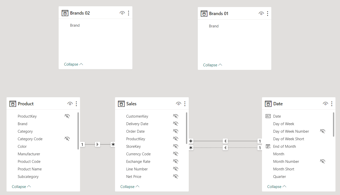
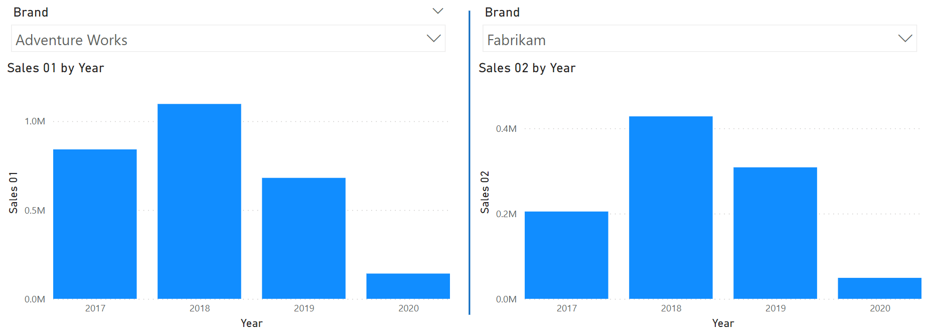
We then use the two tables as the sources for the slicers. By doing this, the column charts stop making sense because there is no active filter on Sales. Therefore, the values in the charts always compute Sales Amount for all the brands.
The next step is to restore the visual interactions so that both slicers operate on both visuals. We create two measures that read the content of the correct slicer to compute the value for the chart:
Sales 01 =
CALCULATE (
    [Sales Amount],
    TREATAS ( VALUES ( 'Brands 01'[Brand] ), 'Product'[Brand] )
)
Sales 02 =
CALCULATE (
    [Sales Amount],
    TREATAS ( VALUES ( 'Brands 02'[Brand] ), 'Product'[Brand] )
)
Using the two measures brings us back to the visualization we had at the beginning, with the noticeable difference that the visual interactions are now all active. Therefore, in both charts, we have the option of reading the content of both slicer selections.
We can now author a measure that reads the content of both slicers and computes the maximum yearly sales of both brands:
Y-axis range both brands =
    VAR Range01 = MAXX ( VALUES ( 'Date'[Year] ), [Sales 01] )
    VAR Range02 = MAXX ( VALUES ( 'Date'[Year] ), [Sales 02] )
    VAR Result = MAX ( Range01, Range02 )
    RETURN
        Result
Using this measure as the maximum range for the Y-axis, we obtain the desired report.
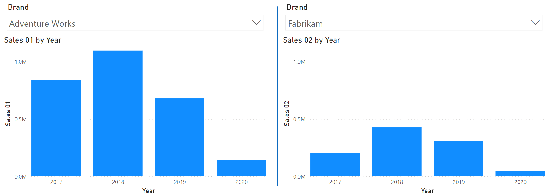
Both visuals now show the same range, and users can visually compare the columns.
Conclusion
As you have seen, DAX is a vital part of Power BI. Not only is it helpful to compute values. With some creativity and with basic data modeling skills, you can obtain nice and coherent visualizations.
Rounds a number up, away from zero.
ROUNDUP ( <Number>, <NumberOfDigits> )
Evaluates an expression in a context modified by filters.
CALCULATE ( <Expression> [, <Filter> [, <Filter> [, … ] ] ] )