 Marco Russo
Every visual element in a Power BI report must complete a number of tasks to provide its result. Visuals showing data must generate one or more DAX queries to retrieve the required measures by applying the correct filters. The execution of these queries increases the wait for the end user and increases the workload on the server – especially when multiple users access a report at the same time. In order to improve the performance and scalability of a report, the best practice is to reduce the number of visuals consuming data on any one page of a report.
The focus is on a single page of the report. Power BI only fetches data and builds the visualizations required for the active page of a report. When the user switches their focus to a different page, the waiting time only depends on the visuals of the new page. The content of the other pages of that report is not relevant as far as performance is concerned. The goal is to reduce the number of visuals in a single page of a report. This makes it challenging to achieve the desired report layout; however, we can look for the right visualization once we realize that the number of visuals in the same page is negatively affecting the user experience.
Analyzing the original report
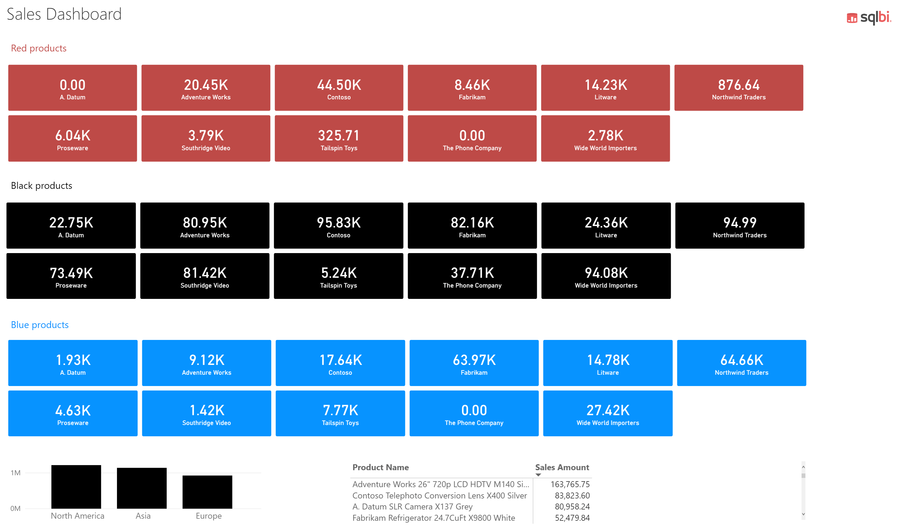
For example, the following report shows one card visual for each box representing the sales of a brand in a different color.

The report contains 33 card visuals, one column chart, and one matrix, each populated by a different DAX query. There are another four text boxes and one image that do not come from DAX queries. The rendering time of this page executed on a very powerful desktop is 2.7 seconds. We consider this to be unbelievably bad performance, since the slowest DAX query in the report runs in 22ms. You can see the exact timing on your computer by enabling the Performance Analyzer pane. You then:
- Click on Start recording.
- Click Refresh visuals.
- Sort by Total time in a Descending

By clicking on Refresh visuals again, we could see a different sort order; still, the overall execution time should be similar. In this example, the slowest visual in the page was the “Red – Contoso – Card” which displays 44.50K as the Sales Amount of red products for the Contoso brand. By expanding this node in the list provided in the Performance Analyzer pane, you can see that most of the time is spent in “Other”.

The meaning of “Other” is that this visual had to wait for other tasks to be completed before being able to execute the DAX query and render its result. Because the report contains 40 visuals, 35 of which execute at least one DAX query, some visuals must wait for other visuals to complete their task before they are able to perform any action.
You can also export this result in a JSON file using the Export link, and then analyze the events in more detail. For example, the actual cost of the DAX query execution in the Analysis Services (AS) engine is just 123ms, whereas the overall cost of the aggregated DAX query events is 539ms. The difference between these numbers is the overhead generated by 35 requests made to the AS engine. Benchmark data is available in the PerformanceOriginalCards.pbix report included in the samples files.
Creating the optimized report
How can we improve the performance, all the while returning the same layout? We need a single visual that produces the same illustrative effect as many cards. For example, by using Card with States by OKVIZ we can create a grid of cards where a measure is repeated for each value of a column. This custom visual is available for free in the AppSource marketplace, and the latest private version is also available at https://okviz.com/card-with-states/ . Even though the marketplace displays the message “May require additional purchase”, all the features are free. All you need to do is register on the OKVIZ website for your free lifetime license.

We replaced each set of card visuals for one of the colors (red, black, and blue) with a single instance of Card with States. We do this by specifying the corresponding color measure (Red Sales for the red color) and the Brand column as a Category.

By setting the properties of the visuals properly, we obtain an identical rendering for our report.
The real difference is the performance obtained by reducing the number of visuals in the report. If we repeat the Refresh visuals operation in Performance Analyzer, we see that the slowest visual is refreshed in 310ms and that we now have only 5 visuals being generated by DAX queries.

Because we removed 30 visuals from the report, first we greatly reduced the workload on the AS engine, and second we improved the scalability of our report when executed by multiple concurrent users. Last but not least, the refresh of the page went down from 2.7 seconds to 0.3 seconds, saving 88% in execution time. This is a massive improvement of one order of magnitude, achieved without changing any part of the data model.
If you export that result in a JSON file using the Export link, the detailed analysis (included in PerformanceCardWithStates.pbix) shows the following:
- the actual cost of the DAX query execution in the AS engine is now 12ms (formerly 123ms),
- the overall cost of the aggregated DAX query events is 21ms (formerly 539ms).
If you look at the previous screenshots, you might notice that the rendering time of Card with States is 181ms – see Visual display – which is much more than the original card (13ms). However, the aggregated rendering time of all the visuals in the new report is now 764ms; that same operation in the original report took an aggregated rendering time of 1,331ms.
The following table compares the metrics between the original and the optimized reports.
| Original report | Optimized report | |
|---|---|---|
| Card visual | Card (default) | Card with States |
| Number of card visuals | 33 | 3 |
| Number of DAX queries | 35 | 5 |
| Execute Query (AS) event duration | 123ms | 12ms |
| Execute DAX Query event duration | 539ms | 21ms |
| Render event duration | 1,331ms | 764ms |
| User waiting time duration | 2,700ms | 310ms |
You may wonder how it is possible that the report completes the operations in 310ms – which is half of the total rendering time in the optimized report. You want to keep in mind that Power BI can parallelize the execution of different tasks. There is a limit to this parallelism and 35 visuals cannot be executed and rendered in parallel. When you have only 5 visuals generating queries in a report, the parallelism is more effective.
Conclusions
This article shows that the number of visuals in a report can degrade the performance by one order of magnitude, compared to the results obtained by using a smaller number of visuals. At the time of writing, Power BI does not have a generic “small multiples” feature to automatically create multiple copies of the same visual based on the value of an attribute, such as the Brand attribute used in this article. The AppSource marketplace already offers several custom visuals with a specialized “small multiples” option, like Small Multiple Line Chart and Sparkline. The latest version of Card with States by OKVIZ is the first visual providing the “small multiples” option to replace multiple instances of the Card visual, which is a very common source of performance issues in Power BI.