 Marco Russo
The Tabular model is common to Analysis Services, Power BI, and Power Pivot. You can find an introduction to KPIs in “Creating KPIs in Power BI Desktop”. This article describes in more detail all the KPI properties available, providing insights not available in the documentation.
Every measure of a Tabular model can be transformed into a KPI, which has these additional attributes compared to a measure:
- Status: visually describes the status of the measure.
- Goal: a value used to compare to the original measure, usually to determine the Status.
- Trend: a visual representation of how the measure is changing over time.
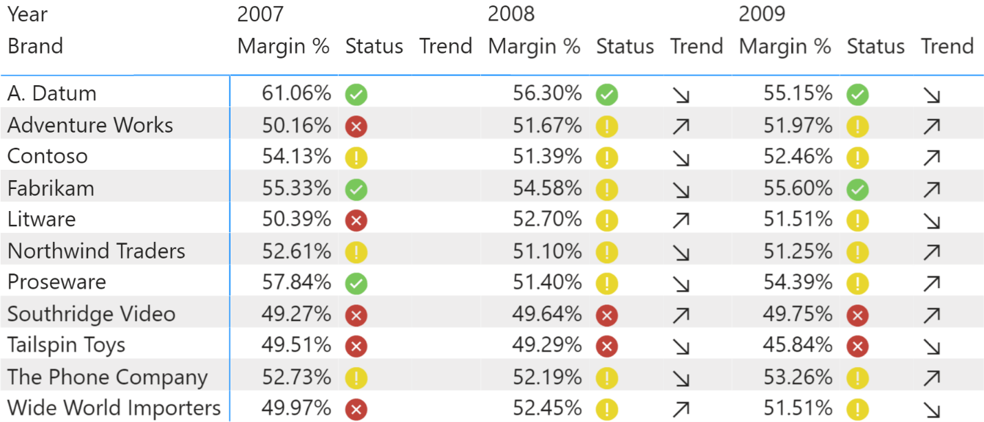
By using the KPIs you obtain reports like the following.
The Tabular model offers several properties for Status, Goal, and Trend attributes:
- Graphic: the graphical element to display for the attribute (only for Status and Trend).
- Expression: a DAX expression that defines the value of the attribute.
- Description: a string with the description of the meaning of the attribute. This string could be used by the client, even though it is not currently displayed by Power BI.
- Format String: how to display the result of the expression (only for Goal).
Goal (Target) properties
Even though the attributes shown to the user are called Status, Goal, and Trend, in Tabular these attributes are called Status, Target, and Trend, respectively. Therefore, we use Goal for the user interface, whereas we use Target to describe the corresponding properties in the Tabular model.
The Target is just another measure that can be compared with the result of the expression assigned to the KPI measure. When displayed in the user interface, it is used to define a reference value compared to the value of the KPI. For example, the Target for Sales Amount could be the Budget Amount. Even though it is common to just reference another measure, the Target could be defined using any DAX expression.
The properties available for Target are:
- Target Description: description of the Goal value of the KPI.
- Target Expression: a DAX expression evaluated in the filter context of the KPI measure.
- Target Format String: the format string used to present the Goal value for the KPI.
Status and Trend properties
Status and Trend are similar attributes that differ in how they are consumed in the report. However, both Status and Trend have the same set of properties to describe how to graphically represent the KPI status and trend. The graphic elements available are identical, so it is up to the data modeler to choose graphical element that better represent the concept of Status and Trend.
The properties available for Status and Trend are:
- Status Description: description of the Status.
- Status Graphic: the group of graphical elements to display for Status.
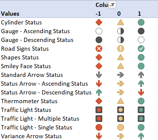
- Status Expression: DAX expression returning an integer value between -2 and 2, which identifies the Status graphic icon to use.
- Trend Description: description of the Trend.
- Trend Graphic: the group of graphical elements to display for Trend.
- Trend Expression: DAX expression returning an integer value between -2 and 2, which identifies the Trend graphic icon to use.
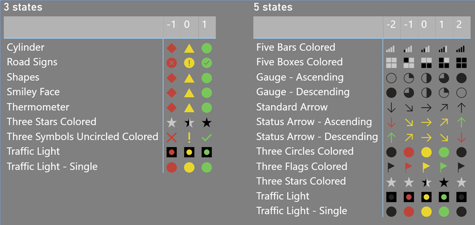
Because the Description properties are not used by Excel and Power BI clients, we focus only on Expression and Graphic. The Graphic properties identify the group of graphical elements to use showing the Status and Trend attributes. The values allowed in Graphic are predefined strings that identify graphical elements with 3 states or 5 states. Each state is identified by an integer value according to the following table that shows the graphic icons supported by Power BI. Important: the name used in the Graphic properties does not match the visual representation every time. For example, Thermometer and Smiley Face do not match with what you would expect visually in both Power BI and Excel.
Excel supports multiple states for the Graphic property of the KPIs by using a decimal number, whereas Power BI uses an integer value. Each Graphic can have 3 or 5 possible graphic icons, depending on the value of Expression.
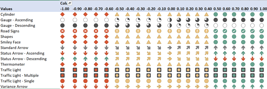
You must be careful choosing a Graphic with 5 states, because their representation is different between Power BI and Excel for the same value. If you want to use only integer values in the model because the same graphic should be visible in both Power BI and Excel, the following table is a simpler reference for Graphic results in Excel.
There is an additional difference between Power BI and Excel. When the Graphic selection is not recognized, Power BI does not display a graphical element and only shows the underlying integer value; however, Excel always uses a default representation that is different between Status and Trend. The default representation of Status is the Traffic Light – Single, and the default representation of Trend is the Status Arrow – Ascending. Moreover, Excel displays a blank icon when the expression value is -2 and shows the icons of 1 when the expression value is 2.
The DAX formulas provided in the Expression properties are evaluated in the filter context of the KPI measure. As you have seen in the explanation of the Graphic visualizations, the Expression value has different interpretations in Excel and Power BI:
- Power BI, Graphic with 5 states: Expression must be an integer value between -2 and 2;
- Power BI, Graphic with 3 states: Expression must be an integer value between -1 and 1;
- Excel, Graphic with 5 states: Expression must be a decimal value between -1 and 1;
- Excel, Graphic with 3 states: Expression can be in integer value between -1 and 1;
The different graphical representation of a KPI Status and Trend between Power BI and Excel limit the options available if you want to enable the KPI consumption from both clients. Power BI does not display any graphic when the value is not recognized, whereas Excel displays the graphic for 1 for any positive value greater than 1, and does not display any graphic for any negative value less than -1.
Best practices for using KPI in Tabular models
As shown in the previous examples, the differences between Power BI and Excel might limit the KPI graphics you should consider for your model. This section contains a quick guide to the safest choices based on client requirements.
Options for models consumed by both Power BI and Excel
You should consider only graphics that have the same representation in Excel and Power BI if your model could be consumed in both environments. Even though you create KPIs in a Power BI model, users might use Analyze In Excel. In order to support this scenario, we suggest the following:
- Use only 3 states for both Status and Trend.
- Limit the choice of graphics to:
- Road Signs
- Shapes
- Traffic Light
- Traffic Light – Single
The Shapes graphic displays the same result as Cylinder and Smiley Face on both Power BI and Excel. However, Shapes better describes the result you obtain.
For the Trend property, you could use the Standard Arrow graphic if you only use three states and accept the different representations in Excel compared to Power BI. It is important to use an integer value as a result of the Expression; this is because Power BI displays the number instead of the corresponding graphic element if the Expression result has a decimal part such as 0.2 or 1.4.
Options for models consumed by Power BI only
If Power BI is the only client used to display the KPIs of a Tabular model, you can use 3 or 5 states as long as the Expression returns an integer number included between -1 and 1 for graphics with 3 states, or an integer number included between -2 and 2 for graphics with 5 states.
For the Status Graphic property, we suggest the following:
- 3-states:
- Road Signs
- Shapes
- Three Flags Colored
- Three Stars Colored
- Three Symbols Uncircled Colored
- Traffic Light
- Traffic Light – Single
- 5-states:
- Five Bars Colored
- Five Boxes Colored
- Gauge – Ascending
- Gauge – Descending
For the Trend Graphic property, we suggest the following:
- 5-states:
- Standard Arrow
- Standard Arrow – Ascending
- Standard Arrow – Descending
All the graphics with 5 states can be used with only 3 states if the Expression returns only a number among -2, 0, and 2.
Options for models consumed by Excel only
If Excel is the only client used to display the KPIs of a Tabular model, you can use 3 or 5 states as long as the Expression returns a decimal number included between -1 and 1.
For the Status Graphic property, we suggest the following:
- 3-states:
- Road Signs
- Shapes
- Traffic Light
- Traffic Light – Single
- 5-states:
- Gauge – Ascending
- Gauge – Descending
For the Trend Graphic property, we suggest the following:
- 3-states:
- Variance Arrow
- 5-states:
- Standard Arrow
- Standard Arrow – Ascending
- Standard Arrow – Descending
All the graphics with 5 states can be used with only 3 states if the Expression returns an integer value included between -1 and 1.
Conclusions
Defining KPIs in Tabular models is very useful in obtaining consistent visualizations across different reports and applications. Unfortunately, differences in the supported graphics between Excel and Power BI limit our ability to use several available graphics. We invite you to vote the following idea related to Power BI and Excel in KPI visualization: Microsoft Idea · Matrix/tables should display KPI of a Tabular model like Excel (powerbi.com).