 Marco Russo & Alberto Ferrari
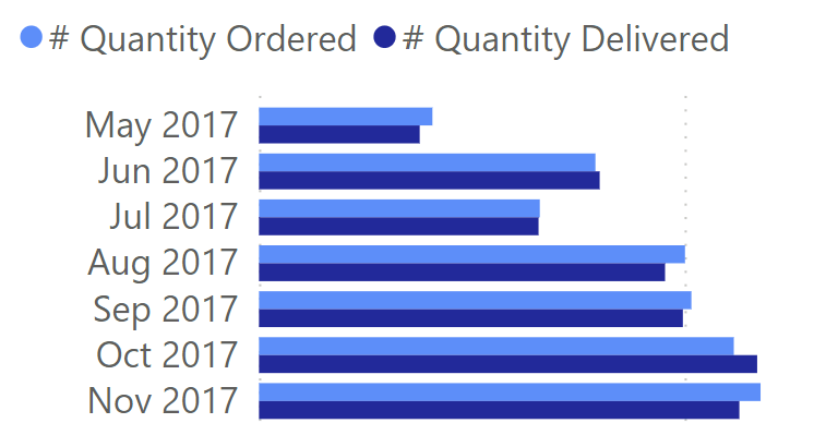
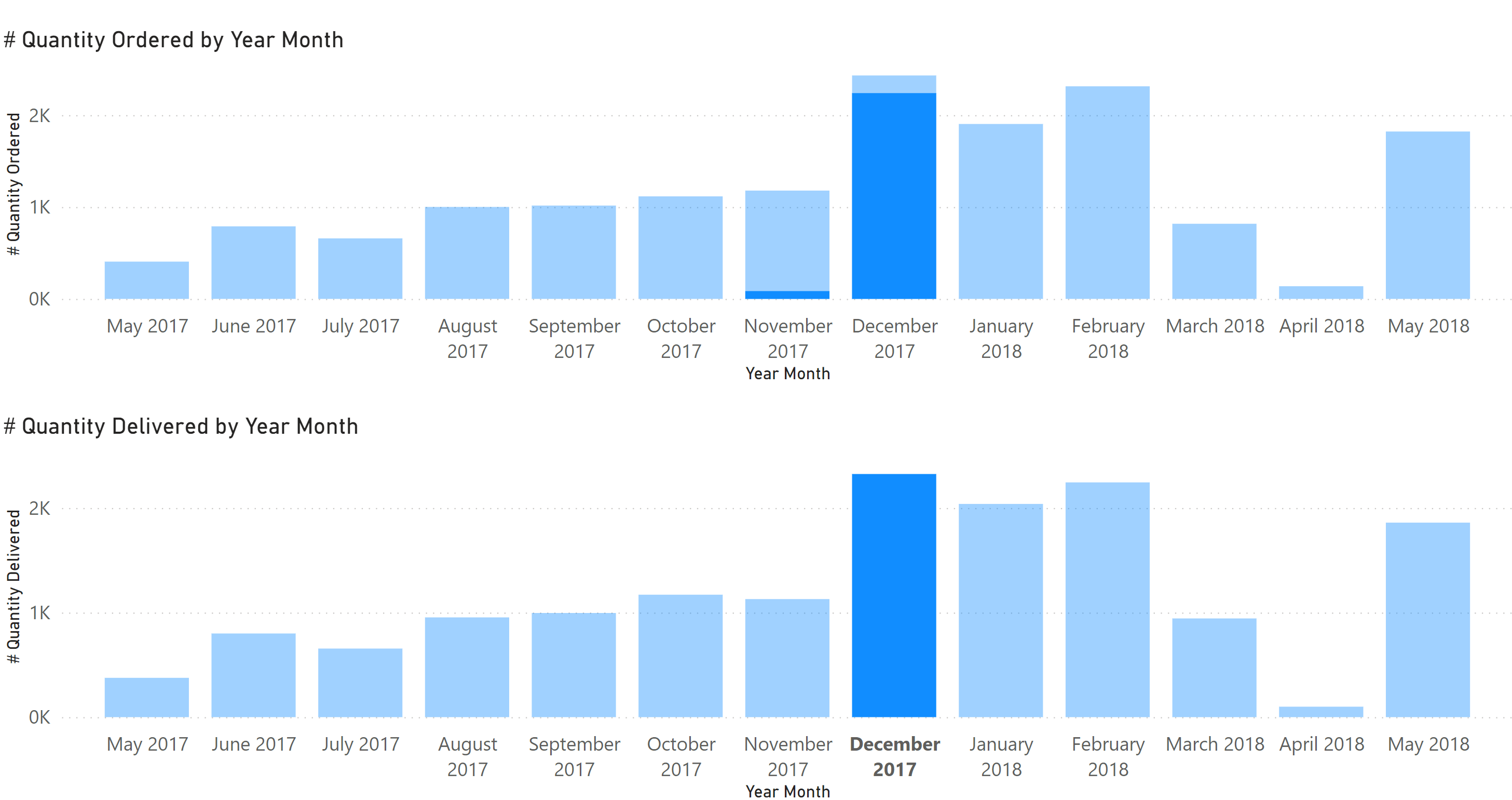
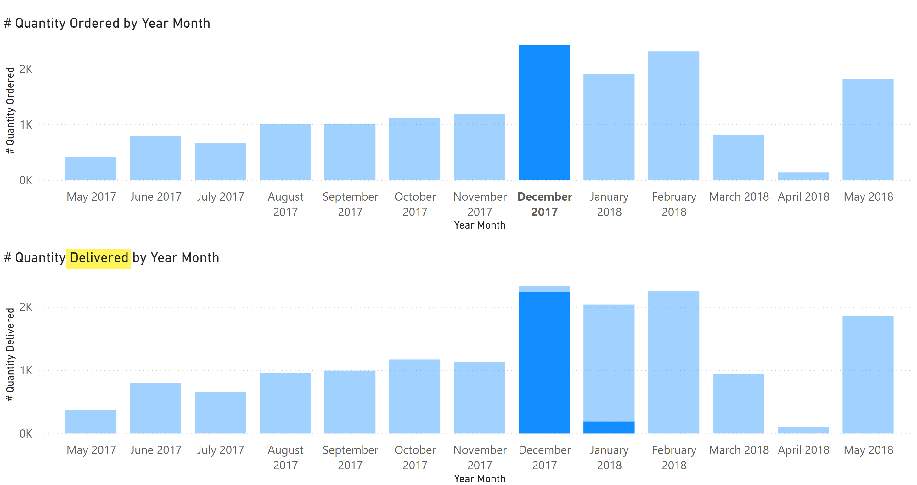
Tables sometimes contain two or more dates related to one same event. In that case it is best practice to use a single Date table in the model, to allow measures using different dates to be included in the same visual with a single Date axis. For example, the following chart shows the quantities ordered and delivered of products in the Sales table for each month.
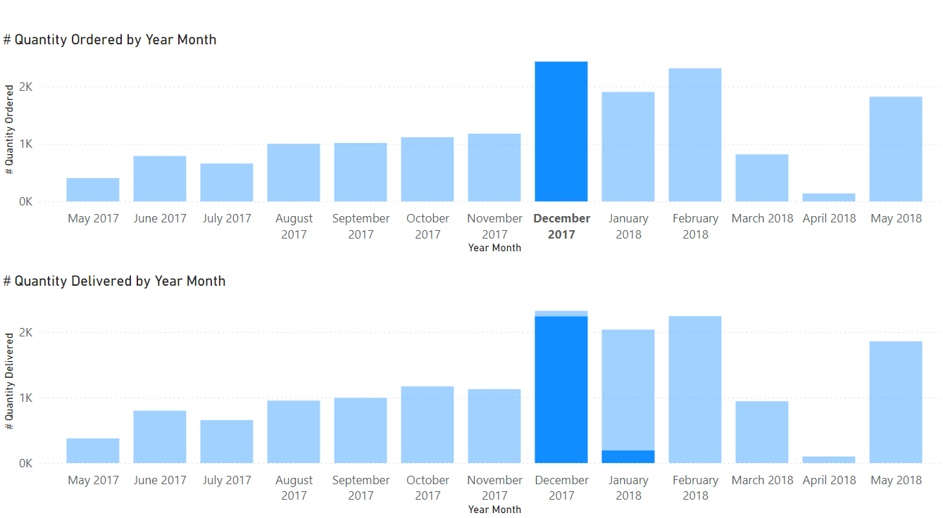
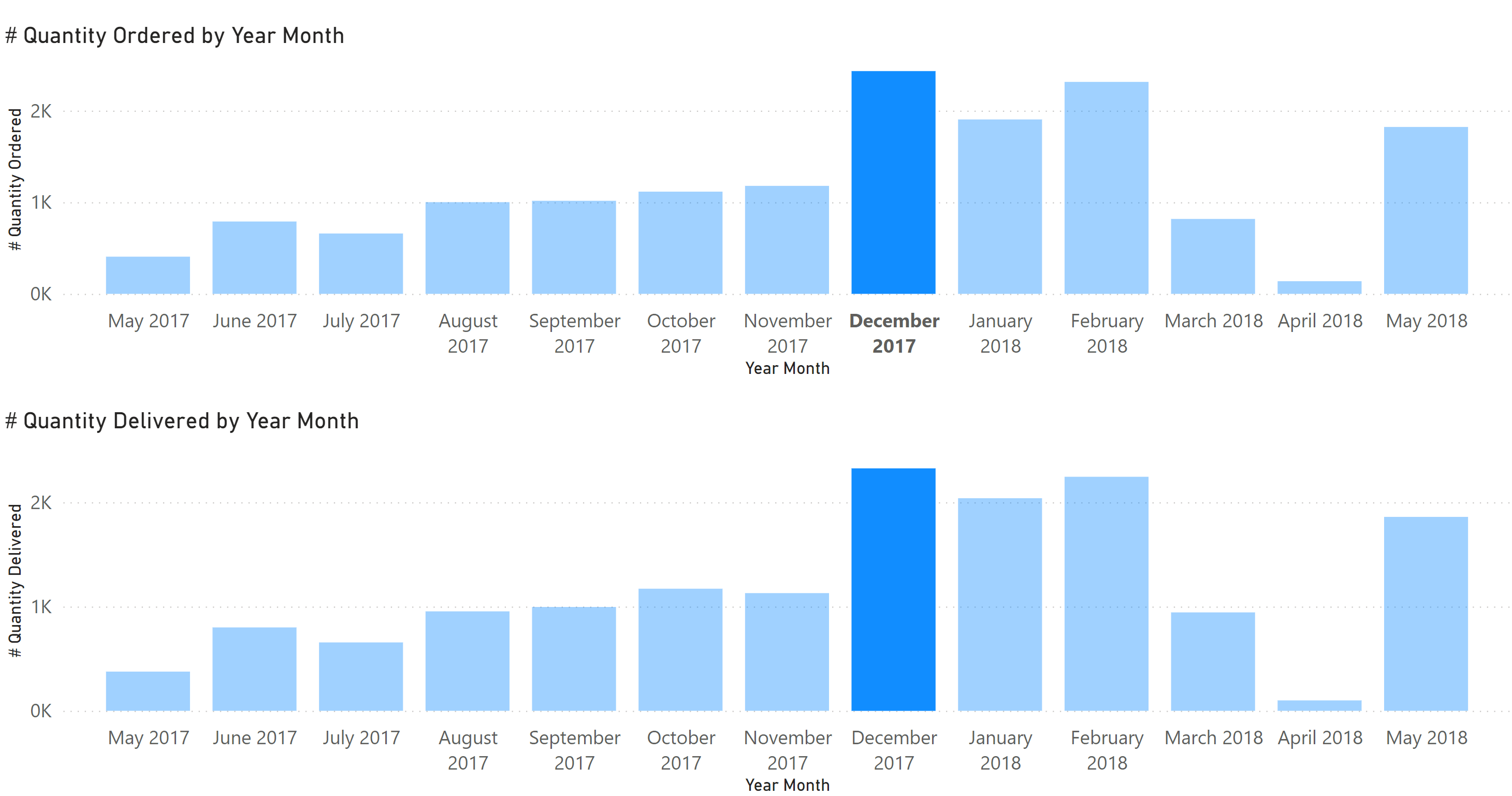
However, some requirements need a different approach. For example, suppose the user wants to select the quantities ordered in December 2017 and cross-highlight in another chart the delivery time of those orders, as in the following chart. We see that most of the orders were delivered in December 2017, but that a significant portion was delivered in January 2018.
As we will see, this kind of user experience cannot be achieved by using a single Date table. At the same time, we do not want to lose the ability to show measures related to different dates in the same chart, as we did in the first chart of this article. This article shows how to create a data model that satisfies both requirements.
Multiple relationships with a common Date table
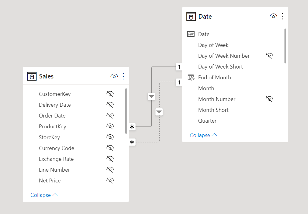
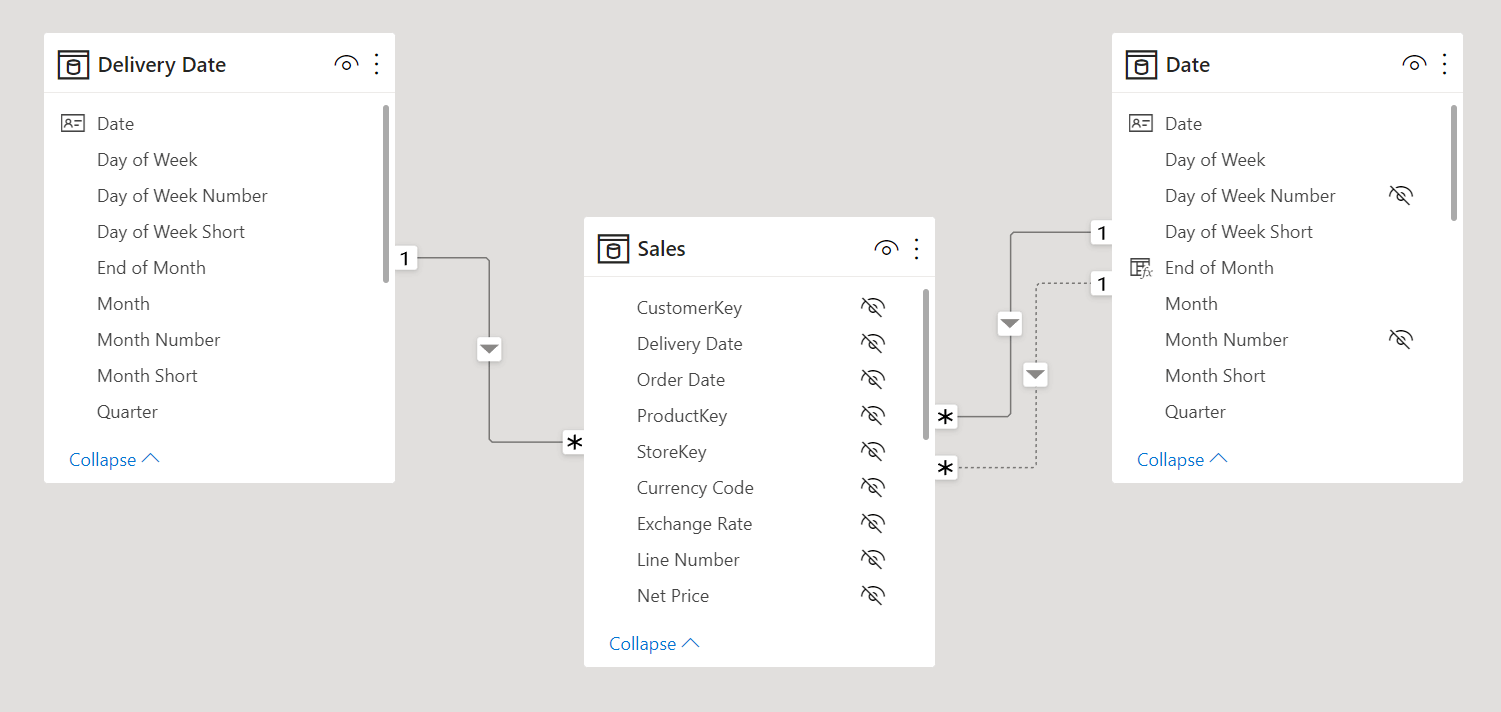
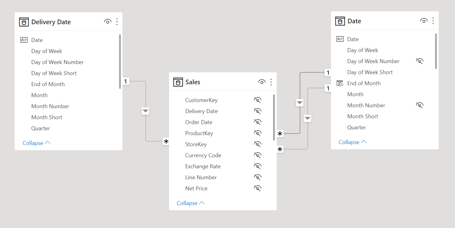
The best practice when we have multiple dates is to create a single, shared Date table and to connect it to all the date columns with different relationships. When a table has more than one date column, only one relationship can be active while the other relationships are inactive. In our sample model, the Date table connects both Sales[Order Date] and Sales[Delivery Date] with two relationships: one is active (with Order Date) and one is inactive (with Delivery Date).
With this model, the measures to show the quantity by Order Date and Delivery Date can be defined as follows:
# Quantity Ordered := SUM ( Sales[Quantity] )
# Quantity Delivered :=
CALCULATE (
    SUM ( Sales[Quantity] ),
    USERELATIONSHIP ( Sales[Delivery Date], 'Date'[Date] )
)
Only # Quantity Delivered requires a CALCULATE with USERELATIONSHIP to enable the inactive relationship. While a new measure is needed for each combination of measure and date to include in the report, this model is simple and effective from a user perspective.
Implementing two date tables
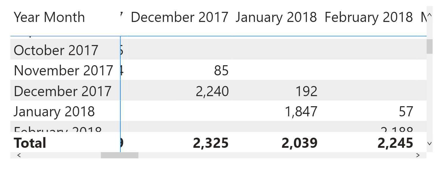
We reach the limit of the approach with a single Date table when the visualization requires two dates simultaneously. The first example is a matrix where the order month is on the rows and the delivery month is on the columns. The original # Quantity Ordered measure shows that the orders made in December 2017 were delivered mainly in the same month (2,240) plus a small but significant portion in January 2018 (192).
The data model contains two date tables: we added a Delivery Date table that relates to the Sales table with an active relationship.
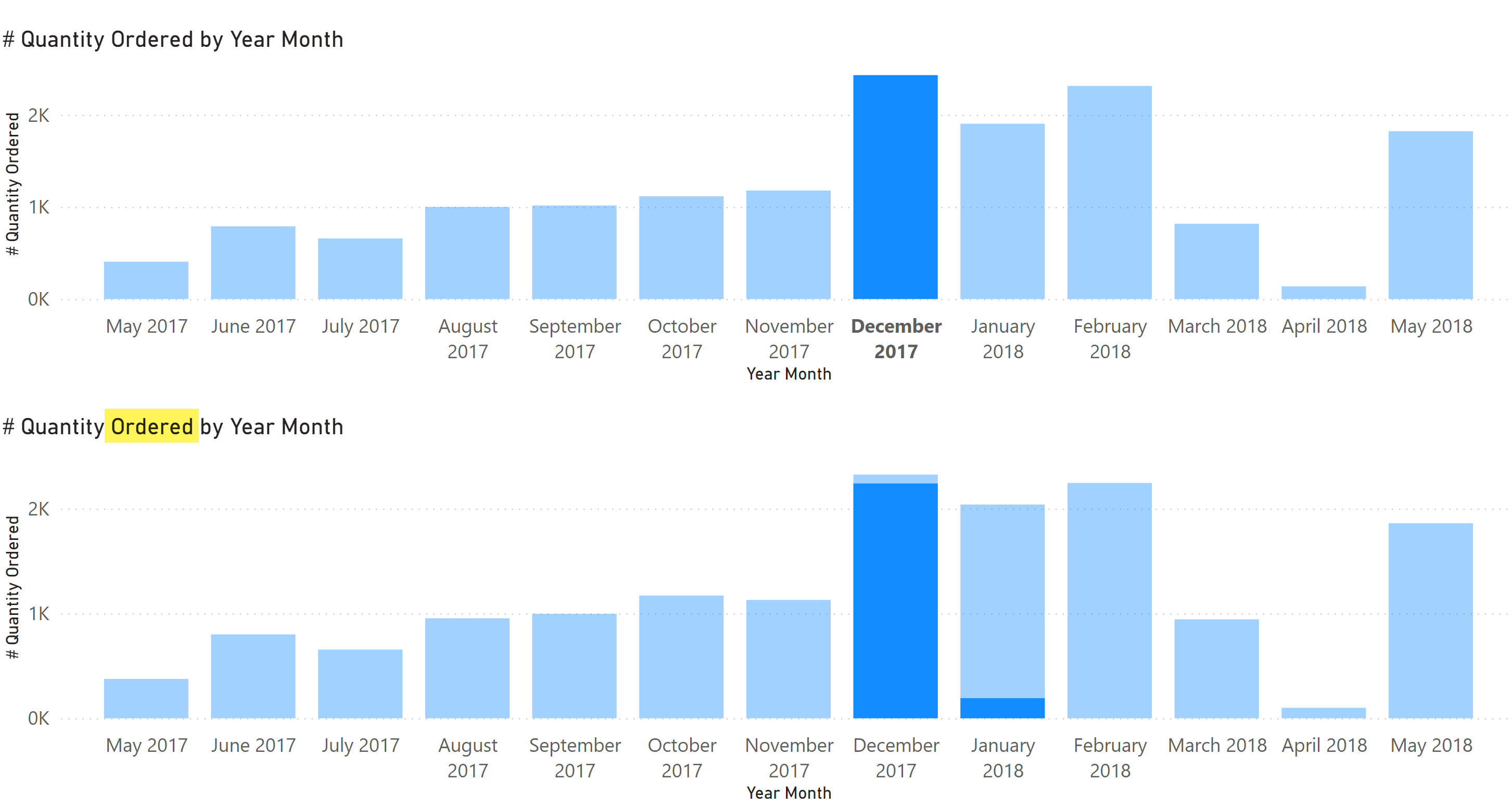
Though this approach works well from a calculation point of view, only a few cells of the matrix are populated, making it hard to obtain a compact visualization. Indeed, if we try to use this model with two charts – the first chart below uses Order Date on the axis, the second chart uses Delivery Date – the cross-highlighting works correctly only when we select December 2017 on the bottom chart. Indeed, it will filter the orders delivered in that month. The chart showing the orders highlights the fact that those December 2017 deliveries pertain to orders dating back to both November 2017 and December 2017; this is correct.
Unfortunately, selecting December 2017 on the top chart filters the orders taken in December 2017, but the chart with the deliveries highlights only the quantities delivered in that same month. We know from the previous matrix that this is inaccurate.
A simple solution that does not add any DAX code is to use the # Quantity Ordered measure in the chart below. This way, the selection of December 2017 in the top chart highlights the corresponding deliveries in the bottom chart for December 2017 and January 2018.
At this point, the model would be easier to understand if we had a single measure called # Quantity, but we still want to enable the more common case we have seen in the previous chart of this article. A first approach could be to fix the # Quantity Delivered measure so that it displays the correct value when it is evaluated in this scenario. When there is a filter on the Deliver Date table, then it simply sums Sales[Quantity] without modifying the relationships. Otherwise, it activates the relationship between Sales[Delivery Date] and Date[Date] as in the original version of the measure:
# Quantity Delivered :=
IF (
    ISFILTERED ( 'Delivery Date' ) ,
    SUM ( Sales[Quantity] ),
    CALCULATE (
        SUM ( Sales[Quantity] ),
        USERELATIONSHIP ( Sales[Delivery Date], 'Date'[Date] )
    )
)
This way, we can use the # Quantity Delivered measure in the chart below and still get the correct result.
If the presence of an active relationship for Delivery Date makes the model harder to use, you might consider the alternative described in the following section. With an active relationship, Delivery Date impacts all the existing measures: it could be difficult to understand the implications and the difference with the filters based on columns of the Date table. For example, the fact that # Quantity Ordered displays the same amount as # Quantity Delivered if used with the Delivery Date table may be hard to explain to the users.
Working with a disabled relationship
While the presence of the Delivery Date table enables the matrix scenario and cross-highlight scenarios described so far, these complex reports are usually a small percentage of what the model is typically for. Most of the time, a single date axis is required; in an ideal world, every measure should be “smart enough” to understand how to produce a result that makes sense, or there should be a clear indication of the absence of relationship between a table and a measure. For example, if we group by a column that is not connected to the measure, we expect that the measure will not be filtered at all. This is exactly the behavior we have by default with a table that shares no relationships with other tables in the model. We can thus use an alternative approach: disable the relationship between Delivery Date and Sales.
The # Quantity Delivered measure enables one of the two inactive relationships connected to Sales[Delivery Date] depending on the presence of a filter on Delivery Date. Suppose the user is filtering any column of the Delivery Date table. In that case, the relationship with Delivery Date is activated – otherwise, it is the relationship with Date that is activated so that Date filters Sales[Delivery Date] instead of Sales[Order Date]:
# Quantity Delivered :=
IF (
    ISFILTERED ( 'Delivery Date' ),
    CALCULATE (
        SUM ( Sales[Quantity] ),
        USERELATIONSHIP ( Sales[Delivery Date], 'Delivery Date'[Date] )
    ),
    CALCULATE (
        SUM ( Sales[Quantity] ),
        USERELATIONSHIP ( Sales[Delivery Date], 'Date'[Date] )
    )
)
We must also change the # Quantity Ordered measure so that in case Delivery Date is filtered, it must activate the relationship between Delivery Date and Sales. Technically, this could be the default behavior for all the measures, but in this example, we do not want side effects on other measures:
# Quantity Ordered :=
IF (
    ISFILTERED ( 'Delivery Date' ),
    CALCULATE (
        SUM ( Sales[Quantity] ),
        USERELATIONSHIP ( Sales[Delivery Date], 'Delivery Date'[Date] )
    ),
    SUM ( Sales[Quantity] )
)
The Delivery Date table does not impact other measures by default: this is not necessarily the more common scenario. Usually, you want to see the effect of a filter applied to a table, but there could be cases where you do not want to create confusion around the behavior of measures with a specific name. In that case, making the relationship active only for the measures where that filter has a purpose could be a better choice.
Conclusions
A single Date table in a model is always the best practice. However, additional date tables can make sense when two dates must be present in the same visual or in visuals that must interact through cross-highlighting. In those cases, you can create “smart” measures that automatically switch the active relationship to obtain an appropriate behavior based on the user’s selection.
Evaluates an expression in a context modified by filters.
CALCULATE ( <Expression> [, <Filter> [, <Filter> [, … ] ] ] )
Specifies an existing relationship to be used in the evaluation of a DAX expression. The relationship is defined by naming, as arguments, the two columns that serve as endpoints.
USERELATIONSHIP ( <ColumnName1>, <ColumnName2> )