 Marco Russo & Alberto Ferrari
Picture this: you manage a company that sells subscription services on the web, and you want to track the evolution of your customers by analyzing different events to understand how many customers start a trial before they purchase or how many renew or cancel their subscriptions.
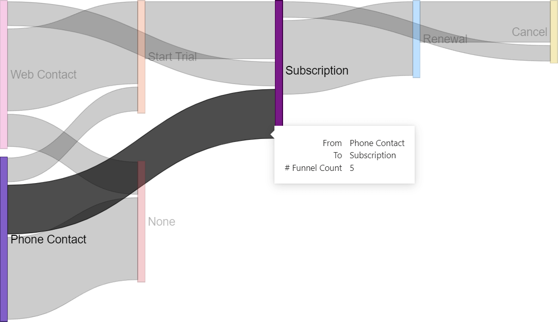
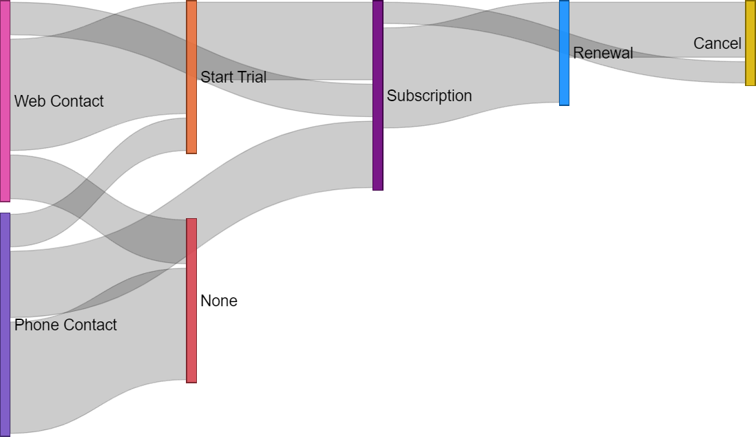
The report should look like this: the darker flow indicates the number of customers who skipped the trial and went directly from a phone call to purchasing a subscription.
This diagram uses Sankey Chart, a custom visual that you can install from Microsoft AppSource. The Sankey Chart has a wide range of applications. In this example, we use the Sankey Chart visual in Power BI to display a funnel for events related to customers. However, we can use the same concept in different scenarios. This article aims to explain how to shape a data model for the Sankey Chart.
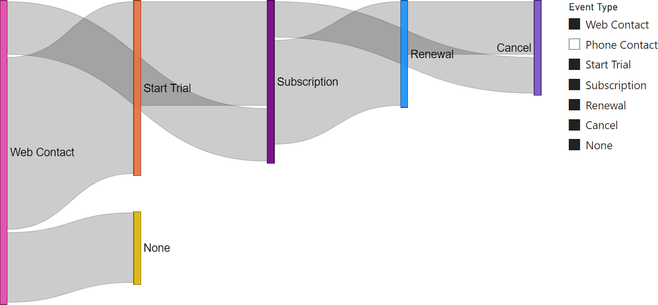
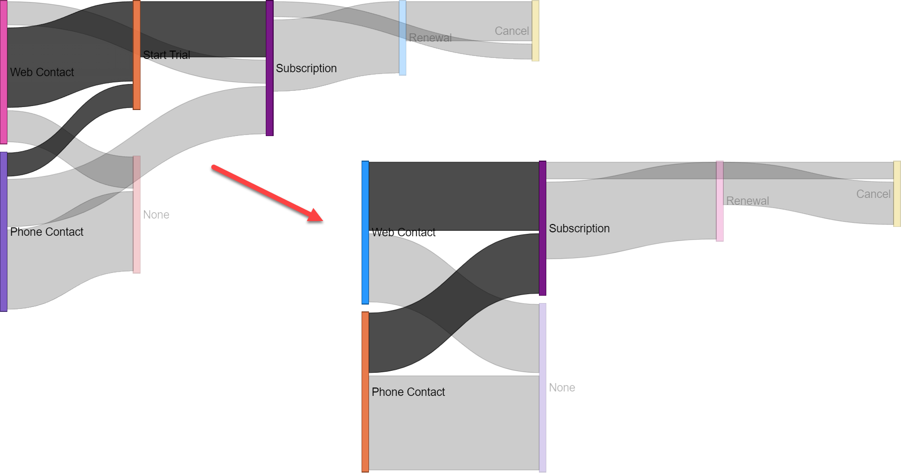
The Sankey Chart requires the data source to have a peculiar format. Because the starting model is not optimal for Sankey, we include transformations of the model in both M (Power Query) and DAX. Moreover, once the initial chart works, we will make it dynamic so that users can choose which events to include in the report. For example, in the following chart, we focus on Web Contacts only, so we removed all the contacts that started the process with a Phone Contact from our analysis.
Making the funnel dynamic requires a mix of non-trivial data modeling and DAX skills. We must build a specific model for the chart and transform data via some acrobatics. But first things first: let us start by looking at the initial model.
Initial model
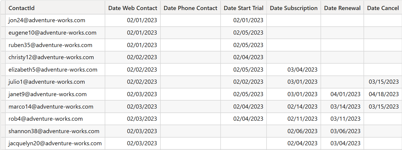
The input of the analysis is a Contacts table that contains all the information about leads and customers as dates of specific events:
In our example, each event can happen only once, and the events have a specific order of visualization. In different scenarios, there could be multiple instances of the same event, and it would still be possible to represent that in a Sankey visualization. However, we use this model because it better reflects the requirements for the funnel visualization.
Moreover, some events are mutually exclusive in this example. For example, a customer is contacted through the web or by phone. There cannot be both events showing for a single customer. Similarly, the renewal of a subscription can happen multiple times, but we store only the first occurrence of the event. Your model may differ; hence, you should adjust the transformation to fit your needs.
Describing the expected result
Our goal is to obtain the following visualization.
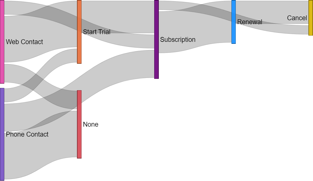
The Sankey Chart visual shows how many customers transition from one state to another. In our example, there are no states: events are happening. However, we consider a customer as being in the state of his/her last event. Customers who started a trial of our service are in the Start Trial status, and they remain there until they possibly subscribe. From the Subscription status, they may go to Renewal or Cancel.
The width of each connection represents the number of customers that moved from one state to another.
The Sankey Chart has three inputs: Source, Destination, and Weight.
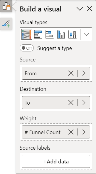
Source and Destination are the lists of statuses. Weight is the number of customers transitioning from one status to another, and it must be a measure. In the static solution, we can use two columns from one table as Source and Destination, and assign to Weight a simple measure that counts how many rows share the same Source and Destination values. However, for the dynamic solution, the model should be more complex than a single table, and the measure is far from simple.
Designing the static data model
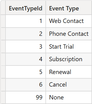
Each event is a column in the Contacts table in the original data source. However, we need an Event Types table with the event names because we must unpivot the Contacts table. In the same Event Types table, we also store a key, which is helpful for both creating relationships and sorting.
Web Contact and Phone Contact are mutually exclusive. We consider the first contact date for each customer, regardless of its kind (Web or Phone).
It is worth noting that we added an EventTypeId with value 99 marked as None. This special event is helpful for customers with only one state visible and no further transition. In that case, the Sankey would hide those rows because there are no transitions to show. We will create a dummy transition to the None status to show those contacts.
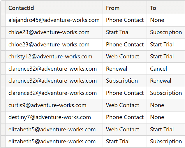
The initial Contacts table has one row for each customer, with several relevant dates. We need a table with a row for each event – where the event is the change from one state to another. In other words, if a customer has three dates filled, we will generate two rows: one for each transition. Our goal is to build the Funnel Sankey table.
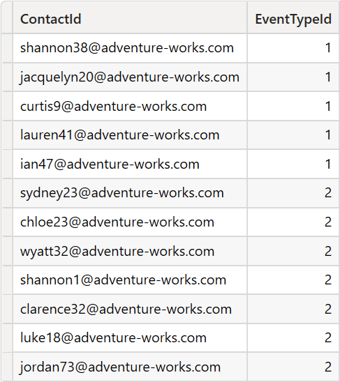
Based on this table, we can obtain the number of customers for each combination of events by counting the number of rows in Funnel Sankey:
# Funnel Count =
COUNTROWS ( 'Funnel Sankey' )
Building the Funnel Sankey table requires two steps: unpivoting the original table and creating another table containing the transitions. The first step is a long DAX expression. Luckily, length does not come with complexity. The entire expression is a UNION of sub-expressions, where each unpivots a single column.
For example, the following expression returns a table with the list of contact IDs that have a date in Contacts[Date Web Contact], which means that the Web Contact event exists for those IDs:
CALCULATETABLE (
    ADDCOLUMNS (
        DISTINCT ( Contacts[ContactId] ),
        "EventTypeId",
            LOOKUPVALUE (
                'Event Types'[EventTypeId],
                'Event Types'[Event Type], "Web Contact"
            )
    ),
    FILTER (
        ALLNOBLANKROW ( Contacts[Date Web Contact] ),
        NOT ISBLANK ( Contacts[Date Web Contact] )
    )
)
Please note that we had to use FILTER ( ALLNOBLANKROW () ) to avoid circular dependencies when creating relationships with this table. If you are unfamiliar with this pattern, you can find more information here: Understanding circular dependencies in DAX.
We repeat the same expression for each event, changing the event name in line 7 (Web Contact) and the corresponding Contacts column referenced in line 10 (Date Web Contact) in the code snippet above. The complete code for the Events is here:
Events =
VAR _ExistingEvents =
    UNION (
        CALCULATETABLE (
            ADDCOLUMNS (
                DISTINCT ( Contacts[ContactId] ),
                "EventTypeId",
                    LOOKUPVALUE (
                        'Event Types'[EventTypeId],
                        'Event Types'[Event Type], "Web Contact"
                    )
            ),
            FILTER (
                ALLNOBLANKROW ( Contacts[Date Web Contact] ),
                NOT ISBLANK ( Contacts[Date Web Contact] )
            )
        ),
        CALCULATETABLE (
            ADDCOLUMNS (
                DISTINCT ( Contacts[ContactId] ),
                "EventTypeId",
                    LOOKUPVALUE (
                        'Event Types'[EventTypeId],
                        'Event Types'[Event Type], "Phone Contact"
                    )
            ),
            FILTER (
                ALLNOBLANKROW ( Contacts[Date Phone Contact] ),
                NOT ISBLANK ( Contacts[Date Phone Contact] )
            )
        ),
        CALCULATETABLE (
            ADDCOLUMNS (
                DISTINCT ( Contacts[ContactId] ),
                "EventTypeId",
                    LOOKUPVALUE (
                        'Event Types'[EventTypeId],
                        'Event Types'[Event Type], "Start Trial"
                    )
            ),
            FILTER (
                ALLNOBLANKROW ( Contacts[Date Start Trial] ),
                NOT ISBLANK ( Contacts[Date Start Trial] )
            )
        ),
        CALCULATETABLE (
            ADDCOLUMNS (
                DISTINCT ( Contacts[ContactId] ),
                "EventTypeId",
                    LOOKUPVALUE (
                        'Event Types'[EventTypeId],
                        'Event Types'[Event Type], "Subscription"
                    )
            ),
            FILTER (
                ALLNOBLANKROW ( Contacts[Date Subscription] ),
                NOT ISBLANK ( Contacts[Date Subscription] )
            )
        ),
        CALCULATETABLE (
            ADDCOLUMNS (
                DISTINCT ( Contacts[ContactId] ),
                "EventTypeId",
                    LOOKUPVALUE (
                        'Event Types'[EventTypeId],
                        'Event Types'[Event Type], "Renewal"
                    )
            ),
            FILTER (
                ALLNOBLANKROW ( Contacts[Date Renewal] ),
                NOT ISBLANK ( Contacts[Date Renewal] )
            )
        ),
        CALCULATETABLE (
            ADDCOLUMNS (
                DISTINCT ( Contacts[ContactId] ),
                "EventTypeId",
                    LOOKUPVALUE (
                        'Event Types'[EventTypeId],
                        'Event Types'[Event Type], "Cancel"
                    )
            ),
            FILTER (
                ALLNOBLANKROW ( Contacts[Date Cancel] ),
                NOT ISBLANK ( Contacts[Date Cancel] )
            )
        )
    )
VAR _SingleEvents =
    FILTER (
        GROUPBY (
            _ExistingEvents,
            Contacts[ContactId],
            "@Events", SUMX ( CURRENTGROUP (), 1 )
        ),
        [@Events] = 1
    )
VAR Result =
    UNION (
        _ExistingEvents,
        ADDCOLUMNS (
            SELECTCOLUMNS ( _SingleEvents, "ID", Contacts[ContactId] ),
            "EventTypeId",
                LOOKUPVALUE (
                    'Event Types'[EventTypeId],
                    'Event Types'[Event Type], "None"
                )
        )
    )
RETURN
    Result
The result is the following.
As is, this table is not ready yet for the Sankey Chart. This table defines which states are traversed by customers. We need to transform it into a different structure that tells where the customer started (From) and where he/she went (To).
As a reminder, our goal is to obtain the following Funnel Sankey table.
To create the Funnel Sankey table in DAX (shown in the following code), we use Events to locate the existing transitions from one event to another. Because of the sort order, we can use a simple OFFSET function to retrieve, for each row, the following status by partitioning by customer and sorting by EventTypeId. Then, the last step is to transform the FromId and ToId numeric values into corresponding names that are easier to display in a Power BI report:
Funnel Sankey =
SELECTCOLUMNS (
    GENERATE (
        'Events',
        SELECTCOLUMNS (
            OFFSET (
                1,
                'Events',
                ORDERBY ( 'Events'[EventTypeId], ASC ),
                PARTITIONBY ( 'Events'[ContactId] ),
                MATCHBY ( 'Events'[EventTypeId], 'Events'[ContactId] )
            ),
            "@ToID", 'Events'[EventTypeId]
        )
    ),
    "ContactId", 'Events'[ContactId],
    "From",
        LOOKUPVALUE (
            'Event Types'[Event Type],
            'Event Types'[EventTypeId], 'Events'[EventTypeId]
        ),
    "To",
        LOOKUPVALUE (
            'Event Types'[Event Type],
            'Event Types'[EventTypeId], [@ToId]
        )
)
Once the calculated table is in place, we can create the static chart using the From and To columns of the Funnel Sankey table.
Designing the dynamic model
The static chart is extremely fast because it relies on a calculated table, and the measure computing the weight of each flow is a simple COUNTROWS. However, it cannot filter out certain events. For example, a user may want to remove Start Trial from the set of events. This removal means that all customers that reached Start Trial, and from there went to a subsequent status should be shown as going directly from either Web or Phone Contact to their destination status, as depicted in the following figure.
Making the model dynamic requires more work because we can no longer rely on static information. We must compute the transitions directly in the measure by scanning the Events table.
We need two tables to hold the Source and Destination values. The two tables are nothing but a copy of Funnel Events: they are required for the visual, as we cannot use the same table (Funnel Events List) for both Source and Destination:
Sankey From =
SELECTCOLUMNS (
    'Event Types',
    "From Event", 'Event Types'[Event Type],
    "EventTypeId", 'Event Types'[EventTypeId]
)

Sankey To =
SELECTCOLUMNS (
    'Event Types',
    "To Event", 'Event Types'[Event Type],
    "EventTypeId", 'Event Types'[EventTypeId]
)
Once the tables are in the model, we build the proper set of relationships.
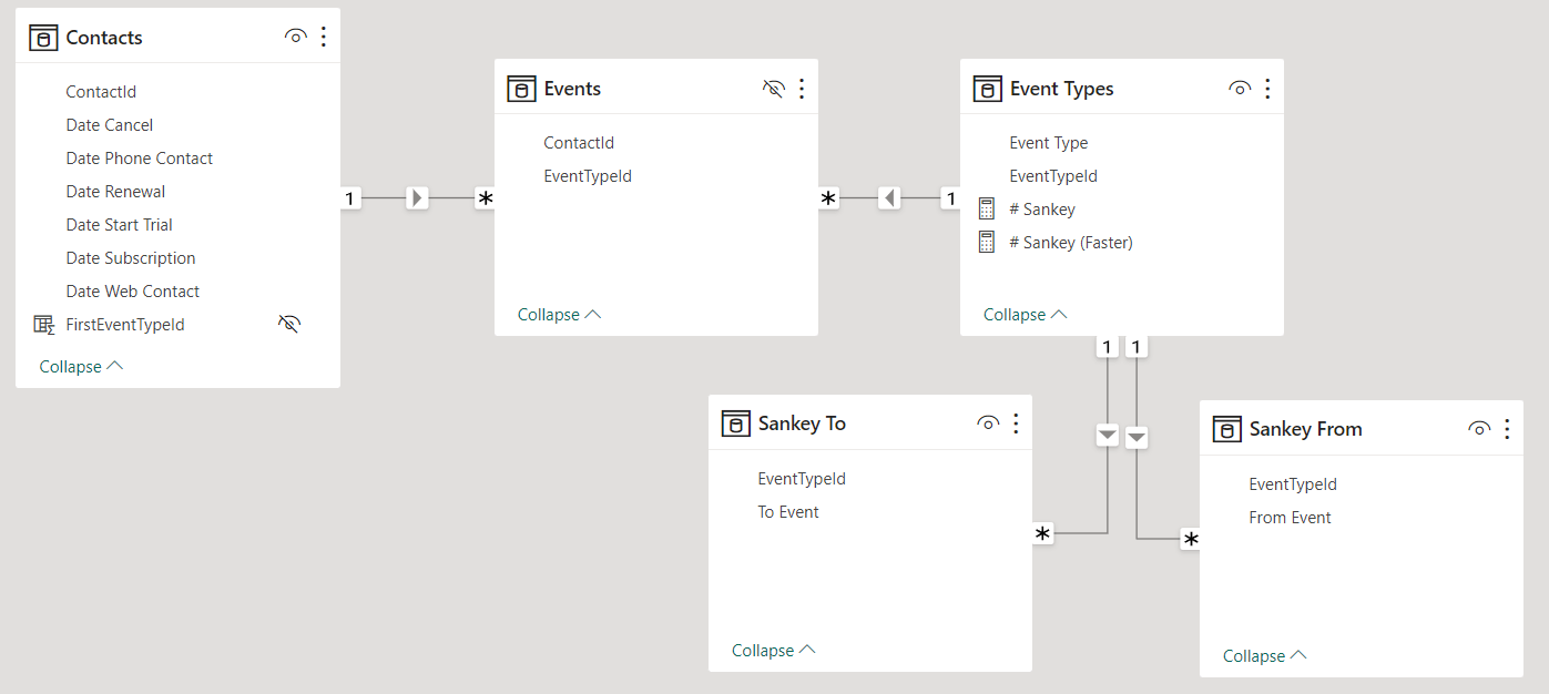
The two tables, Sankey From and Sankey To do not filter Event Types. Consequently, they do not filter the Events table. We need to transfer the filter manually in DAX. Besides, we do not want the filters to propagate because they would mess up the measure.
Before moving forward with the code, we must consider what hiding an event means. There are two types of event types: start events and middle events. A start event is the first contact with a potential customer. A middle event is any other event except for the very first one.
We assume that when users hide a start event, they are not interested in the evolution of customers contacted that way. However, when they hide a middle event, they do not want to filter the contacts; they are just not interested in that specific intermediate event. Therefore, the transitions will skip the unselected event without filtering the contacts.
In other words, hiding a start event means filtering both events and contacts, whereas hiding a middle event means filtering only the event, but still seeing the flow of customers. Finally, users may want to hide at the same time both start events and middle events, or they may filter out all start events, making the scenario more intricate.
Again, we define a start event as the first event that puts the customer in contact with our system. To avoid hardcoding the event type, we create a calculated column in Contacts that stores the type of event that is their first contact:
FirstEventTypeId = CALCULATE ( MIN ( Events[EventTypeId] ) )
And here is the code of the # Sankey table; it is long and filled with comments to let our readers follow the code:
# Sankey =
--
-- Event "None" to show single events without a subsequent event in Sankey Chart visual
-- Use direct value to avoid executing LOOKUPVALUE for each measure
--
VAR _NoneEvent = 99

--
--  If no FirstEvent is selected, then we need to show all events.
--  If the event selection includes some FirstEvents, then we will
--  limit the analysis to only the customers who had their
--  first event as one of the selected events
--
VAR _AllFirstContactEventTypes = ALLSELECTED ( Contacts[FirstEventTypeId] )
VAR _SelectedEventTypes = VALUES ( 'Event Types'[EventTypeId] )
VAR _ShowAllEvents = ISEMPTY ( INTERSECT ( _AllFirstContactEventTypes, _SelectedEventTypes ) )

--
--  FirstContactEventTypes contains the selection of the first events to be considered.
--  It may include all first events (if none is selected), or only some of them
--  (if the user removed some first events from the list).
--  It is worth noting that FirstContactEventTypes, despite containing event types,
--  filters Contact. Indeed, its content has the lineage of Contacts[FirstEventTypeId]
--
VAR _FirstContactEventTypes =
    FILTER (
        _AllFirstContactEventTypes,
        OR ( _ShowAllEvents, Contacts[FirstEventTypeId] IN VALUES ( 'Event Types'[EventTypeId] ) )
    )
--
--  EventsWithFrom contains all the events matching the FROM selection in the Sankey.
--  Because we use FirstContactEventTypes, the selection only includes events that
--  happened to contacts whose first event is among the selected first events.
--
--  TREATAS transfers the filter from Sankey From to Events
--
VAR _EventsWithFrom =
    CALCULATETABLE (
        'Events',
        _FirstContactEventTypes,
        KEEPFILTERS ( 'Events'[EventTypeId] <> _NoneEvent ),
        KEEPFILTERS (
            TREATAS ( VALUES ( 'Sankey From'[EventTypeId] ), 'Events'[EventTypeId] )
        )
    )
--
--  AllselectedEvents contains all the visible events, limiting its scope to the
--  contacts whose first event has been selected.
--  This variable is useful to find the NEXT event, in the next variable.
--
--
VAR _AllselectedEvents =
    CALCULATETABLE (
        'Events',
        _FirstContactEventTypes,
        ALLSELECTED ( 'Event Types' )
    )

--
--  Here we compute the destination state.
--
--  For each event, it finds the next one in the current selection.
--  If there are no TO events, then the row will be removed by
--  the Sankey. In order to avoid this behavior, only for the start
--  events, we have a further IF that checks the very special case
--  of the first event, sending those events to NONE.
--
VAR _EventsWithFromAndTo =
    ADDCOLUMNS (
        _EventsWithFrom,
        "@ToId",
            COALESCE (
                SELECTCOLUMNS (
                    OFFSET (
                        1,
                        _AllselectedEvents,
                        ORDERBY ( 'Events'[EventTypeId], ASC ),
                        PARTITIONBY ( Events[ContactId] ),
                        MATCHBY ( 'Events'[EventTypeId], 'Events'[ContactId] )
                    ),
                    "@ToID", 'Events'[EventTypeId]
                ),
                IF (
                    RANK (
                        DENSE,
                        _AllselectedEvents,
                        ORDERBY ( 'Events'[EventTypeId], ASC ),
                        PARTITIONBY ( 'Events'[ContactId] ),
                        MATCHBY ( 'Events'[EventTypeId], 'Events'[ContactId] )
                    ) = 1,
                    _NoneEvent
                )
            )
    )
--
--  It is now time to reduce the calculation to only the events that match the
--  Destination filter coming from the Sankey.
--  This time we cannot use TREATAS, because the events are stored in a variable;
--  therefore, we use FILTER and IN.
--
VAR Result =
    COUNTROWS (
        FILTER ( _EventsWithFromAndTo, [@ToId] IN VALUES ( 'Sankey To'[EventTypeId] ) )
    )

RETURN
    Result
The description of the code is inside the comments; it is unnecessary to describe it further. It requires time to understand how it works, as its behavior is quite delicate. However, it achieves our goal of showing the visual the way we need.
Believe it or not, the measure depicted here is the educational one. Performance-wise, it works fine, but it is not the fastest implementation. However, improving the speed requires writing code that is much harder to read and explain. For interested readers, the # Sankey (Faster) measure in the demo attached to this article is a faster implementation available for study. However, due to the complexity of the code and the limited benefits in terms of performance, we strongly recommend our readers use the educational version of the measure: it is much easier to understand and debug. A simple measure to debug proves to be way better, as developers can be more confident about its behavior.
Transforming data with M (Power Query)
In the article, we have shown how to generate the Events table with DAX. While this is undoubtedly one of the options available, many users feel more confident using M (or SQL) to create the table. If you only want the static version of the Sankey Chart visual, then you might want to avoid complex DAX in your model. In the Sankey Demo PQ.pbix demo file, you can find a model version that uses DAX only for the measures but does not rely on any calculated table.
There are several pros and cons for each solution. While DAX calculated tables are fast to compute with the proposed code, it is also true that large calculated tables can require a lot of memory during the refresh operation. The entire refresh operation can fail if there is not enough memory. However, if memory is an issue, the Power Query transformation could fail if the code does not fold into a single request to the data source. In other words, we provide the two solutions for the sake of covering all the bases. Still, you should figure out which works better for your solution by testing the memory commitment during the refresh to ensure it will not become a critical point once published.
Conclusions
Using the Sankey Chart visual in Power BI requires specific data preparation. It is possible to adapt the data model to show a funnel using the Sankey diagram when we have a list of event dates in a table, such as the Contacts table analyzed in this example.
You can use the same approach with other entities, such as states of support tickets or medical records. The critical takeaway is to obtain entities (columns and measures) to use in the parameters of the Sankey Chart visual, using a static table for the static analyses and a more complex measure for dynamic evaluation that allows the user to exclude certain events from the report.
Returns the union of the tables whose columns match.
UNION ( <Table>, <Table> [, <Table> [, … ] ] )
Returns a table that has been filtered.
FILTER ( <Table>, <FilterExpression> )
Returns all the rows except blank row in a table, or all the values in a column, ignoring any filters that might have been applied.
ALLNOBLANKROW ( <TableNameOrColumnName> [, <ColumnName> [, <ColumnName> [, … ] ] ] )
Retrieves a single row from a relation by moving a number of rows within the specified partition, sorted by the specified order or on the axis specified.
OFFSET ( <Delta> [, <Relation>] [, <OrderBy>] [, <Blanks>] [, <PartitionBy>] [, <MatchBy>] [, <Reset>] )
Counts the number of rows in a table.
COUNTROWS ( [<Table>] )