 Marco Russo & Alberto Ferrari
At SQLBI, we teach DAX. We have been teaching DAX to thousands of people all over the world. Both in-person and online, we have met an extremely diverse crowd of students: different cultures, ages, backgrounds, experiences, and requirements. If there is a single statement all our students would agree on, it is the following: learning DAX is much harder than one would think. Moreover, we think anybody – even non-SQLBI students – would agree on this: DAX is not simple. We feel the same way! It took both of us years of hard work and study before we felt we had reached proficiency in DAX.
This article is not a rant about DAX. At SQLBI, we love DAX. Instead, the topic of this article is an analysis of the reasons why DAX is hard to learn; this article searches for ways to make DAX easier. We conclude with a proposal: adding visual calculations to the language would greatly reduce the friction in using Power BI. Be prepared: this is a long article. Not hard to read, but quite long. There are many topics to cover, and we hope the article is just the beginning of an interesting conversation with our readers and with the Microsoft engineers.
Programming languages can be easy to learn
Before diving into the reasons why DAX is hard, let us see if that applies to any programming language. If all programming languages were hard and DAX was no exception, there would be nothing to discover. Being hard would just be a standard.
It turns out that programming can be easy. Think about the Excel formula language: everybody uses Excel. Not everybody is a master of Excel, and yet they use the language at whatever level of complexity is required for their specific needs. You start using Excel with simple math, and then you discover ranges; maybe you delve into tables, arrays, and CSE formulas. Anyway, you do not need to master all the details of the language to build gorgeous reports. You start learning, and you stop when your needs are met. At every step on your Excel learning curve, you feel powerful; the sense of satisfaction for each of your small victories is huge.
Excel is somewhat unique in this sense. It relies on an extremely powerful language, which is also surprisingly easy to use. In our opinion, the secret ingredient of Excel is that the language is visual. In Excel, there is a direct connection between what you see on the screen and the result you want to obtain. Do you want to sum two values? Click on the first value, hit plus, click on the second value, job done. Throughout the entire process, you see what you are doing. If the number is wrong, you immediately see the result.
Let us elaborate on this with an example. Imagine you have some data in an Excel workbook, and you want to compute a sales running total. The solution is straightforward: the value of the previous row plus the current row.
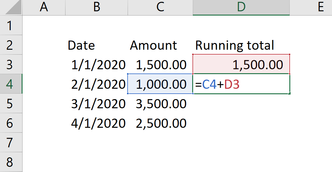
Do you see how visual Excel is? Using colors, it drives your eyes easily to the cells referenced in code. The result is satisfying, to say the least: you compute a running total by knowing only how to sum two cells, and how to copy & paste to repeat the formula in all the rows where you want the result to appear.
Visual programming goes one step further than that. Not only do you see the result immediately, based on numbers visible on the screen; The code for the cell is visible in the same place too. You do not need to author the formula in a different environment: formulas, parameters, and results are all found within the same worksheet.
If you want to achieve the same result in Power BI, things are quite different. Frustrating, to put it mildly. Let us analyze what you need to do:
- First, you need to know that you want to write a measure. This is not trivial: if you want a result in a Power BI report, you need a measure.
- Second, you need to know your model. In our case, we have a single table only, with four rows. In the real world, things are very different. The table contains columns and values that might be different, in name and content, than what you see on the screen.
- Third, you need to figure out an algorithm that works the same way on all the rows. A single DAX expression is evaluated in every cell of the report. In our Excel example, the first cell (D3) has a specific formula: being the first, its value is just the current value. You sum the previous value with the current value starting from the second row. In Excel, two cells in the same table can thus have different formulas, whereas Power BI does not offer this feature: all the cells are controlled by the same formula.
Let us say that you come up with the correct algorithm, either on your own or by searching on the Web; you find out that the formula is, “sum the values of sales that are found before or equal to the current date”.
The last step is the hardest: how do you write the code? Here is a possible answer:
Running Total :=
VAR CurrentDate = MAX ( Sales[Date] )
VAR PreviousSales = FILTER ( ALL ( Sales ), Sales[Date] <= CurrentDate
VAR Result = SUMX ( PreviousSales, Sales[Amount] )
RETURN
    Result
And here is what you need to know, to author it:
- You need MAX in order to find the current date, because you want the last date visible in the current filter context; the latter happens to be a filter applied to the Sales table by the visual when you are slicing by date.
- You need ALL over Sales, in order to get rid of the filter context. It would otherwise limit the number of rows visible in Sales.
- You need FILTER in order to restrict the result of ALL to the sales that took place before the current date.
- You need SUMX in order to iterate over the result of FILTER; this in turn retrieves the value of Amount in the row context of the iteration introduced by SUMX.
None of these concepts is intuitive. Most newbies fail in authoring a simple running total because they are not familiar with things like row context, filter context, iteration. It does not matter how easy it is for an experienced DAX developer to author this formula. In the self-service BI world, anybody should be able to author a running total easily. No PhD required, just some googling and a hint of common sense.
There is more. The entities that you manipulate in Excel are cells. Yes, you can work with arrays, tables, and more advanced structures. But by just referencing cells and ranges, you can already leverage tremendous analytical power. In Power BI, there are no cells. There are tables, columns, relationships, and measures. You do not see these entities in your report. Tables and relationships are the foundation of the model you are working on – they are mostly invisible in a report. In a report, you see the result of calculations and aggregations. Tables are in the background, they are not what you see. Still, measures work on tables and columns.
Bear in mind that we are not preaching that Excel is better than Power BI. We are not comparing them at all. All we are doing is trying to understand what makes Excel so much easier than Power BI, because we want to steal the secrets of Excel to make Power BI a better tool. Being visual, in our opinion, is the most powerful of those secret ingredients of Excel.
Simplicity in Excel comes with limitations. The very fact that you can mix cells with different formulas in the same table comes at a price. Indeed, Excel presents severe limitations when it comes to the number of rows allowed in a table. Theoretically, you can reach a limit of one million rows in a worksheet. In practice, as soon as you reach a few hundred thousand rows, performance becomes so bad that you start rethinking your report. Power BI, on the other hand, handles tens of millions of rows in the blink of an eye. Billions are also a viable option – not scary at all when using Power BI Premium.
Similarly, Excel is super-easy as long as you work with a single table. If you need to work on a model containing multiple tables, you end up relying on VLOOKUP – again with a huge performance hit. Power BI, on the other hand, handles models with multiple tables seamlessly.
Therefore, we can conclude that programming need not be hard. DAX can be made simpler by adding some visual elements to it. That said, making DAX more visual should not disrupt its performance. After all, we do not want to go back to Excel; we want to improve DAX.
Why DAX is not a visual language
The reason DAX is not visual like Excel is, lies deep in the roots of the tool. Power BI is the result of merging multiple tools into a single product. Over time, Microsoft developed Analysis Services Tabular (AS), Power View, and Power Query. Merging these three products was the genesis of Power BI. Although the old tools were merged into a single product, they remain different tools based on different technologies:
- AS is the engine that stores your data: it is based on tables, relationships, measures, and columns. It is an extremely powerful database that provides Power BI with its unprecedented power and speed.
- Power Query is the ETL tool introduced in Power Pivot first. It has a great ETL language, and it can mashup data from virtually any source. It provides Power BI with its connectivity to external data sources.
- Power View was originally introduced in Excel and SharePoint as the next data visualization tool. Only when it was moved into Power BI did Power View really spread its wings and start to fly, at the heights we see now. Power View lost its name and identity – nobody talks about Power View anymore – but it gained the unconditional love of Power BI users.
Now the thing is that these three products are integrated together in Power BI, but they are not a single tool: they are still three souls in one body. For sure, they communicate together. Power Query loads from external sources and provides data to AS, which stores it in its database. Power View queries AS to produce visuals. AS is the core of Power BI: it sits in the middle between the data sources and the final visualization. AS is also responsible for any calculations over the data. This is the reason why measures are stored in AS.
Although AS is the core, you do not interact with AS. What you see in the end is Power View, the tool that produces the visuals in your reports and dashboards. These visuals are generated by Power View out of queries executed by AS. AS has no clue whether the result of a query lands in a matrix, a line chart or a slicer. AS receives a query, computes it, and returns the result. At the cost of repeating ourselves: AS is responsible for calculations, Power View for the visualization.
In AS calculations occur through measures. Measures are entities stored and executed by AS. AS speaks tables and relationships. AS does not even know about the existence of visuals. This is the reason why a measure cannot reference values in a visual. A measure lives in a different world: the world of AS. In other words, there is no way a measure can reference something like “the previous row in a matrix”, or “the subtotal at the year level”. These are visual representations of values, but AS is not visual at all.
Introducing visual calculations
So far, we have seen that in order for a language to be easy, it needs to be visual. Moreover, we also saw that DAX, Power BI’s programming language, cannot be visual. Should we conclude that DAX will never be a visual language – therefore we need to live with its complexities? Well, the purpose of this article is quite the opposite: we would like to build extensions to the DAX language to get the best of both worlds: a language that can speak both “tables and relationships” and “visuals, rows and columns”. The extension we would like to discuss is Visual Calculations. Let us elaborate on this.
The data in each visual is populated by sending a query to the underlying model in AS. The result of this query is a table containing the most detailed data gathered to produce the visual. Let us call this table ReportData.
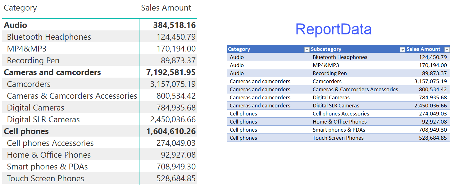
You can think of ReportData as the result of exporting the data of a matrix in Power BI to a .CSV file, for later massaging with Excel.
ReportData in and of itself is just a name for the result of a query. What if we extend DAX to add calculations on top of this table? For example, the percentage against the grand total could be expressed this way:
% Total :=
DIVIDE (
    ReportData[Sales Amount],
    TOTAL ( ReportData[Sales Amount] )
)
There is no TOTAL function in DAX. Think about it as a new function, that returns the total of the table resulting from the query that the matrix sent to the report.
The same calculation in DAX would be:
% Total :=
DIVIDE (
    SUM ( Sales[Sales Amount] ),
    CALCULATE ( SUM ( Sales[Sales Amount] ), ALLSELECTED () )
)
If the new functionality were restricted to only totals, it would not be very useful. What about the percentage over the category total? We bet many DAX developers would have to think for a while before coming up with the correct answer:
% CategoryTotal :=
DIVIDE (
    SUM ( Sales[Sales Amount] ),
    CALCULATE (
        SUM ( Sales[Sales Amount] ),
        ALLSELECTED (),
        VALUES ( Product[Category] )
    )
)
Whereas by working with ReportData, the calculation could be as easy as using a hypothetical PARENTTOTAL function:
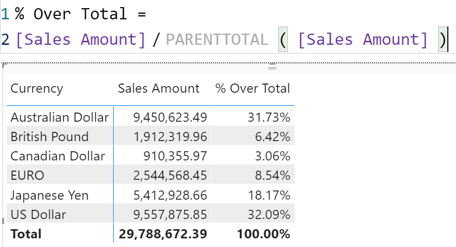
% Category :=
DIVIDE (
    ReportData[Sales Amount],
    PARENTTOTAL ( ReportData[Sales Amount] )
)
Before we move on, you can notice that the new syntax we are suggesting works regardless of the columns used in the report. Indeed, by using the content of ReportData and a higher-level function like PARENTTOTAL, it would work on the report – returning the percentage against the parent total no matter which columns are being used for slicing and dicing. The DAX code, on the other hand, works in a report that is slicing by category; it would fail if you sliced by other columns.
What about the running total we were showing at the beginning of the article? In this visual language, it could look something like:
Running Total :=
ReportData[Sales] + PREVIOUS ( ReportData[Running Total] )
It looks like a recursive definition. It is not. Using PREVIOUS, you could reference the previous row in ReportData. The engine can be smart enough to implement it using a windowing function, or an iteration.
Are we suggesting a new programming language? Not at all. The idea is to extend DAX, not to replace it. This feature could be implemented as part of DAX, with a user interface on top of it to make it simpler. What follows is neither DAX nor a new project being developed, it is just an example of what such DAX extension might look like:
EVALUATE
ADDVISUALCOLUMNS (
    SUMMARIZECOLUMNS (
        'Product'[Category],
        'Product'[Subcategory],
        "Amt", [Sales Amount]
    ),
    "Pct",
        DIVIDE (
            [Amt],
            PARENTTOTAL ( [Amt] )
        )
)
The ADDVISUALCOLUMNS processes the result of SUMMARIZECOLUMNS by adding new columns. In the new column definition, you may access specialized functions to navigate through the table returned by the inner SUMMARIZECOLUMNS.
The advantage of this approach is that the calculations in ADDVISUALCOLUMNS reference values that are directly shown on the screen in a Power BI visual. Remember: any number you see in a visual is returned by a SUMMARIZECOLUMNS query executed on AS. The visual knows the names of these columns and their content. This extension of the language would let the visual know which value you are clicking on when you select any cell of the visual.
DAX would not become totally visual. It would still be structured with the usual tables and relationships. Yet the existence of ReportData tables makes certain calculations possible, without the names of the tables and columns in the model being known: you only need to point and click on a cell in the visual. Like you would do in Excel.
Obviously, we do not want all users to learn this syntax. A good user interface in Power BI could let users define the set of visual calculations in a simpler way, with a code generator that implements the more intricate DAX syntax.
The goal of visual calculations is not to replace DAX. DAX is still there for power users and model builders. More casual users can experience great satisfaction by building non-trivial calculations in a visual way. If and when they are ready to move to the next level, the full AS DAX is waiting for them.
On the other hand, developers and more experienced users could use this new feature as an enhancement of DAX to author queries and/or complex calculations. Indeed, ADDVISUALCOLUMNS would be extremely handy for everyone. Just think, for example, that you could use this feature to precompute a table and then perform further calculations on the resulting table, reducing the need to compute certain values again and again – better usage of the cache, better performance.
Of course, it is just an idea. A lot of work needs to be done in defining the features of visual calculations. For instance, we need a definition of a set of features. It should include the navigation through the table – previous row, next row, running sums – and maybe some time intelligence logic because time intelligence is almost everywhere. Do we need ADDVISUALROWS, in addition to ADDVISUALCOLUMNS? We do not have an answer yet; it is something to think about.
Moreover, the result of any query in DAX consists of a table with many rows. Power BI visuals oftentimes pivot their data, showing for example the year on columns instead of rows. Do we need to be able to refer to the previous column, too? In some way, the goal of this feature is to express calculations using the entities seen in the visual. Therefore, the concepts of row, column, and subtotal should be present in the navigation functions.
For example, should subtotal rows be present in the ReportData table or not? For non-additive measures, the presence of sub-totals would be needed, along with more complexity in the language. Avoiding them might prevent some calculations, keeping the language simpler.
We could go on and show further ideas on this feature for days, but the goal of this post is not to define a new feature. Instead, we want to show the generic idea and – most importantly – ask for your help.
We published a new idea on ideas.powerbi.com (DAX calculations at visual level of reports), referencing this article and providing a brief description of the idea described here. There are at least two ways you can help:
- Use the comments on this article to express your opinion. What kind of functions do you think would be useful to have for the visual calculation? Does the idea sound interesting? Do you think you or your colleagues may benefit from visual calculations?
- Vote for the idea if you like it, and spread the word so that – if it reaches a good number of votes – Microsoft engineers might be tempted to actively think about visual calculations and finally develop the feature.
Finally, if you honestly believe that this idea would only mess up Power BI by adding a useless layer of complexity, then say that. We are truly interested in unbiased opinions from you. Together, we can better understand the implications of visual calculations and – hopefully – apply pressure to bring it to life in the best way.
Returns the largest value in a column, or the larger value between two scalar expressions. Ignores logical values. Strings are compared according to alphabetical order.
MAX ( <ColumnNameOrScalar1> [, <Scalar2>] )
Returns all the rows in a table, or all the values in a column, ignoring any filters that might have been applied.
ALL ( [<TableNameOrColumnName>] [, <ColumnName> [, <ColumnName> [, … ] ] ] )
Returns a table that has been filtered.
FILTER ( <Table>, <FilterExpression> )
Returns the sum of an expression evaluated for each row in a table.
SUMX ( <Table>, <Expression> )
The Previous function retrieves a value in the previous row of an axis in the Visual Calculation data grid.
PREVIOUS ( <Column> [, <Steps>] [, <Axis>] [, <OrderBy>] [, <Blanks>] [, <Reset>] )
Create a summary table for the requested totals over set of groups.
SUMMARIZECOLUMNS ( [<GroupBy_ColumnName> [, [<FilterTable>] [, [<Name>] [, [<Expression>] [, <GroupBy_ColumnName> [, [<FilterTable>] [, [<Name>] [, [<Expression>] [, … ] ] ] ] ] ] ] ] ] )