 Alberto Ferrari
Starting from the July 2020 version, Power BI Desktop offers the possibility of using external tools to modify its internal Tabular model. With a tool like Tabular Editor, you can create a KPI directly in Power BI Desktop so that it can be used in any Power BI report and also by using the Analyze in Excel feature. The KPI feature was previously available only in Tabular models created in Analysis Services or Power BI Premium. This introductive article shows you how to create and consume KPIs in Power BI Desktop. A more detailed description of the available KPI graphics and the corresponding state values is the topic for an upcoming article.
Let us see the feature with a practical – though fictitious – example. Say Contoso needs to analyze the Margin % of its products. The yardstick is the overall margin, which is the Margin % over time and products with a tolerance of 2%. The overall margin of Contoso is 53%. Therefore, a category with a Margin % less than 51% is considered bad (red), over 55% is considered good (green), in between 51% and 55% is considered average (yellow). Moreover, Contoso wants to analyze the trend of Margin % compared with the previous year. For example, the margin might be red but Contoso can evaluate which action to take depending on whether it is improving or not over time.
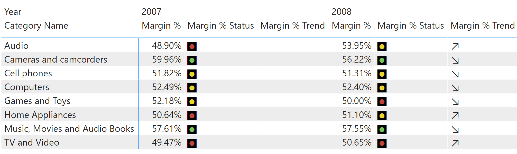
Here is the report we want to obtain:
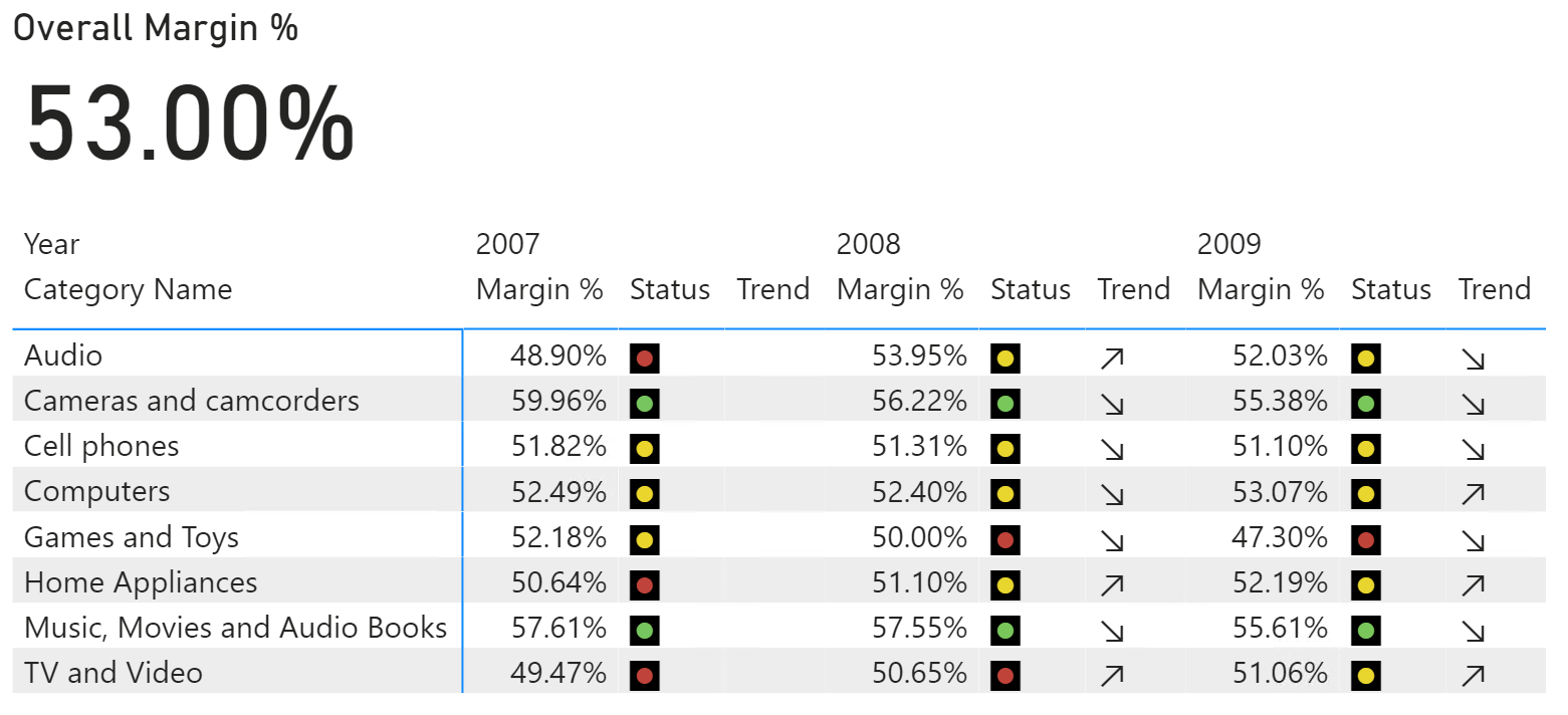
From the report, you can easily tell that Home Appliances in 2008 is yellow, but it is improving over the previous year. The same is happening in 2009. On the other hand, the trend for Cameras and camcorders is negative despite the indicator always being green.
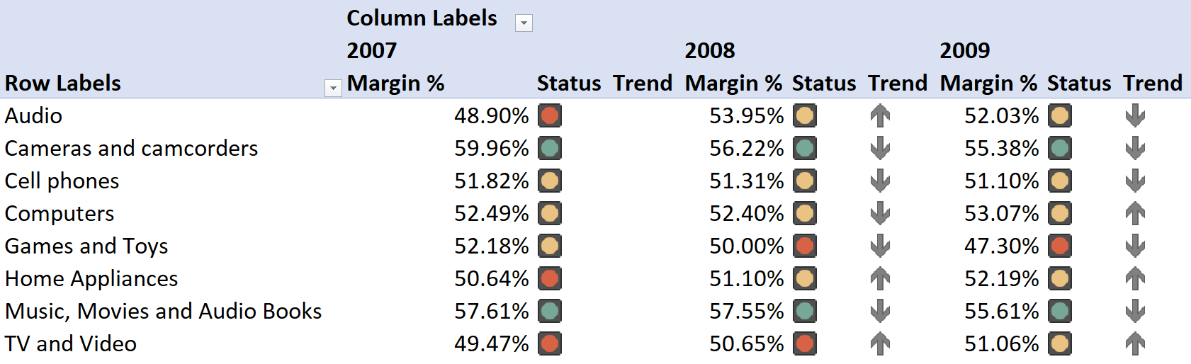
Because the KPIs are defined in the data model, you can also create a similar report using Analyze in Excel after you publish the report to Power BI Service (www.powerbi.com).
This is the perfect scenario for a KPI. Up to July 2020, you had to do some acrobatics with conditional formatting and measures to produce a report like this. It was doable, but with much effort. Moreover, whatever you did with Power BI and conditional formatting had to be repeated for Excel. Using KPIs in the Tabular model, you can create a KPI on top of the Margin % measure so that the KPI definition can be used by Excel and Power BI and retain the same properties over all the visuals.
In a Tabular model, a KPI is defined by properties that you need to understand beforehand.
First, a KPI is always based on a measure. When you create a KPI in Tabular, you replace a measure with the KPI. The measure itself becomes the value of the KPI. You can still use and reference the measure in your code. In the Power BI user interface, the measure is shown as a KPI, no longer as a measure. In our example, we transform the Margin % measure into a KPI.
A KPI has additional properties: Goal, Status, and Trend. In our example, the Goal of Margin % is the overall margin percentage. The Status is a visual indicator of how you refer to the value of a KPI when compared with the Goal. You define the status of a KPI by performing some math on the value of the measure and the Goal of the KPI. The result of Status must be a number that Power BI transforms into a visual representation. From a technical point of view, the Trend is another status. We call it Trend, but technically it is nothing but another status that visually represents the comparison of the value of the measure with another value. In our case, we compare the value of Margin % with the same Margin % measure computed within the same period in the previous year. Because we are using the current value against the previous year, we depict a trend. Regardless, the definition of what “trend” means is entirely in your hands.
Now that we have set the foundation of what a KPI is in Tabular, let us build one together. In the companion content of this article, you find two Power BI Desktop files named Start and End. If you like you can open the starting point and follow the description step by step, to learn by doing.
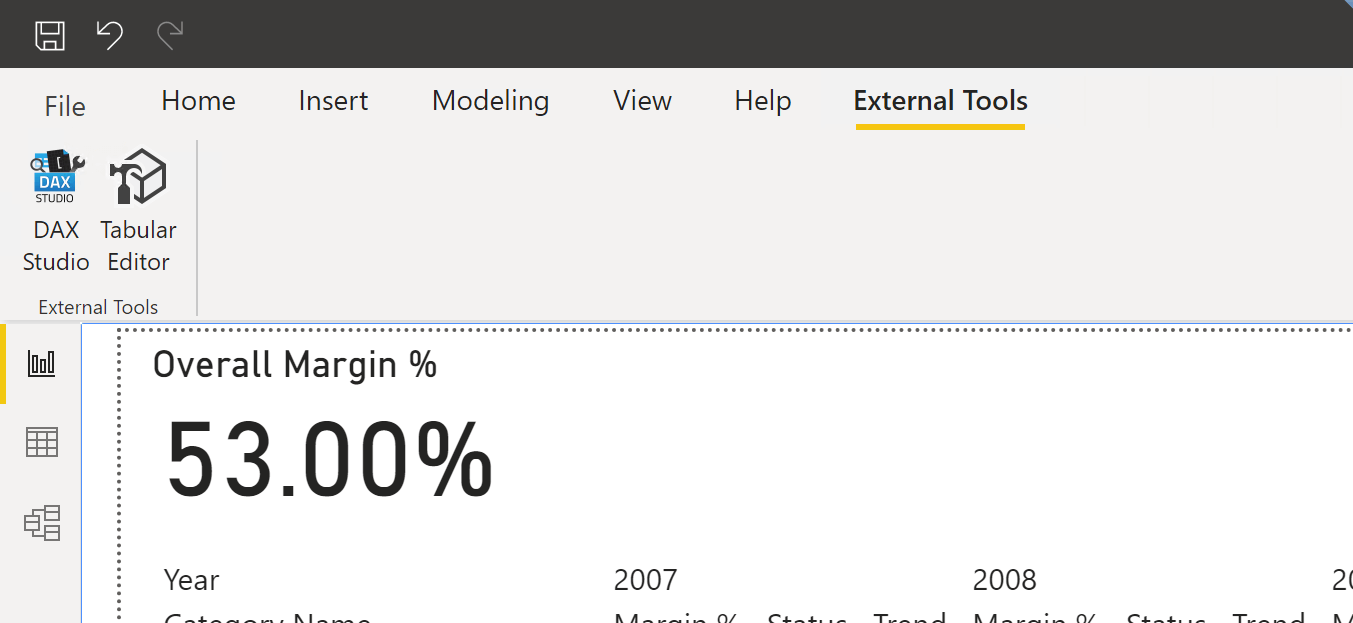
First, you need to install Tabular Editor. Once Tabular Editor is installed, in the External Tools panel of the Power BI ribbon you can see the Tabular Editor icon.
The Tabular Editor user interface (UI) is very different from Power BI’s: Tabular Editor is designed for productivity and development. It requires some getting used to before you are proficient with Tabular Editor. The thing is, it is definitely worth it!
The starting model already contains a few basic measures:
Sales Amount :=
SUMX ( Sales, Sales[Quantity] * Sales[Net Price] )

Total Cost :=
SUMX ( Sales, Sales[Quantity] * Sales[Unit Cost] )

Margin :=
[Sales Amount] - [Total Cost]

Margin % :=
DIVIDE ( [Margin], [Sales Amount] )

Margin % Overall :=
ROUND ( CALCULATE( [Margin %], REMOVEFILTERS () ), 2 )
As we explained earlier, we need to turn the Margin % measure into a KPI. You right-click on the Margin % measure and choose “Create New | KPI” from the context-menu.
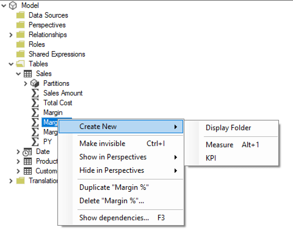
By doing that, the measure turns into a KPI and a new KPI icon appears below the measure. From there, you can update the properties of the KPI. Let us see them briefly.
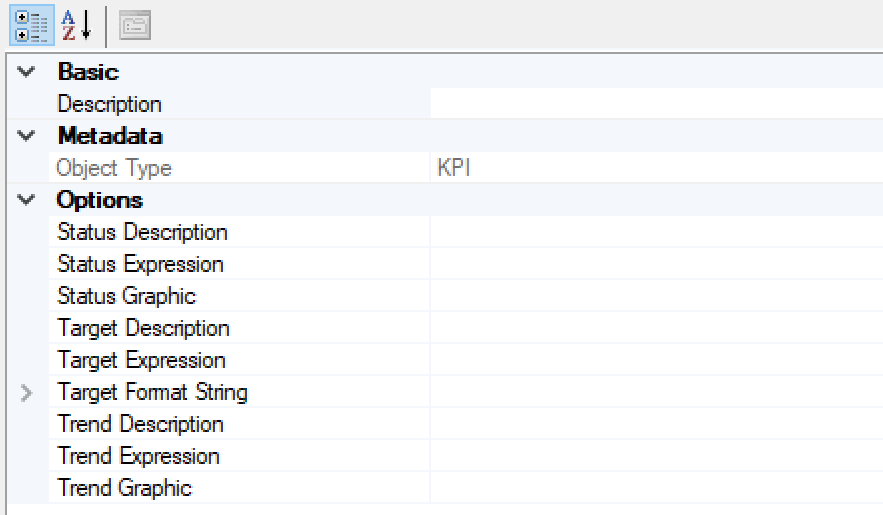
There are basically three properties: Status, Target, and Trend. These are the internal Tabular names for Status, Goal, and Trend. As you can see, Status and Trend let you define the description, the expression, and the graphic to use. The Target (which is called Goal in Power BI) has a format string and no graphic. Indeed, Status and Trend are graphical items, whereas Target is a number.
To edit the expressions in Tabular Editor, you choose the property (Status, Target or Trend Expression) from the Property list in the expression editor. Doing this, you get a full editor to enter your DAX code.
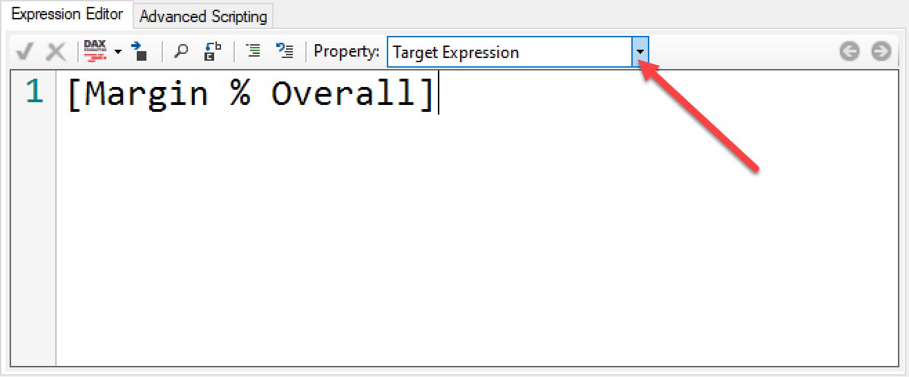
For the Target, we just use [Overall Margin] as the Target Expression and a regular percentage (0.00%) as Target Format String. Once this is done, you have defined the first property of the KPI. In order to update Power BI Desktop, you must save the project in Tabular Editor. You can do so through the menu or by using CTRL-S. Either way, Tabular Editor updates Power BI Desktop by creating the KPI.
You can notice that the Fields pane of Power BI Desktop no longer shows Margin % as a measure. Instead, it shows Margin % as a KPI that includes three properties named Value, Goal, and Status.
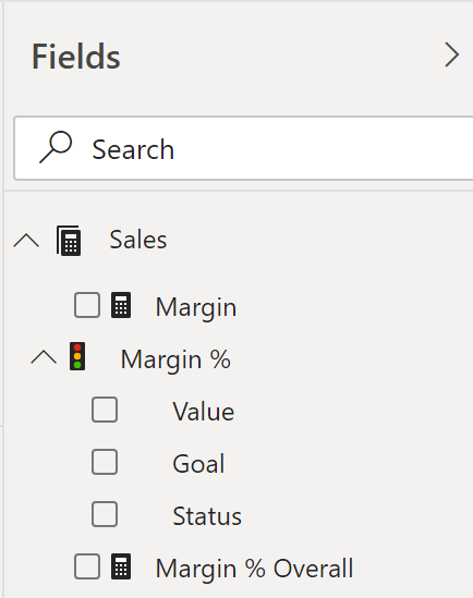
If you select Value, Power BI Desktop uses the original Margin % measure. If you select Goal or Status, Power BI Desktop invokes measures that are automatically created to query the KPIs. These measures follow a standard naming convention. The original measure is Margin %. The newly created measures are named _Margin % Goal, _Margin % Trend, and _Margin % Status. These measures use the definition you provide in the properties of the KPI. They act as regular measures; you can call them in your DAX code and use them in reports. Power BI Desktop uses these KPI properties in a particular way. For example, if you select Status, Power BI shows a graphic instead of showing the number.
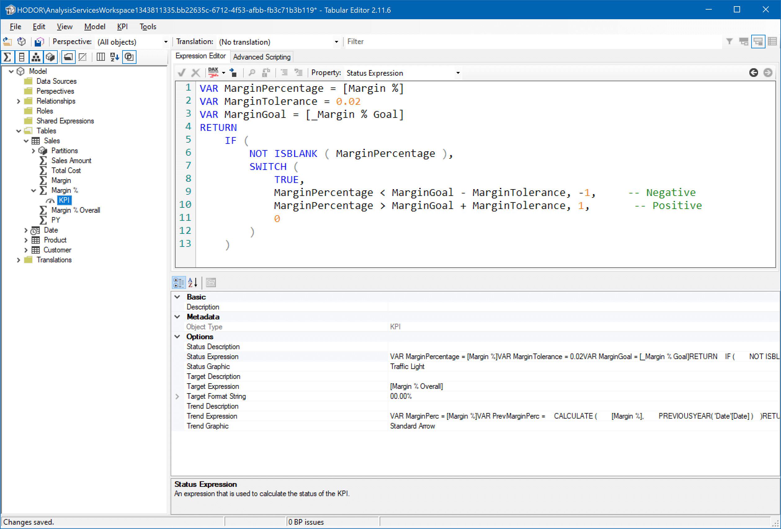
By now we have set the Goal properties. Let us go back to Tabular Editor and set the Status and Trend properties. Status is represented through a graphical element. You choose the symbol required – we used a traffic light – and you define a Status Expression that returns an integer, corresponding to the symbol you want to produce. Because we are using a traffic light, there are three statuses: -1, 0, and 1:
-- DAX code for Status Expression
VAR MarginPercentage = [Margin %]
VAR MarginTolerance = 0.02
VAR MarginGoal = [_Margin % Goal]
RETURN
    IF (
        NOT ISBLANK ( MarginPercentage ),
        SWITCH (
            TRUE,
            MarginPercentage < MarginGoal - MarginTolerance, -1,     -- Negative
            MarginPercentage > MarginGoal + MarginTolerance, 1,      -- Positive
            0
        )
    )
As you can see, in the code we use the _Margin % Goal measure to obtain the target of the KPI. By comparing the value of the current KPI against the target along with the tolerance, we return -1 for bad, 1 for good, and 0 for average.
In a similar way, we now define the Trend properties. In this case, we use a standard arrow for the graphic and a different expression that compares the current value of the KPI with its value in the previous year. The Trend Expression must be defined as follows:
-- DAX code for Trend Expression
VAR MarginPerc = [Margin %]
VAR PrevMarginPerc =
    CALCULATE (
        [Margin %],
        PREVIOUSYEAR( 'Date'[Date] )
    )
RETURN
    IF (
        NOT ISBLANK ( MarginPerc ) && NOT ISBLANK ( PrevMarginPerc ),
        SWITCH (
            TRUE,
            MarginPerc > PrevMarginPerc, 1,  -- Positive
            MarginPerc < PrevMarginPerc, -1, -- Negative
            0
        )
    )
Once everything is properly set, your Tabular Editor looks like this:
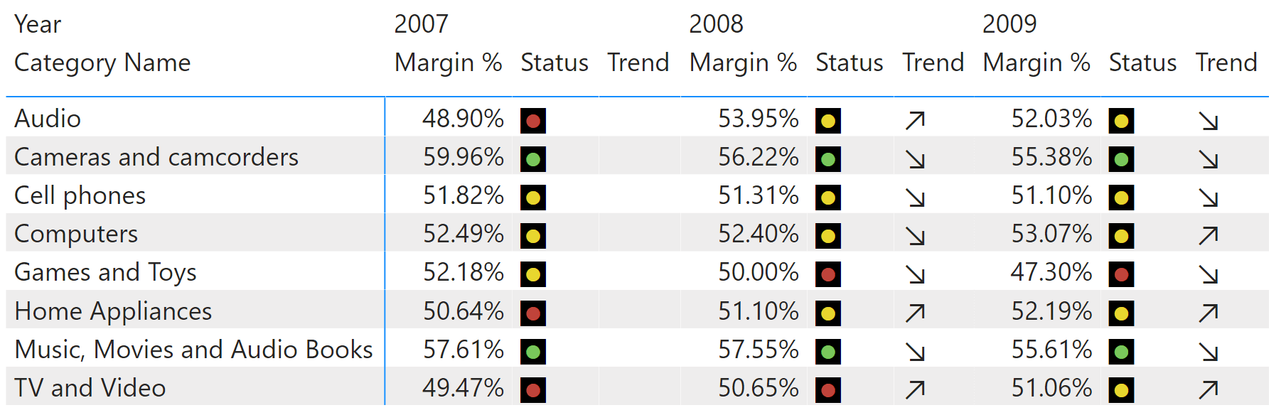
You can save the project and go back to Power BI; it is now time to use the KPI in the report. Please note that you might not see Trend in the KPI properties in Power BI. You need to collapse and expand the Fields pane again, to force Power BI to refresh the fields.
The last step is to add Margin % Value, Margin % Status, and Margin % Trend to the report. Because the names of the measures are quite long, it is a good practice to rename them in the visual to obtain a nicer look. Indeed, you see below what the report looks like without renaming the measures.
As you see, a lot of space is wasted to accommodate for the title, containing the measures’ names. You do not have control over the names in the model; this is why you must rename the measures in the visual. Your result should be what you can see below.
Congratulations! You created your first KPI in Power BI Desktop. There are several important details to keep in mind about the graphics that you can use, the numbers to use for Status and Trend, or the behavior of a KPI in the presence of calculation groups… But this article is already a long one, there is no room to go further.
Stay tuned, we are working on future articles with more details.