Design guide for Power BI slicers and filters
This article describes the available options to filter data in Power BI by using slicers and filters. After an initial description of the features available in the Power BI infrastructure, there are several examples of the visuals available for different scenarios.
Designing for interaction
Power BI reports provide a level of interactivity for users that go beyond traditional, static reporting. Compared to more conventional Business Intelligence reports, such as Paginated Reports, Power BI’s report canvas can be much more dynamic. Power BI does not simply rely on outside parameter selections to apply filters, which then impact how visuals render. Instead, Power BI provides more advanced interactions that empower viewers to make meaningful selections as they explore and click on elements of a report.
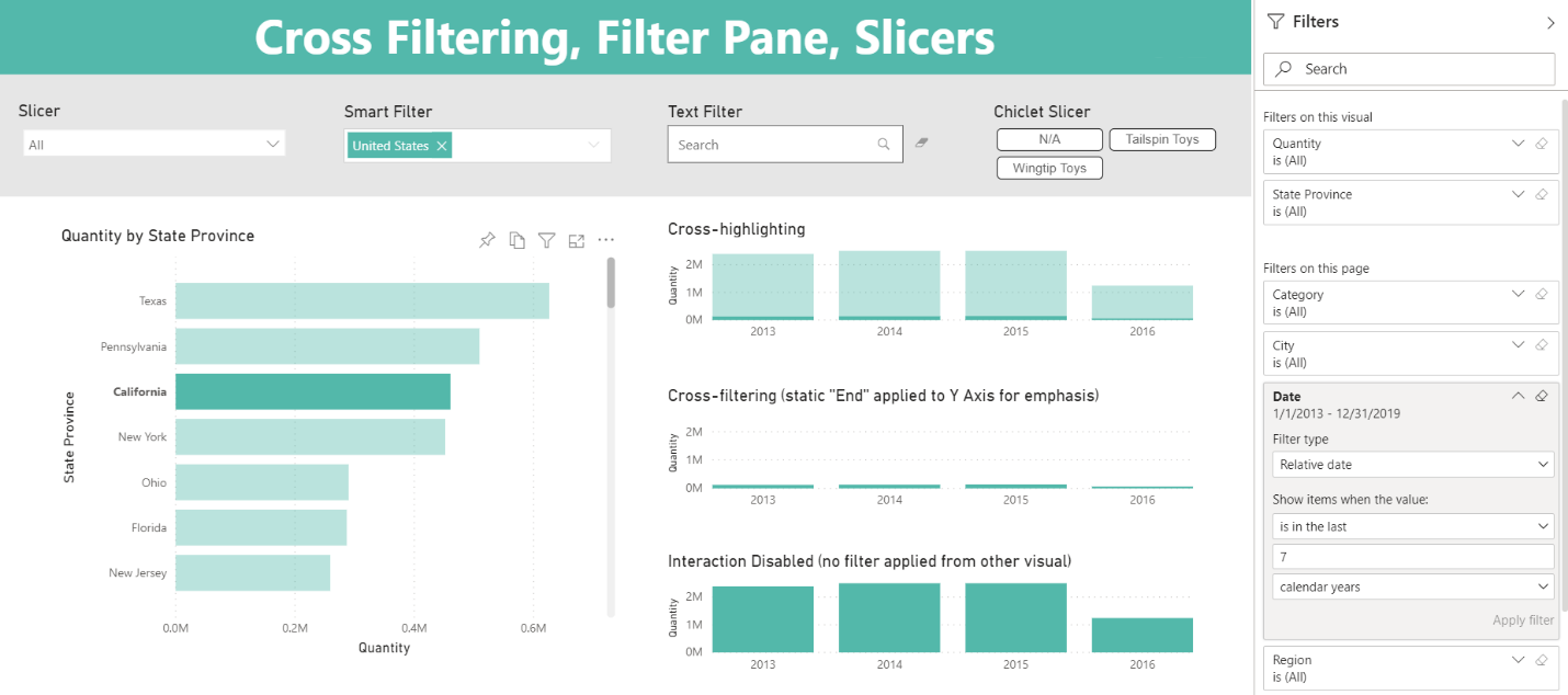
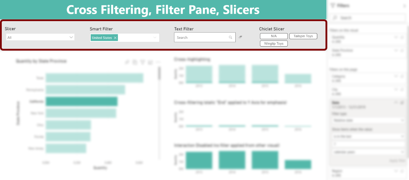
At its core, Power BI’s interactivity relies on how filters are passed (or not passed) between visuals or by outside filter selections. There are a multitude of ways that report designers may build interactivity into their reports. Three important ways that designers can encourage interaction are through techniques such as cross filtering (and cross highlighting), the Filter Pane, and slicers.
There is no correct way to choose between cross filtering, slicers, or the Filter Pane. Depending on your analysis and what viewers prefer, you often work with a combination of all three. In most situations, however, the balance of these techniques will influence your report design both from a visual perspective and from a user experience perspective.
Let’s consider aspects of all three:
1) Cross filtering
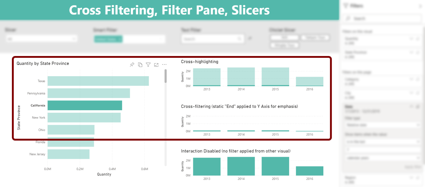
Cross filtering in Power BI provides interactivity among visuals on the page. Visuals respond based on a user’s selection from another visual. Closely related is cross highlighting, which is available for a subset of visuals such as bar and column charts. In the case of cross highlighting, the context of the visual total is preserved but semi-transparent. The filtered selection is opaque.
Multiple levels of cross filtering are also available by employing Ctrl + Click across more than one visual.
Without any outside slicer visual or using the Filter Pane, viewers can dynamically apply filters on the page through cross filtering.
Unlike slicers and filters, however, cross filtering does not easily maintain selection state. As soon as a user clicks elsewhere, the selection is lost and the associated filter is no longer applied. Compared to cross filtering, slicers and filters applied through the Filter Pane retain their selections until a user explicitly changes the values.
You have global control in the Options area to set the cross filtering or cross highlighting experience for your report viewers. You can also modify behavior on a per-visual basis using Edit Interactions on the Format tab in the ribbon and applying changes with icons in the visual header.
2) Filter Pane
A second option to apply filters is Power BI’s Filter Pane. The Filter Pane is either expanded, collapsed, or hidden. While you can adjust the width of the Filter Pane, the location is not customizable. It always appears on the right side of the report canvas. Power BI offers some ability to change Filter Pane formatting as a whole and for individual filters.
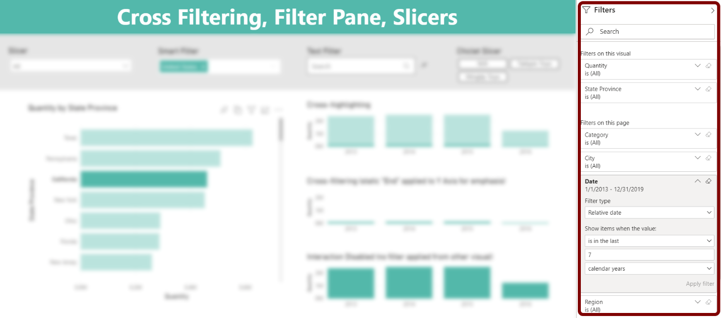
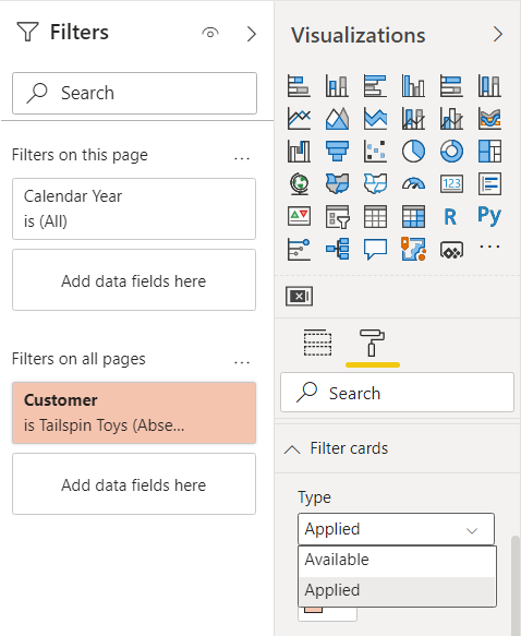
Color may be an important element of your Filter Pane design. In addition to matching or accenting the background of your main report, Filter Cards on the Filter Pane itself have a background color property. Depending on whether an individual filter is Available or Applied, color may be different. This distinction provides visual cues to highlight when filters are applied.
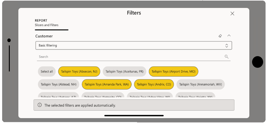
The Filter Pane offers both a Basic Filtering and an Advanced Filtering option. While this article is meant to consider more of the overall impact of options on a report’s visual design, you can go deeper by exploring these different Filter Pane options. They will impact the user experience but will not have as much impact on the visual design of your report canvas.
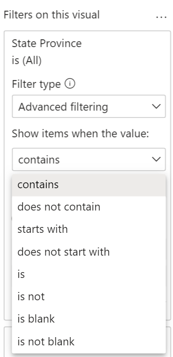
Depending on the context of a user’s selection and your decisions as report author, you will see a combination of Visual Level Filters (“Filters on this visual”), Page Level Filters (“Filters on this page”), and Report Level Filters (“Filters on all pages”) on the Filter Pane.
Unlike with slicers, you could add any number of possible filters to the Filter Pane without impacting the design of your report canvas. The Filter Pane provides a good method to give users some of the additional filters they may want without having to crowd your report with slicers.
3) Slicers
While slicers provide similar filtering results as cross filtering or the Filter Pane, slicers are visuals. Consequently, choosing to use slicers means that you allot portions of the page itself to additional visuals. Therefore, you must factor slicers into the visual design of your report canvas, and space on a page is finite. Devoting areas of your report page to slicers means those sections are not available for your primary visuals.
While Microsoft determines the Filter Pane’s location, you have an abundance of ways to position your slicers on the report canvas. For example, do you want your collection of slicers grouped together at the top, left, or right side of the page?
A collection of slicers may commonly be seen grouped together toward the top, left, or right side of a report page.
Perhaps you want to employ a bookmark technique to “hide” the slicers when not in use. You also must decide if all filters should be slicers, or whether only important filters will be shown on a page as slicers while minor ones move to the Filter Pane. Each decision has visual impact and an influence on your user experience.
Slicers should be positioned to feel natural to report viewers. Yet, slicer choice and positioning that may work for your visual design may not always be optimal for users. Find balance to provide the best user experience that will make slicers available while not distracting from the primary visualizations on the page.
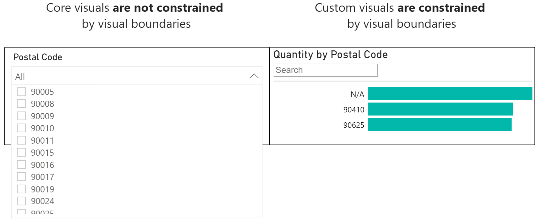
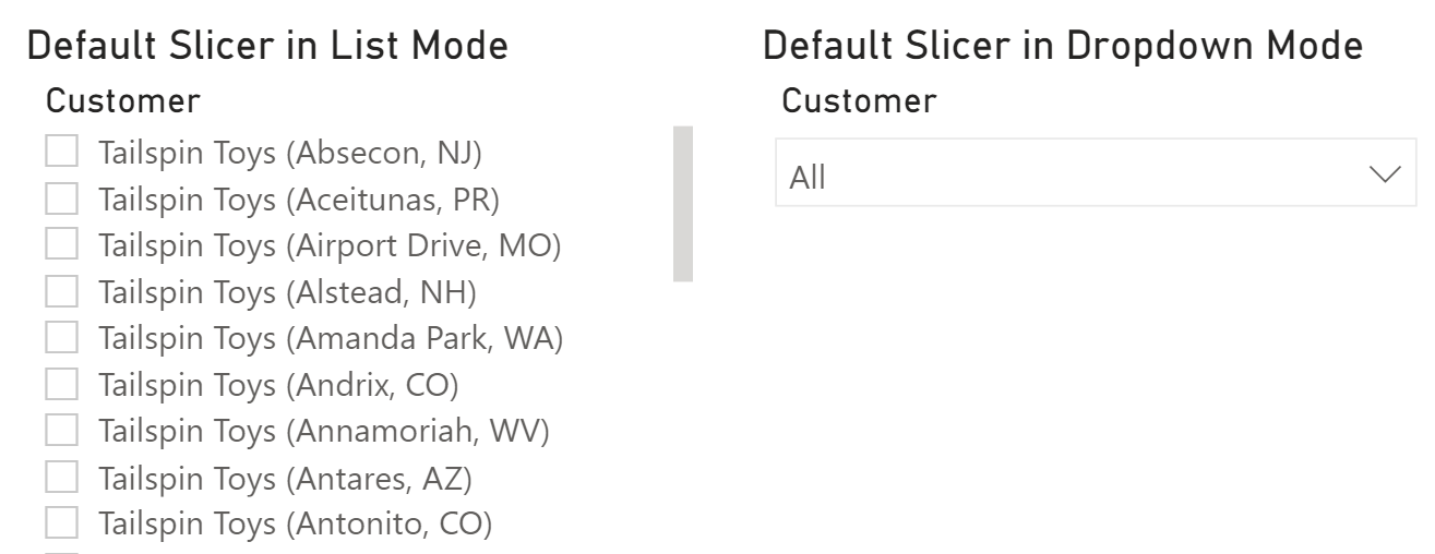
Since they are visuals, another consideration for slicers is whether to use the core Slicer visual or one of the many custom visuals available from the AppSource marketplace. This choice is not simply about functionality or aesthetics either. A key consideration for choosing any custom visual is that it cannot extend outside of its boundary while the built-in slicer can. Note how below, the dropdown slicer in the image on the left extends past the bottom border when needed, but in the image on the right nothing can extend past the right border.
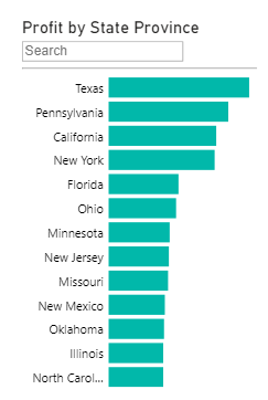
The versatile Power BI slicer
The built-in Slicer visual provides versatility combined with the advantage of being fully supported across all Power BI usage scenarios.
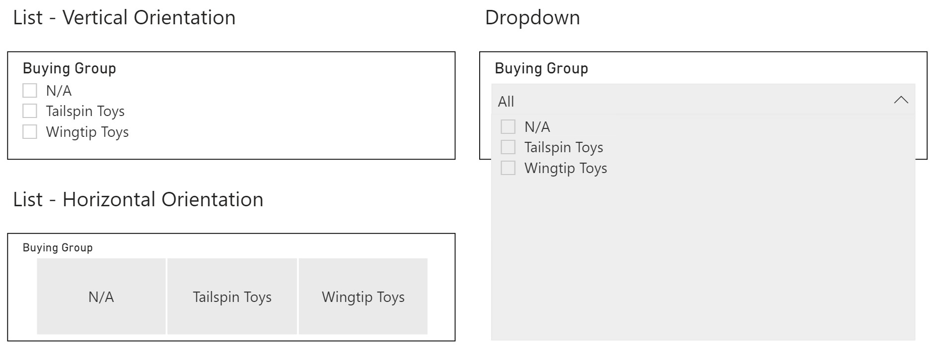
There is a wide variety of visual formatting available to the basic Slicer visual. The default view is List, but options include:
- Available for all data types
- List (vertical and horizontal orientations)
- Dropdown
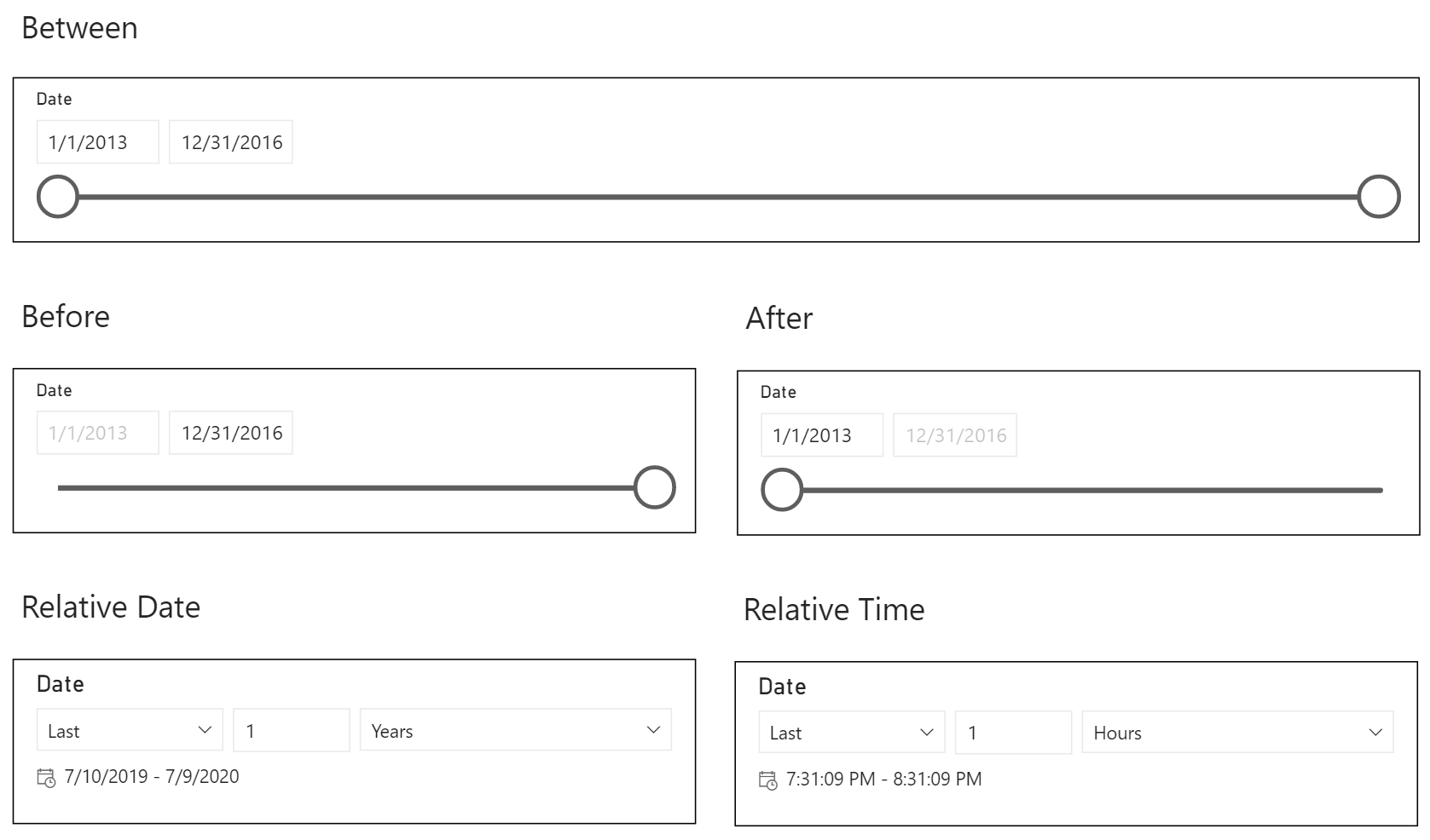
- Also available for Date or DateTime data types
- Between
- Before
- After
- Relative Date
- Relative Time
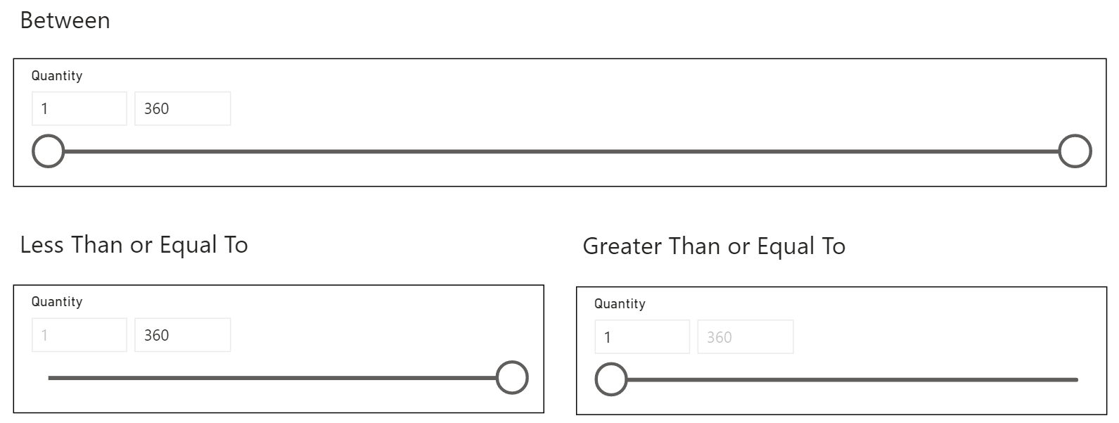
- Also available for Whole Number or Decimal Number data types
- Between
- Less Than or Equal To
- Greater Than or Equal To
In addition, the default Slicer offers single and multi-select options along with optional Select All.
Overall, the built-in Slicer visual offers a large range of functionality and the full support of the Power BI product team across all areas of the Power BI ecosystem. Consider whether this slicer may meet your needs alongside any of the following custom visual slicers.
Slicer behavior
By default, report pages will re-render whenever a slicer selection changes. In some cases, this may not be ideal if you have many selections to make and would like to delay query evaluation and refreshing of the report page. One of Power BI’s Query Reduction techniques available in Options is to Add an Apply button to each slicer to apply changes when you’re ready.
This decision is not strictly a performance consideration because it also impacts the visual appearance of your report. Adding the Apply button for query reduction requires more room on the report page dedicated to each slicer.
When using default visual interactions, slicers behave like Page Level Filters. You can also modify the default behavior on a per-visual basis using Edit Interactions, which unlocks more flexibility than what you have available from filters applied to the entire page in the Filter Pane.
Sync Slicers are another feature unique to slicers compared to the Filter Pane or cross filtering. If you use Sync Slicers on every page, they act like Report Level Filters, applying the same filter selections on all pages. Sync Slicers offer more flexibility than using the Filter Pane in this regard though, since you can customize the sync behavior on a slicer by slicer and page by page basis.
Measure filters
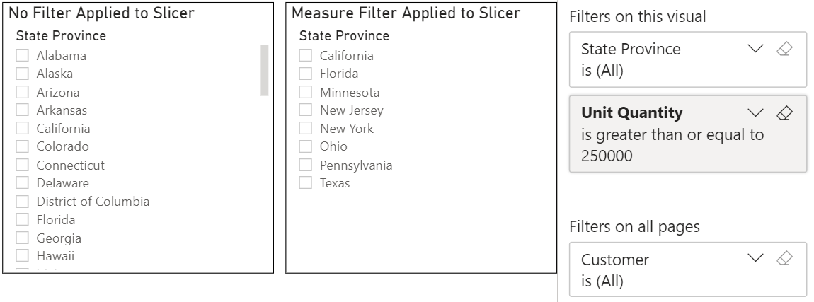
Finally, another consideration when using slicers is that you can apply measure filters. While this capability may not heavily influence your layout and visual design, it could certainly impact the user experience and your data model design.
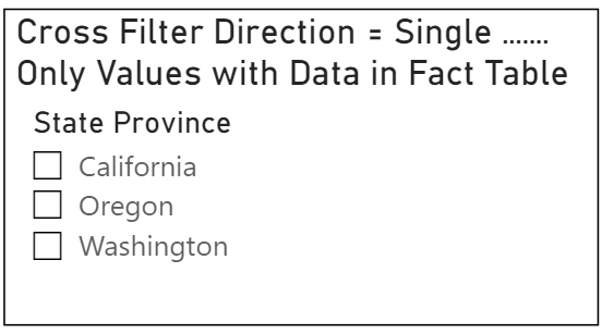
Measure filters in slicers can be particularly helpful if your users only want to see options where relevant measure data exists. For example, what if users only want to choose among States with Sales in a related fact table instead of all states in the dimension table? Adding a measure filter to the slicer satisfies the use case and also helps avoid the temptation to use a bi-directional relationship between the two tables.
Choosing between cross filtering, filter pane, and slicers
As mentioned, there is no right combination of Cross filtering, Filter Pane, and Slicers that will work in every circumstance. Before looking at sample usage scenarios in more detail, let’s summarize some strengths and weaknesses of each choice.
| Cross filtering | Filter pane | Slicer | |
|---|---|---|---|
| Selection state | Temporary | More permanent | More permanent |
| Impact on report page | Built-in to existing visuals | Separate panel | Additional visual(s) |
| Edit interactions | Per-visual control | Not applicable | Per-visual control |
| Sync selections across multiple pages | Not applicable | Report Level Filters | Sync Slicers |
| Visual diversity | Any visual | Not applicable | Many visual options |
| Apply measures to filter available values | Not applicable | No | Yes |
| Delay evaluation for query reduction | No | Yes, but not default option | Yes, but not default option |
In summary, selection state for cross filtering is temporary while it is more permanent for slicers and for the Filter Pane. Cross filtering changes frequently as users interact with visuals, while the other two options only update when a user manually and explicitly updates values.
When it comes to the impact on the report page, cross filtering or the Filter Pane do not require additional space like slicers do. The Filter Pane is collapsible to allow for an enlarged view of the report page.
In terms of syncing selections across multiple pages, slicers offer the most flexibility combining Sync Slicers with the ability to edit individual visual interactions. The Filter Pane with fields added to “Filters on all pages” / Report Level Filters allows selections to remain consistent from page to page as well.
With regard to visual diversity, slicers provide a variety of options while cross filtering can be setup for nearly any visual. The built-in Slicer developed by the Power BI Product team is only one among many slicers. There are several Marketplace visuals developed by community and partners, each with their own appeal in different scenarios.
Usage and design scenarios
While there are limitless possibilities for how report designers build content for their different industries and organizations, here are a few sample scenarios and how designers may select between common slicer or filter options. What might work better considering different ways to approach report design? The following ideas help illustrate what’s commonly available but are not meant to be exhaustive. You know your data and your users. Design for them!
Sample design considerations
Some questions to consider that could be helpful while working through a report design process might be:
- Is your report Exploratory or Explanatory?
- An exploratory report helps users uncover new insights by offering many paths to ad hoc discovery. An exploratory report in Power BI may offer many different slicers, filters on the Filter Pane, and heavily promote cross filtering. Many early iterations of a report or reports used to help understand a new dataset are exploratory in nature.
- An explanatory report guides users through the data and may take a different approach to interaction. Fewer filters may be used because you as the report author move the viewer through the content. Explanatory reports may still encourage interaction, but it is often more intentionally directed using techniques such as bookmarks or drill through pages.
- How many visuals are too many?
- Although they allow valuable on-page interaction, slicers take up space. Filters on the Filter Pane do not.
- Slicers add extra complexity to your page layout and formatting. While filters on the Filter Pane have some format options such as color, you will typically spend less time designing with filters than with slicers.
- Will your report rely heavily on DirectQuery — with or without aggregations built into the data model?
- Since DirectQuery keeps the data at the source, you may want to both limit the number of slicers and enable query reduction to improve the overall user experience.
- There are a host of additional techniques to consider that are more related to the data modeling process than to report design, so don’t forget about that side too.
- Will your viewers rely on the Power BI mobile app?
-
- While not a completely foreign experience from accessing a report in the Power BI service or embedded in an application, the user experience on the mobile app differs—especially if you use the dedicated mobile layout.
- Too many filters on the mobile app may be cumbersome for users.
-
Prioritizing filters and slicers
Have you encountered Power BI design conversations where stakeholders want to add almost everything from the data model as a page full of slicers? Oftentimes, this request signals that the users do not fully understand what they want yet, so they opt for everything.
Many business users like slicers because they are easy to use and highly visible. Since slicers are part of the report page itself, they are hard to miss.
In situations like this, try to help users uncover the goals for the report or dashboard, prioritize what is most important, and define how they primarily will interact with the report. If they describe their goals using natural language such as “I want to see Sales by Year by Country”, anything following a “by” in the sentence may be a good candidate for a filter.
Are there opportunities to employ common hierarchies around Date, Geography, or Product? Using the hierarchy options in certain slicers may offer the chance to consolidate what may have started as multiple slicers into one.
Are there many values or long text in the values? Perhaps a searchable option would work well.
A picture is worth a thousand words, right? Some slicers allow images, which may be useful to display icons, logos, or even flags.
Prioritizing is key though. While slicers are beneficial, there is a visual impact (and quickly a performance cost) as you increase the number of slicers on a page.
Before the current Filter Pane arrived, there were several arguments against adding fields to Filters instead of using Slicers. The previous filter area defaulted to a collapsed view and was hard for untrained viewers to find, applied filters were not easily differentiated from available ones, and more. With the newer Filter Pane, those early concerns are largely reduced.
There could also be an opportunity for additional options outside of the “slicer versus filter” discussion. Why limit yourself to the more traditional ways of reporting? Remember, we often want to encourage more consumer interaction with the visuals and the data!
- When enabled, Power BI’s Personalize Visuals feature allows viewers to change visuals and add personal bookmarks without overwriting the original report. With Tabular Editor, you can even create perspectives in the dataset so that you can curate an end user view that is specifically for Personalize Visuals.
- The Q&A visual allows viewers to ask natural language questions about a dataset. Results for the Q&A visual — which uses AI to help parse language and answer questions — should improve if you invest time managing terms and teaching Q&A based on your viewers’ previous questions.
In general, high priority or highly-used filters will be good candidates for slicers. Move everything else to the Filter Pane if possible.
Example: slicers for filtering many values
When working with a large number of field values, the Slicer in List mode does not leave as much space for other visualizations. More efficient options will often improve your overall user experience.
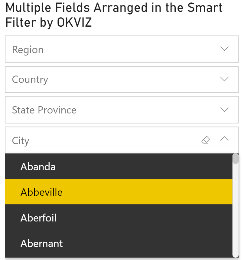
If a field has more than a few values, consider the Dropdown option within the default Slicer, searchable options such as the Text Filter, Smart Filter Pro by OKVIZ (which also allows multiple fields added to the same visual), or move these filters to the Filter Pane where you can use Advanced Filtering set to contains to search. From a visual design perspective, any of these options use space more efficiently than the List view in the core Slicer visual does.
Populating slicer or filter values also has a performance cost. Delaying results until they are needed benefits your user experience. Considering this point, avoid using slicer options that populate large amounts of data at the expense of rendering primary visuals on the report page.
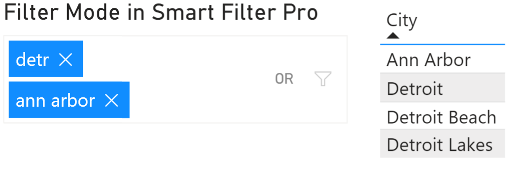
Example: advanced search
Some visuals such as the Smart Filter Pro by OKVIZ have more advanced capabilities. For example, this visual allows users to copy and paste a long list of items from other applications such as Notepad or Excel. You can also add AND / OR logic as well as search a range of values or dates. Finally, the Smart Filter Pro also supports search patterns and wildcard search (*, ?, !) in and has good performance compared to other possible options that load all unfiltered items into memory.
Example: hierarchy slicers
Whenever an important hierarchy is involved, consider the default Slicer visual now that it supports an expandable tree view for hierarchies. This improvement offers much more flexibility than what used to be available when the Slicer was limited to a single field. The Hierarchy Slicer and Hierarchical Filter – xViz, and Smart Filter Pro set to Hierarchy Mode all handle hierarchies as well.
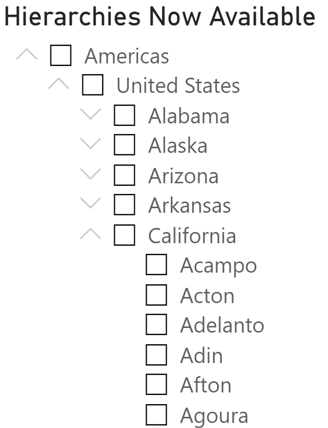
Hierarchies cannot be added to the Filter Pane as a unit. Instead, each level within the hierarchy would have to be added as a separate filter. In this case, visualizing a hierarchy is best viewed in an appropriate slicer.
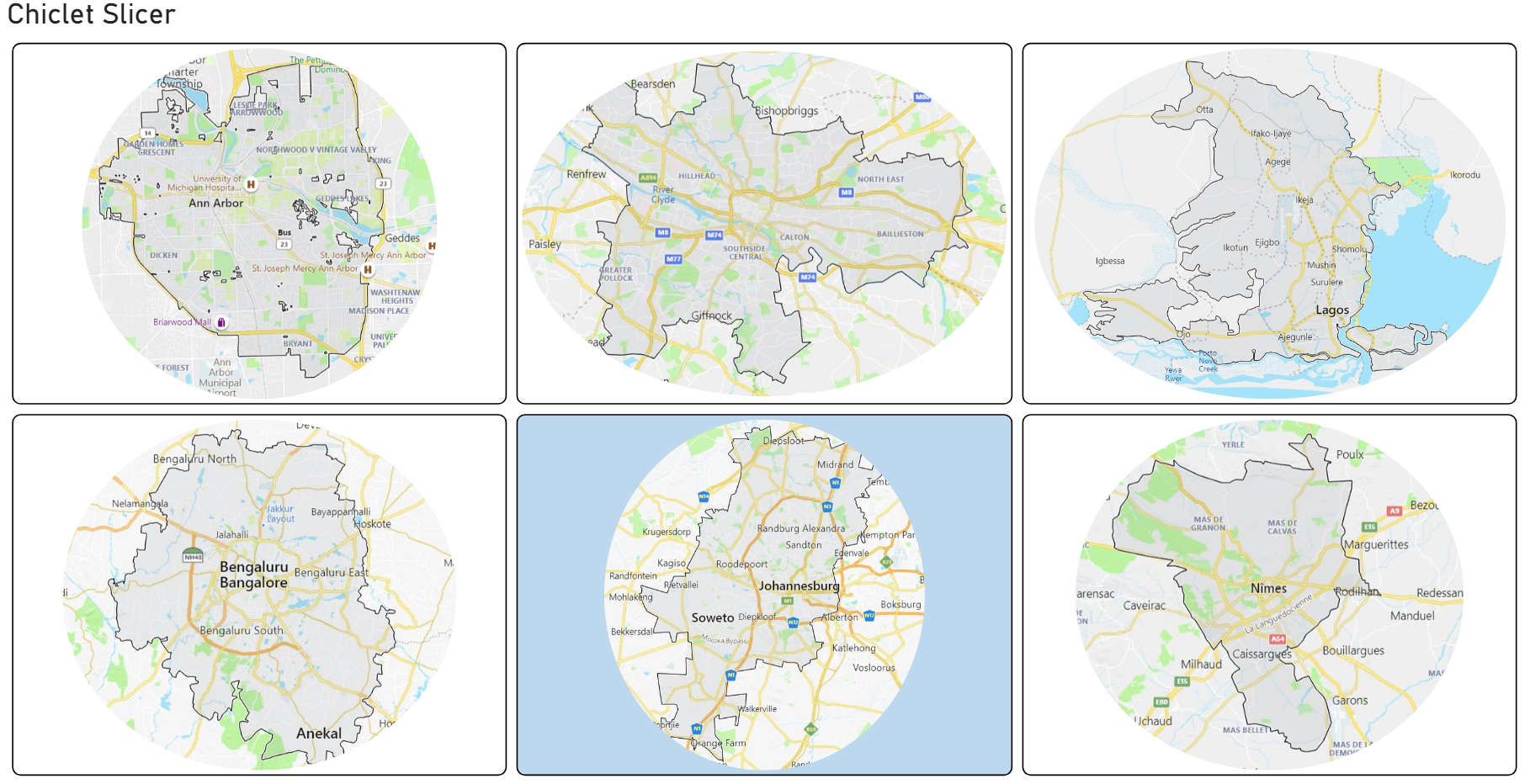
Example: image slicers
If you want image selection, perhaps use cross filtering with an image in the Table or Matrix visual, or add images to the Chiclet slicer. These options will display images from URLs or small, low-resolution images stored into the data model. The Table and Matrix visuals limit image height to 150px maximum. The Chiclet slicer allows some additional control over image sizing and appearance.
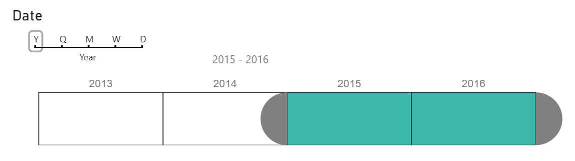
Example: timeline slicers
For slicing on dates, perhaps use the Timeline Slicer or one of the other timeline brush community visuals. Consider the Play Axis custom visual when working with any type of sequence. This visual includes a timer to automatically progress through a sequence of values. It can be particularly helpful to “animate” a timeline.
Example: integrating charts with filters and slicers
Consider cross filtering core visuals if filters are required but not core to your visualization, and when preserving selections is not important. Almost every core visual is good for cross filtering. The Table or Matrix visual with Data Bars enabled in conditional formatting is a good way to improve a dense visual to summarize data while also encouraging interaction and cross filtering.
Alternatively, consider some of the community visuals that combine charts with slicer or filter values. An example of this approach is the Attribute Slicer.
Closing thoughts
Since slicers are visuals, there are numerous options for your reports. You can choose among any combination of the core Slicer and the myriad marketplace visuals from other developers. You could also forego slicers and opt to move filters to the Filter Pane. Find the combination that suits your data and users.
If you’ve made the decision that you want to use slicers in some way on your Power BI report, experiment with the various marketplace visuals to find which one(s) may work best for you. There are so many options, some of which combine unique data visualization with filtering in the same visual.
Keep in mind that depending on your usage scenario, a custom visual may be appropriate or could cause a headache. For example, many organizations may only allow Certified visuals. In addition, even if your organization allows all visuals, your users may want to export to PowerPoint / PDF or view the report in another way where uncertified custom visuals may fall short. In many of these cases, your visual design may not suffer but the user experience may.
Overall, try to be consistent. While it is okay to include a combination of slicers and Filter Pane on a report, avoid mixing too many different types of slicers on your report page. Your choice of slicer needs to consider the end-to-end impact from design to deployment.
Most important of all, your viewers will benefit from intentional design on your part. Don’t overlook the many ways that users may interact with your report, which is a key differentiator of Power BI over more traditional BI reporting. Take the same care when designing your filtering capabilities into your report that you would with your primary data visualization design.