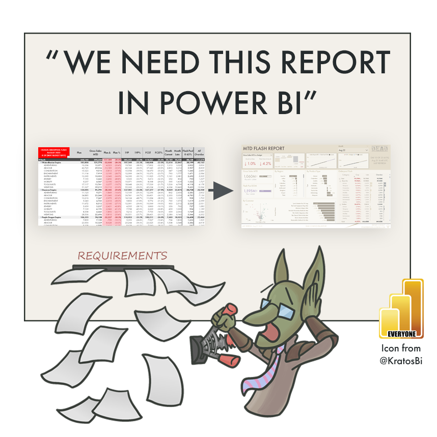
“We need this report in Power BI”
LET’S TALK REPORTING REQUIREMENTS
…and why talking with business users is the most important part of making a new report
HOW DO WE MAKE THE RIGHT REPORT - A USEFUL ONE?
Another abandoned report… this is not what we want. It may have went live, but nobody’s using it…
Many reporting requests have a common starting point - existing reports.
These might be Excel workbooks, large PowerPoint slide decks, or bundles of reports scattered across other technologies. For one reason or another, these reports need to be re-made, re-designed or migrated over to Power BI. “They need to be in Power BI, and they need to be there now.” The business has urgent needs, and there’s pressure from management to see the result. But where do we start? What do we make? Defining the right requirements is essential if we want to make an effective report that is used and delivers value. Otherwise, it will just be collecting digital dust & cobwebs in an abandoned app…
In this article, I discuss 3 common approaches to collecting reporting requirements, arguing in favor of the third approach - working iteratively & collaboratively with business users to make the report.

Option 3 can be the most valuable - talking & working with business users to define the reports
AN EXAMPLE THROUGH A STORY - ‘THE FLASH REPORT’

This is Bink the Data Goblin. Bink needs to make ‘The Flash Report’. Good luck, Bink!
Let’s follow a recent example, with Bink the Data Goblin.
Bink works at our organization - multinational distribution company that sells adventuring equipment. You know, adventuring equipment - everyday essentials like swords, armor & potions…
Anyway, the company has recently implemented some new data systems. Information will be consolidated or migrated from old systems, into what will hopefully be a single source of truth. As this project nears its completion, Bink receives a request to move some existing reports into Power BI. After some initial discussions, she agrees, and receives a mail with an example of the current reports being used in Excel:
““See attached the August Flash report... by when will it be in PBI?” ”
The Flash Report ~20-30 worksheets similar to the above.
So let’s open the reports. Doing this for the first time is often overwhelming. New metrics, acronyms and fields are there, and it’s… a lot. These terms and calculations don’t seem familiar; it’s a bit of information overload. Thankfully, the business has provided some supplemental information - there’s another provided file, “Data points Flash Report v6 JV.docx”, which lists out some fields and calculations.
Going through the report, it’s time to decide - how do we proceed? What will we make? Where do we go from here? How do we make this Flash report in Power BI? Well there are many ways forward, but not all roads may lead to the desired outcome…
ROUTE 1: THE LIFT & SHIFT
MINIMAL REQUIREMENTS - COPY EXISTING REPORTS
There’s a lot of pressure and urgency, so Bink might decide the fastest way forward is to re-create the existing views in Power BI. Using the current reports as a template, she gets started connecting to the data and creating the necessary model. Here-and-there she needs to ask some questions to get clarification on calculations or fields, but is able to reproduce the reports in Power BI; they look very similar, if not identical.
The Flash Report lift & shift to Power BI with slight formatting modifications
It’s used a bit, but frequently exported to Excel. Many complain it takes too long to find what they need.
-
Requirements documented by the developer, aiming to re-create the existing Excel report.
Visuals:
Full-page Matrixes & TablesMetrics:
Sales MTD
Targets: Plan, 1YP, FCST
Target Comparison: Plan (Delta & %), 1YP (%), FCST (%)
Open Orders: Current, Late & Overdue
Other: Flash Pool (Current + Late) * 65% (Delivery Estimation)
Dimensions:
Area > Nation > Product TypeLayout:
Conditional formatting on Plan comparison, highlight of Flash Pool.
THE RESULT

The report is live, so it’s a success, right?
Not quite - not if it isn’t being used.
Technically, Bink has done exactly what was requested. The Flash Report is in Power BI. The numbers are correct and the model is performant. At first, the business is happy, because the report no longer needs to be made manually. While it does address some immediate, basic needs, after some time, another Excel version of the Flash Report starts being distributed by Finance in Excel, again.
Bink checks the report usage metrics and Power BI activity logs, and she is disappointed. Less than 50% of users with access are viewing the report. Most users are also exporting the data to Excel, where some are creating other, slightly different views that they share via mail. Even though the original report was automated, the people who used to make it are exporting it to change or add things, again, re-distributing it via email. Some are even still using the original file connected to old systems, in parallel.
ROUTE 1: WHAT HAPPENED
This obviously isn’t the optimal result. Yes, the report was copied into Power BI, but it’s clearly not helping the business be more effective or answer their questions with insights on data.
Disadvantages of a lift & shift approach
When doing a lift & shift, we miss out on the many easy opportunities to improve existing reports, taking advantage of Power BI features to help our business. Sometimes, a lift & shift is selected because it may be perceived as faster or more resource-efficient, since no additional features must be added or re-designed. The reality is often that the resource gain is minimal. This is because the negative impact on the quality of the end-product is often steeper, resulting in post-go-live change requests and redesigns which will cost more time & resources, by the end.

Here, the new report is the same. It inherits all the issues with the original, which was made in and for a different tool. Instead of leveraging the visualization capabilities in Power BI, we have treated Power BI like Excel, sticking to only the table & matrix visuals. Except that it isn’t Excel. Users can’t modify cells or create further calculations, leading to exports and adoption issues. We sought to automate, but because the solution doesn’t fit the needs of the users, it’s creating additional steps and downstream export reports.
When creating reports in Power BI, it’s important to fit the tool capabilities to the design so we can maximize the value from the tools we use. In this report, it takes a long time to get insights from the table, and is very overwhelming. Visualization capabilities in Power BI can help users get information more quickly & efficiently than digging through the table.
ROUTE 2: “TELL US WHAT YOU NEED & WE’LL MAKE IT”
LIST OF REQUIREMENTS FROM STAKEHOLDERS
Management has commissioned a re-design of the report by a small consulting team. As this new Power BI project gets started, consultants send out a ‘requirements template’ to the users. It’s a well-formatted Excel file that lists out a number of questions and requests for information, as well as sections for other ‘technical requirements’ and ‘functional requirements’.
After a demonstration of example reports for stakeholders, the requirements file makes its rounds. There are a few meetings to review, approve and finalize the contents therein, before the build is estimated. Then, the project can finally start. It took a bit longer, but finally, the report can be developed, based on the final business requirements document provided.
The consultants get busy and start to develop the report. They’re quite experienced in creating Power BI reports, and are determined to make something elegant. A few of the requirements need to be adapted, but in general they succeed in ticking all the boxes. On top, they think the report follows best practices and is more visually appealing & professional than the previous version. They offer up a demo:
The Flash Report designed from requirements provided by stakeholders
Management like it better and it’s easier to see the top line… but overall, the usage is still low. Why?
-
Business Reporting Requirements
Should be able to switch between comparison MTD & Full Month
Target should be phased by the # workdays
Should be able to select Month & Area as filters
Comparison to targets in %
Plan / Budget
Forecast (FCST)
1 Year Prior (1YP)
Comparison of Sales MTD with Budget Plan by Region Hierarch & Product Hierarchy
Matrix breakdown of Flash Pool order metrics
Current Orders
Late Orders
Flash Pool @ 65%
Overdue (all dates)
Shows when the report / data was last updated
Can export the data to Excel
… etc
THE RESULT

Usage & adoption still isn’t very high. Why is that?
In the delivery presentation and demonstrations, the report impresses management. Stakeholders like what they see and are excited to launch it. The report is handed over and it goes live. It is used a lot in the first weeks, but after some time, the usage actually drops, dramatically. Shockingly, at one point it’s used even less than the original lift & shift version.
There are a lot of requests to add or change things in the report, but some users are still relying on the Excel reports connected to the old systems. They say there’s not enough detail, or that the reports are too ‘fancy’. After some time, the report is used mainly by the executive leadership, while most of the user community turn to other tools and data to answer their questions.
ROUTE 2: WHAT HAPPENED
The difficulty with requirements documents is they require many assumptions. In reality, these assumptions are rarely - if ever - fully met. For example, a complete requirements document assumes that the stakeholders filling it out…
…represent the entire user group that should use the report
…understand what’s possible with their data, the tool & technology
…know & understand what they need
…can adequately describe what they need to the developer / designer
…can anticipate their future needs and how they will use the reports
…etc
Some challenges of working with requirements documents alone and not discussing with users
Note
Requirements documents are often necessary, but most useful when combined with user discussions. They become problematic if they’re used instead of talking to business users; ‘thrown over the fence’ between report creators & users.
Requirements documents are sometimes used to just make it easier to say when the report is ‘done’ - when all the boxes are ticked. Unfortunately, this can feel an excuse to avoid talking with business users, formally setting the responsibility of report scope & design on stakeholders, themselves. This might initially seem fair - after all, it’s not up to a Power BI expert to say what goes in the report. However, the business need help in translating their questions and needs to the technical & functional requirements. This is particularly true if they aren’t familiar with Power BI reports. Ideally, the process of defining the requirements should be a collaborative exercise.
While involving business users does ask more availability or time from them, in my experience, it tends to produce both a better result and higher adoption. In discussions, an understanding of their perspectives, pains & challenges will paint a clearer picture of reporting needs than if they write it down, themselves. Data experts can observe users using existing reports, seeing what they do with the data and asking about what actions they take. Based on these discussions, data experts can help define what the key user stories are - the key business questions & problems they try to address with data. Then, together, data & business experts can discuss ways to answer those challenges effectively in a report. These become the underpinnings of the report, and when documented, represent the reporting requirements.
ROUTE 3: “WHAT QUESTIONS ARE WE TRYING TO ANSWER?”

TALKING TO BUSINESS USERS & ITERATING, TOGETHER
Determined to get it right and help her business users, Bink and her colleagues decide to talk and collaborate better with the business. The users will have to invest some more time in the report design, but they hope this will lead to a better result that helps them be more effective. The project team aim to understand a few key questions, such as:

COMMENCING USER WORKSHOPS
They start by defining who will use the report with the users. Together, they identify several user groups, each having their own needs and perspectives. From management, interested in a quick picture of the top line, to analysts, who are diving into the details. The project team document this, and from there, discuss existing reports and data. They are working together to define the business questions & problems the users are looking to address. To do this, they ask questions about the reports from their own research, and listen as users explain how they use the reports, what they look for and what they do with the data. For example:

HOW DO USERS USE EXISTING REPORTS?
…and how do we translate these to an improved design? Below are some notes from Bink’s whiteboard discussions with various users:

1. The users started by checking if the target was being met month-to-date.
Here Bink suggested a MTD trendline, a better chart type to see the progress vs target by workday. Users liked that idea, and together they agreed it would be useful to drill to a specific workday.

2. They looked at the month-end target and estimate where they might land.
Bink noticed they paid special attention to this Flash Pool metric. It was much more important than Bink expected. The Flash Pool is an attempt to estimate what open orders would be shipped, so the business could estimate if the month-end target would be reached. Bink noticed the users were always adding the Flash Pool to the Sales MTD to get an end of month (EOM) estimate vs. the full-month target. Pointing this out, the group realized it was an easy and obvious thing to call out in the report.

3. They sort by target delta or %, to look for big gaps. They would then ask the regional managers for the list of customer sales to see which customers and products were most behind.
Bink realized that a simple way to see the customer detail by region would be helpful, so they can quickly take action on the orders of those customers. They tried a few different methods to do this, but ultimately settled on a scatterplot to quickly identify customer outliers.

Users always checked the YTD figures after the Flash Report, to see if the areas behind are only behind this month, or for the whole year. They sought more context for this month’s situation.
Bink proposed having a small YTD visual which could be cross-filtered if users were investigating the MTD numbers, so that context was always visible if needed.
DEFINING THE VALUE
After only 4 hours of workshops, Bink had a much clearer understanding of the users and the report. Bink realized the Flash Report was focused on quickly estimating if we’d reach our month target, and if not, which regions & customers needed additional pressure. “Higher order” user groups like executives and management were focused on a quick “flash” of the situation and problem areas. Regional and account managers needed to understand where in their area of responsibility they could take action (i.e. on big gaps, late orders & overdues).
Together with the users, Bink agreed that a valuable report would make it easy to see if they’d make the month. It would help them place that data into context and take action (i.e. at Customer level). They drew some ideas on a whiteboard and Bink set to work creating first prototypes.
THE RESULT
The final prototype was very different from the first report. However, it answered many of the same questions more effectively; users spent less time getting what they needed and had a clearer picture of their situation. Because the developer better understood the business needs, she made better design decisions like selection of chart types, or what metrics to highlight.
Once it was launched, the report had much higher adoption & usage than the previous ones. There were still occasional requests & feedback. However unlike previous reports, they were made in an effort to continue and extend the collaboration rather than squeeze everything into a single report.
The Flash Report designed together with users after some workshops to discuss the business questions
Users say it’s easier to see if they’ll hit their month target, and investigate easily down to customer detail.
-
Are we making our target MTD?
> Card with % vs. target MTD
> Only look at 1 target at a time; use target selection
> Always look MTD for sales, Full Month for Sales + Flash Pool;
Show all figures MTD default
> Focus is on making the target; in breakdowns, show the delta with sales, target and % in the tooltipWill we make our target by the End of the Month, from what we know now?
> Flash Pool EOM = Focus on Flash Pool @ 65% + MTD Sales vs. full month target
> Show Flash Pool EOM vs. Full Month Target at top next to MTD
> Show ‘walk’ / ‘waterfall’ of the Flash Pool to the Gap vs. Plan
= Better show how it’s calculated
> MTD Trendline will show both in one, easier to see how trendingWhere are we most behind?
> Start Region / Product hierarchy, but always end at customer in other sheets
= Include customer view
> Many customers - way to see outliers = volcano plot
> Cross-filtering region = easily see customer detail
> “Behind” = MTD breakdowns, but must also see Flash Gap at top line
> Always check YTD figures after = have small YTD “check” view at top
…
ROUTE 3: WHAT HAPPENED
If it’s feasible, discussing with users can be the single most valuable action you take in a reporting project. However, the discussion must be driven effectively by asking the right questions, looking through existing reports and data, and observing the actions users take with their information. If successful, these discussions will help report creators & business users together define the key questions the report must help answer, from which the requirements will crystallize. Often, these discussions reveal surprising elements, for example inclusion of YTD figures in a MTD report to provide context, or that users are doing additional calculations or views in exports which could be automated to yield value to the entire user community.

Involving users will also improve adoption & usage after go-live, because they know what to expect and played a small but significant part of the design & creation exercise. Users may already feel familiar with the report and how to use it, and feel like they were really being listened to and helped. The ‘co-creation’ should be a positive experience for both parties.
Finally, any mock-ups or prototypes created can serve as a blueprint for larger, enterprise projects. This makes it clear to the users what they will get, and to the report creators what they will make. It can even be valuable for data engineers to understand how the data will be consumed & viewed.
BUT WHAT ABOUT SELF-SERVICE?
Focusing on business questions and problems with co-creation is even handy in self-service usage scenarios. In this case, there is often a community of practice built up around report creators or analysts who share with others. There co-creation can bring value, too. Arguably, effective co-creation is a sign of a very healthy community of practice, where self-service creators are focused on answering questions instead of collecting data points. Collaboratively working between consumers and creators is a concept that can span many usage scenarios; from enterprise to managed self-service.
CHALLENGES
That said, running such workshops and prototypes isn’t easy. It does take significant energy for someone to run and prepare such workshops, and requires a different set of soft skills to do successfully. One can’t expect to show up in a call and for users to spill out what they want and need; that is no different than working only with a requirements document.

Workshops can be difficult if communication and change management challenges exist. If users are not available or unwilling to change, then it’s of course difficult to have a productive collaboration. However, if both sides of the discussion - developers & users - remain solution-oriented and willing to collaborate, these discussions can be both stimulating and immensely valuable for a reporting project.
TIPS FOR RUNNING WORKSHOPS
Getting started: Preparation
Things to do before the workshops - prepare & communicate. Click to enlarge the image
-
Come up with questions and hypotheses about what’s important and why.
Look up examples of other, similar reports in that business area to see what others do.
Write down all the metrics and fields and - if you can - their business & technical definitions
Try to understand and illustrate the business processes behind the data - what happens in the business to generate these numbers? Drawing process flows can be really helpful, here.
Try to identify what is the most important -
What should someone see in 3 seconds from this data / report? Why is it so important?
What should they see in 30 seconds?
What would they spend 300 seconds (5 minutes) diving deeper into?
-
Make some suggestions about how to visualize information, and how it can be helpful. Draw it out or use an example, and explain it from the user’s point of view. For example - how long does it take for our executives to say if we are on target if we look through a table vs. quickly glancing at a KPI card at the top of the page?
Draw things in a quick and easy way so people see what you mean.
Give users pens and let them draw if they have an idea. Ensure to give them good feedback for putting themselves out there and proposing something.
Don’t be afraid to show something that isn’t perfect or finished. Remember - perfect is the enemy of good.
If you prefer making mock-ups in Power BI, use mock data like the Contoso database generator from SQLBI.
-
It’s not uncommon for people to ask about data or fields. If you’ve already checked what is available, this is good preparation.
You can avoid assumptions about data availability, data quality and definitions
It tells you what might or might not be possible based on data volume & cardinality
-
“We” and “us” instead of “you” and “them”; subtle, nuanced language can remind everyone that you are on the same team.
Explain things simply without being patronizing. Remember that users might not know anything about Power BI. Don’t make any assumptions about what people do or do not know; just ask.
If certain groups or people haven’t said anything, ensure they have a way to speak. Don’t let the most outgoing person in the room dominate the discussion.
Listen and empathize with people. Your job is to moderate. Workshops are honestly a lot like a D&D game - and you’re the Dungeon Master. Your job is to guide the group and ensure everyone makes it through the adventure.
-
Some examples:
What actions do we take with the data? What do we do with the insights we get from the report?
What questions are we trying to answer? How do we answer those questions, today?
What do we need to take action?
What isn’t working in the existing reports; what’s difficult, missing or frustrating?
It is possible to ask questions about calculations & definitions, but ensure that extensive time is not spent on this in a workshop. It can be a large waste of time and energy. Instead, focus on:
Contentious metrics that have variable or debated definitions in the company, like margins. Ask why they use one definition over another.
-
If someone asks for something, don’t be afraid to challenge or question why. Some hypothetical examples:
Why do you need to see all 3-4 targets at once? Is it not better to show only one target, since we’re typically focusing on one at a time?
Why do we look at the full month? If we phase our target by workdays, we can compare MTD instead, which is more fair and easy?
Shouldn’t we split this up into two different views or pages? We can add some cross-page drill-throughs and filters to make it easier. It will make it a lot less busy and easy to use, no?
Maybe instead of having 20 fields in 1 table, we can split them up into different visuals with cross filtering? We can also have an exploratory visual like a decomposition tree or use field parameters to split the data however you want? We can prepare a demo for tomorrow?
TO CONCLUDE

Build bridges by talking with business users to define the solution, together
Gathering reporting requirements is a challenging but important exercise. Without the right understanding of business needs, reports will not answer the right questions, and will not deliver the right insights. This is true even if the reports are really nice & really fast; if no one’s using the report, then it’s not bringing any value.
The best way to get this understanding is to build bridges with users and understand their point-of-view; talking with one another. Building empathy. While workshops are not always feasible, striving for an iterative co-creation approach may help you build better reports that bring more value to your organization.
Note
The data used in these reports is from a large, randomly generated “data goblins” dataset I’ve been working on for over two years. The data is entirely generated from scratch using Dungeons & Dragons items & locations as seed master data. It is a sales dataset for a fictional company “Dumpledilp’s Equipment & Adventuring Distributions”, otherwise known as DEAD. If you’re interested in hearing more about the dataset, i.e. in a future post, I’d be happy to hear it in the comments, below.