

Swapping Gantt chart hierarchies with Field Parameters
Like most Power BI enthusiasts, I've been playing around with the new Field Parameters feature that came as a Preview Feature in the recent May 2022 release of Power BI Desktop.
The most common use cases I’ve seen thus far tend to involve showing different columns based on a slicer selection. But I'm sure that in the coming weeks and months, the Power BI Community will uncover more elaborate and useful techniques using Field Parameters beyond just this. Here’s one such new application I’ve found…
I had a particular requirement from a client, in which their Project Management Office (PMO) wanted to see two Gantt charts, with different hierarchies on the rows of each:
One showing the standard Portfolio-Program-Project hierarchy that a PMO considers, and
Another showing each Business Unit (BU), and each of the BU’s projects
They also wanted to be able to swap between each Gantt chart using a slicer.
I had been exploring this just before Field Parameters were released, and it could be done with a Bookmark Navigator. However, I've discovered that (after a bit of tweaking) it can also be done using Field Parameters used against a matrix visual.
Here's what the end result looks like, read on to find out how to implement it.

Creating a Gantt chart with a matrix visual
Before getting in to the Field Parameters implementation, I’ll show you how to create a Gantt chart with the native matrix visual. I’m by no means the first person to come up with such an approach (I first saw this idea in a video by Sam McKay from Enterprise DNA), but I’ll walk you through how I’ve gone about it. If you already know how to make one of these, feel free to skip ahead to the next section.
When dealing with project management information, information about different initiatives is typically stored in a hierarchy structure. Here's the schema that we'll consider:

In this example, an Initiative can generically refer to a Portfolio, a Program or a Project of work 1 . For each Initiative, we list the Portfolio, Program and Project (PPP), as well as the owning Business Unit for each Project, and the Start and End Dates. Note as well that the lowest non-blank values in the PPP columns indicates what level of the PPP hierarchy the initiative falls on.
If we want to build a Gantt chart with the standard PPP hierarchy, we can do this with the native matrix visual.
For the rows, we can just drag in each of the PPP columns to make a custom hierarchy.
For the columns, we can bring in the Year and Month Name fields from a date dimension. Note that the date dimension should be disconnected from the Initiatives table, since relating the two tables on Start Date or End Date can make the end result ambiguous for the user.
For the values, we can create a measure that returns 1 if the Initiative is active within the timeframe, or 0 if it is either yet to start or complete.
Here’s the DAX for the measure, and the resulting matrix.
VAR StartDate =
MIN ( Initiative[Start Date] )
VAR EndDate =
MAX ( Initiative[End Date] )
VAR InitiativeActive =
StartDate <= MIN ( 'Date'[Date] )
&& EndDate >= MAX ( 'Date'[Date] )
VAR BlankRowOnMatrix =
(
ISINSCOPE ( Initiative[Project] )
&& SELECTEDVALUE ( Initiative[Project] ) = BLANK ()
) // Identifies blank Projects (which are the Portfolio and Program Initiatives) shown in matrix
|| (
ISINSCOPE ( Initiative[Program] )
&& SELECTEDVALUE ( Initiative[Program] ) = BLANK ()
) // Identifies blank Programs
|| (
ISINSCOPE ( Initiative[Business Unit] )
&& SELECTEDVALUE ( Initiative[Business Unit] ) = BLANK ()
) // Identifies blank Business Units
RETURN
SWITCH ( TRUE (), BlankRowOnMatrix, BLANK (), InitiativeActive, 1, 0 )

Note that the BlankRowOnMatrix variable in the measure definition is used to filter out the Initiative records where the Program or Project are blank. If we don’t add this logic in, we get something like the matrix below, which would be hard for users to make sense of.
Also note that for the visual layout, we need the grand total row to be showing, which I’ve retitled here to read as ‘All Initiatives’. This is to allow the higher levels of the hierarchy (Portfolio and Program) to display values at the same time as the lowest level of the hierarchy shown (Project).
I'm not aware of a way to show these row total values without also showing the grand total. But even with this limitation, you can set the font and background colour of the grand total row to match the page background colour so you don't notice it.
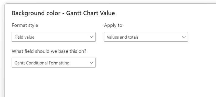
To make the visual look more like an actual Gantt chart, we can add conditional formatting for the background and font colour of the matrix cells. We can make these both consistent by using a single measure for conditional formatting, and basing the conditional formatting values on that. In the measure below, we’re defining it such that the bars at each hierarchy level in the Gantt chart will have a different colour.
VAR LevelColour =
SWITCH (
TRUE (),
ISINSCOPE ( Initiative[Project] ), "#71AFE2",
ISINSCOPE ( Initiative[Program] ), "#73B761",
ISINSCOPE ( Initiative[Portfolio] ), "#4A588A",
ISINSCOPE ( Initiative[Business Unit] ), "#8D6FD1",
BLANK ()
)
RETURN
SWITCH ( [Gantt Chart Value], 1, LevelColour, 0, "#FFFFFF00", BLANK () )
Note that you need to apply conditional formatting to 'Values and totals' in conditional formatting dialogue box. This ensures that each level of the hierarchy can show it’s own bar at the same time.
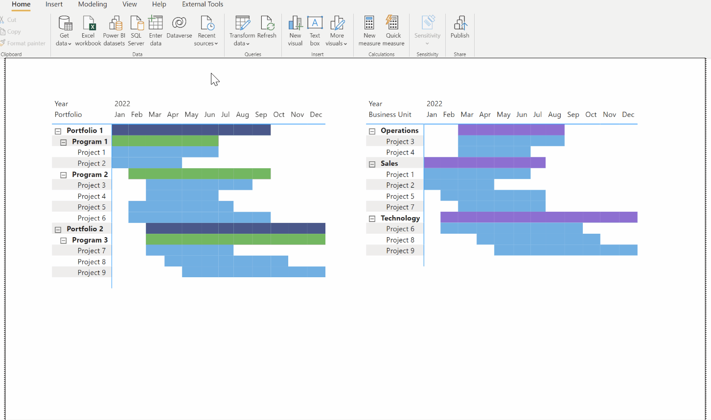
This gives us the basis for our Gantt chart…

You may have noticed that the measures above include logic for Business Units as well. This allows us to create another Gantt chart based on the Business Unit-Project hierarchy by swapping the fields on the rows of the visual…

Adding a field parameter
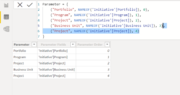
If we want to easily swap between the two Gantt charts above, we can create a field parameter that includes the four fields.
You can then manually select which ones you want, with the sort order determined by the order that you make the selection.
Here’s the same PPP Gantt chart as before, but this time created with the Parameter on the rows of the matrix, and with the Field Parameter slicer after selecting Portfolio, then Program, then Project.

Note however that if you don’t select values in the field parameter slicer in the same order as the hierarchy you want, you’ll get an output that can be hard to interpret. For example, if you select the field values in the opposite order (Project, then Program, then Portfolio), you’ll get something like this…

Since this doesn’t give us very useful information, we’d like to ensure that users can make selections from the Field Parameter slicer than can only result in one of the two Gantt charts we made earlier (PPP and Business Unit-Project).
Setting the sort order for the hierarchies
If we want to enforce what hierarchy levels can be added, and the order they get applied, here's the trick… 2
Edit the DAX that defines the Field Parameter to include all the row permutations, including repeats. For us, this means we need to repeat the Project row at the bottom, but increment the Parameter Order field to a new value.
2. Add a calculated column to return the name of the hierarchy you want to show.
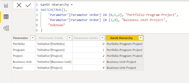
3. Add a slicer to your report page based on the Gantt Hierarchy field, and set it to 'single select only'.
Here’s our final result:

At the time of writing you unfortunately can’t set a matrix visual to have all levels expanded by default, so you still have to expand each level manually.
The bookmark navigator approach may be better for end users that want all the levels already expanded, but this is a good alternative in situations where performance is critical and you can’t afford to add additional visuals to your report page.
Applying this approach to table visual
You can also use this field parameters pattern to retain the sort order for columns in a table visual, without having the hierarchy-expansion issue that the matrix visual has. The approach (shown below) may not be very useful for this particular data table, but you may find a good application of it for your own use cases.

Try it out for yourself!
Download the Power BI report file I used in this post to play around and build your own understanding hands-on.
-
This schema is more robust than if it were at the grain of one-row-per-Project (with the other fields as attributes), because this structure also supports ragged and unbalanced hierarchies. ↩
-
Kane Synder has an good article on applying a sort order with field parameters, and this approach could be used to solve this problem. However, it involves creating numerous field parameters and linking them together in the model. The approach described in this article uses only a single field parameter. ↩