Power BI for Tableau Developers: Introduction
In the fast-paced and ever-changing BI industry, flexibility is king. Learning how to adapt and how to be creative with your solutions is the only way to keep up. One of the ways you can do this is to be well versed in multiple BI and reporting platforms to make sure that your toolbelt includes whatever tools necessary to provide your client with the most appropriate solution.
I know the value of being flexible firsthand as I was a Tableau user for several years until I started using Power BI. I wish that when I started using Power BI I had been able to see a guide to help me translate some of the terminology and functionality from the platform I was used to (in this case Tableau). So if you are a Tableau developer that is getting started in Power BI, or a Power BI user simply interested in gaining more info about Tableau, this article is for you!
Introduction
My name is Spencer Baucke and I am a consultant at Tessellation. I have used Tableau for about 4 years and am very involved in the Tableau community. I have also been a Power BI user for about a year and recently passed the DA-100 certification exam. It’s been awesome getting acquainted with the Power BI community and seeing how similar both communities are in terms of supporting people new to the product.
On social media and on my blog, I used to almost exclusively write about Tableau, but as of late I’ve been writing much more about Power BI and the similarities/differences to Tableau. The idea first came to me soon after the Gartner Magic Quadrant came out in 2019. I posted a tweet (below) saying “#PowerBI is the future. Tell me why I’m wrong?”. Needless to say, the feedback was crazy. I knew from this reaction that this topic was on a lot of people’s minds. Because of my background, this article is written from more of a Tableau point of view, but hopefully, you still find it useful in understanding these two platforms. Let’s dig in!
Product Overviews
Tableau and Power BI are both extremely powerful BI tools with both having unique strengths and weaknesses that have been repeatedly analyzed by members in both communities, including myself. The comparisons are unavoidable, as they are the two biggest names in BI at this time and they find themselves fighting for a lot of the same clients. While they may compete with one another in the market, you will often find both products being used in large enterprises. There are a lot of reasons for this, but one of them is that they both have use cases that fit one product more than the other.
As the readers of this blog know, Power BI is an extremely powerful data modeling tool that has a lot of great visualization capabilities. The VertiPaq Engine offers top-of-the-line data processing and storage while Power Query allows users to do things that most other BI products require whole other software and subscriptions to do (Tableau Prep, Alteryx, Knime, etc). Once developing the front end of your report, Power BI’s visualization capabilities are solid, but sometimes not the most flexible. The types of charts you can use are limited to the charts found in the Visualizations pane and in the marketplace. All in all, the visual capability will get the job done 95% of the time.
Tableau, on the other hand, is a pure data visualization tool. Although they are trying to catch up with Power BI’s data engine capabilities (they introduced Relationships in 2020), there is still a lot to be desired in that category. Tableau’s visualization interface is 100% customizable; the visualizations are not limited to a list of charts found in the program. You start with an x- and y-axis and you are allowed to put any different combinations of dimensions and measures in those slots to create the visual of your choice. Like a wise man once told me, if you want to create a dashboard that you want to print off and put on your refrigerator, you want to use Tableau.
All in all, both of these products are effective in delivering insights to their customers. Both of them have instances where their technology trumps the other (maps in Tableau, data modeling in Power BI), but more often than not your use case could be handled by either. Now, for Tableau folks that are reading this blog looking for more insight into using Power BI, you must realign your priorities and focus. From what I’ve observed from both my clients and from the Power BI community at large, Power BI’s mission is to enable insights for the most amount of people possible giving them the most data and analytics possible in the most timely and data-efficient way possible. This means a HUGE focus on data modeling, performance optimization, and data governance. In order to truly understand Power BI, Tableau users must first make that shift in mindset.
Terminology
We’ve covered some of the conceptual differences; let’s now look at some of the most commonly used terms when discussing Power BI that Tableau users should know about, and how they relate to the world they’re coming from. The terms on the left are the Tableau terms and the ones on the right are the Power BI terms. Much like when translating languages, these terms may not be 100% direct translations due to various quirks or differences, but they still are still mostly the same thing.
Tableau Desktop/Power BI Desktop – we are starting off easy here as both of the desktop versions of the software are called Desktop. Both Power BI and Tableau use this software as the base for the development of the content. Both software have development capabilities in their web storage server/service interfaces but both are more limited than their local Desktop versions. You can download Power BI Desktop for free from PowerBI.com if you want to use this to get started on learning the tool. Tableau offers Tableau Public as a way to publish to their free online server, Tableau Public, but the free version of Power BI Desktop is far more capable than Tableau’s free version.
Tableau Dashboard / Power BI Report – the naming of what is called a report and dashboard can drive a former Tableau user nuts. Unlike Tableau, in Power BI every tab in your Desktop file (called a .pbix file) is like a dashboard in Tableau. You add chart elements and text to the blank canvas you are given, to form what’s called a report. In Tableau the tabs are called Worksheets and you drag worksheets onto a dashboard tab to create your final dashboard. Just remember, when Power BI users talk about a report, they are talking about a dashboard in Tableau terms.
Tableau Server / Power BI Service – when publishing reports for users, both platforms use online or on-premise data repositories that are accessed via web links. Power BI users publish their reports to Power BI Service and Tableau users published their dashboards to Tableau Server. Even though these storage platforms serve a similar purpose, their functionalities can be quite different. Both services allow for the publishing of data sets and visualization content.
You can group your content in Power BI by using workspaces and in Tableau Server by using projects. Both allow you to restrict access to content by managing permissions at different levels throughout Service/Server. One distinct feature of Power BI Service is the ability to create Apps. Apps in Power BI Service are wrappers that allow a constant link for chosen content from a workspace to be displayed allowing users to easily consume and share content without fear of links breaking.
Power BI Dashboard / Nothing – Power BI dashboards and Tableau dashboards are nothing alike. There is actually nothing like a Power BI dashboard available in Tableau. Power BI dashboards are hosted in Power BI Service and contain chart elements from different Power BI reports from that workspace. You can customize these dashboards with text and images, but for the most part, they are just a snapshot/preview of the content found in the other reports in your workspace. There is no item like this in Tableau.
Tableau Prep / Power Query – Tableau users will understand Power Query if you imagine Tableau Prep being available as an app within Tableau Desktop. Power Query is an extremely powerful data transformation tool found within Power BI; it allows you to perform any number of data-restructuring functions that are then loaded into your data model for you to develop with. Think of Tableau Prep, but with far greater capabilities such as custom functions, parameters, and web scraping features. Power Query uses a different syntax for formulas (called M) than the front end of Power BI does (called DAX), so learning Power Query can almost be seen as learning an entire other program. Its functionality is so large, it might take a while to learn how to fully leverage it, unlike the fairly straightforward and easy-to-use Tableau Prep.
Tableau Syntax / Power BI DAX– once your data has been imported in whatever form it may be, you will need a way to manipulate the data to create the KPIs or metrics that are needed for your report/dashboard. The Tableau syntax is more of a free-form coding syntax than it is anything else. In Power BI this language to create new measures or columns is called DAX, and it presents some syntax similarities to Excel formulas. Given the Microsoft connection, people who are used to working with Excel may find using DAX to be fairly similar.
Tableau LOD / Power BI CALCULATE – one of the most common questions I hear from Tableau developers interested in learning Power BI is “how do I do Level of Detail (LOD) calculations in Power BI?”. This is certainly a good question that doesn’t have a straightforward answer per se. Tableau developers rely heavily on LODs because of the flat file structure that their data has had to be in (until recently), so this question is only natural. Power BI can take care of a lot of the aggregation calculations simply by modeling the data correctly. However, when this does not fit all the needs, the CALCULATE function in Power BI is the closest thing.
This CALCULATE function allows you to calculate aggregations of different measures within different levels of “filter context” to get the level of aggregation that you desire. Some of the DAX functions you need to use to create the filter context are ALL, ALLSELECTED, and ALLEXCEPT.
TableauPublic.com / Power BI Galleries – for a lot of Tableau users, Tableau Public is a huge part of their learning and involvement in the broader Tableau community. It’s an online gallery where folks can share and favorite visualizations published by their favorite authors. Power BI Galleries within the broader Microsoft Power BI Communities is similar, but it also includes the Power BI Forums. Although the concept is very close, Tableau Public does offer a lot of nice features not found in the Power BI Data Stories such as being able to search for specific authors.
Similarly to the way that you’re able to share work publicly by posting a Tableau visualization to Tableau Public, you are able to Publish to Web with Power BI. Publish to Web allows you to publish a .pbix file to your personal workspace using any kind of data source, and then create a link that you can embed anywhere on the web. Even though the Data Stories Gallery may leave much to be desired, the Publish to Web feature is an extremely cool feature.
Product Interfaces
For those Tableau users that haven’t taken a look at Power BI yet, let’s take a look at how the interfaces differ from one another. In both instances, I have loaded a data set with NCAA football financial data. For Tableau users who are taking a look at the Power BI layout for the first time, I will use Tableau lingo to get you familiar with the product.
After loading the data (something we’ll go into later) in both platforms you are brought to the blank development interface. Tableau users will recognize the familiar Columns and Rows layout just waiting for blue and green pills to be put there. I have numbered the two different layouts with several features that you may want to know where to find.
- Get Data
- Table Names
- Field Names
- Formatting
- Filters
- Tab Name
- View
- Visualization Menu(more on this later)
- Fields Used in Visual
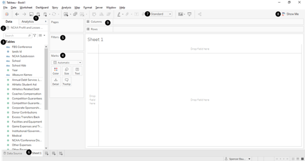
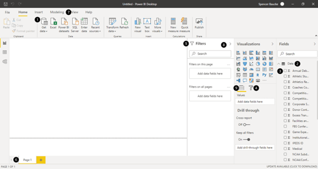
There really is no huge difference between the overall layouts. There are many of the same capabilities in both tools, you just have to find where they’re located. Once you figure that part out, it’s really just a matter of finding out how to make a lot of your favorite chart types. This is where Tableau and Power BI differ: the ease of customization. In the next section, we’ll discuss creating visualizations in both Power BI and Tableau.
How to Create Visuals
This blog post is not meant to get Tableau users to be Microsoft MVPs in one ten minutes article, but it is meant to give you an idea of how Power BI operates and how you could translate your Tableau skills to the Power BI platform. Although I know that Power Query is really where Power BI’s bread is buttered, I want to focus on some of the visual aspects; Tableau does not have a Power Query equivalent, so let’s check out how each platform can create a visual.
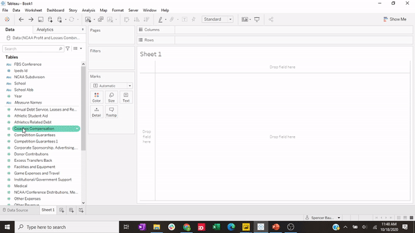
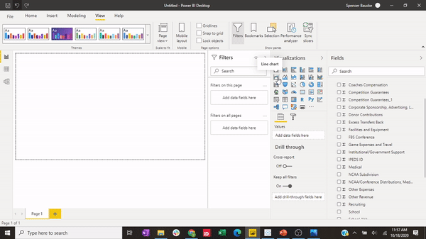
In the videos below I create the same visualization with most platforms; a bar chart showing the coaches compensation by year at the University of Cincinnati.
To create this visualization in Tableau we need to place the appropriate dimensions and measures in their respective places to get the visual to show. Although this may be a little more intensive upfront, you can also add these values to any aspect of the dashboard while not being limited by a certain number of fields you can use or elements of the chart that you can format. Almost everything you can think of is able to be formatted. As you can see below, I drag School to the Rows column to first show all of my schools, then I add the coaches’ compensation field to my rows as I’ll want to see them in a line chart, then I add years to columns. Tableau automatically recognizes that this should be shown as a line chart, but if I wanted to change the chart type I could find my Marks card and change the chart type to a bar chart or another variety of charts.
Creating this same visual in Power BI required a little less work upfront. However, some of the additional formatting you might want to do will be limited. The first step in creating this chart is to open your Visualization pane and choose the line chart visual. This will put an empty template for a line chart on your report. You will see that in your Fields ribbon there are different slots available that you can populate with your fields available to the right. Even if this is limiting for creativity, it certainly is a clear-cut and efficient way to create a visual. I drag the years to the axis field, coaches’ compensation to values, and then school to legend. Because Power BI doesn’t create rows out of these line charts (as I can’t add them to the y-axis), the different schools overlap on the line chart. I then open the Filters pane and populate the school filter that is already there – because it is one of the fields already in the visual. There you have it!
As you can see, both platforms can create some really cool-looking visuals with some differences in how to get there. Hopefully, this quick intro has helped some of the folks seeing Power BI for the first time understand how to create a visual.
Conclusion
I used Tableau for years before opening Power BI for the first time, so I understand where you’re coming from if you are reading this as a Tableau user trying this platform out for the first time. There are so many features that as a Tableau user you will absolutely love in Power BI. Give it a chance. Is it different? Absolutely. Can you make all the crazy weird chart type? Sometimes not. But I promise you that you’ll love the power and flexibility of the platform as a whole. Hopefully, this blog post has given you a taste of what you can expect using Microsoft Power BI and how some of the functionalities are similar.

I want to thank Marco Russo and Alberto Ferrari for having me on the OKVIZ blog, which is a spinoff of SQLBI. Their website, www.sqlbi.com has become an irreplaceable resource for me since diving headfirst into the Power BI world. I also want to thank the Power BI community at large for embracing me and helping me along in my journey. I want to particularly thank Alex Power, Sekou Tyler, Barrett Studdard, and Dave Eldersveld for encouraging me and helping me along the way. Thanks all for reading!